10 Best Real Estate Mobile Websites SMALL SCREENS, BIG IMPACT — IT’S POSSIBLE WITH RESPONSIVE DESIGN!
World-Class Websites For a Mobile-First World RESPONSIVE DESIGN DONE RIGHT
-

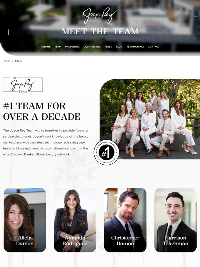
Joyce Rey
Beverly Hills, CAJoyce Rey’s website is a masterpiece of luxury, blending timeless elegance with modern design. Featuring high-resolution imagery and intuitive navigation, it showcases an exclusive collection of exquisite properties. Thoughtfully responsive, the site offers a seamless browsing experience on any device. Joyce’s digital presence reflects her legacy as a global leader in luxury real estate, elevating the online experience for discerning clients.
-
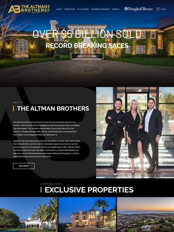
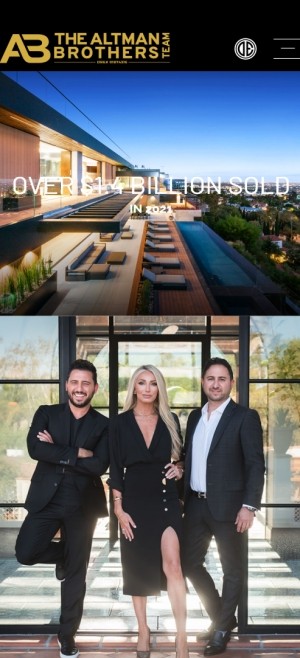
The Altman Brothers
Los Angeles, CAAs leading authorities in Los Angeles luxury real estate, the Altman Brothers embody sophistication and confidence. There is little surprise that the very same qualities describe their professional website. TheAltmanBrothers.com is the ideal platform for LA’s most prestigious multi-million dollar properties, with featured listings showcased on the home page using automated image slideshows. Brandishing a sleek layout with sharp navy and gold accents, compelling high-quality images and video, and easy-to-read content, this mobile-ready website deserves its 4th spot in RealTrends’ 2019 Best Mobile Website Rankings.
-
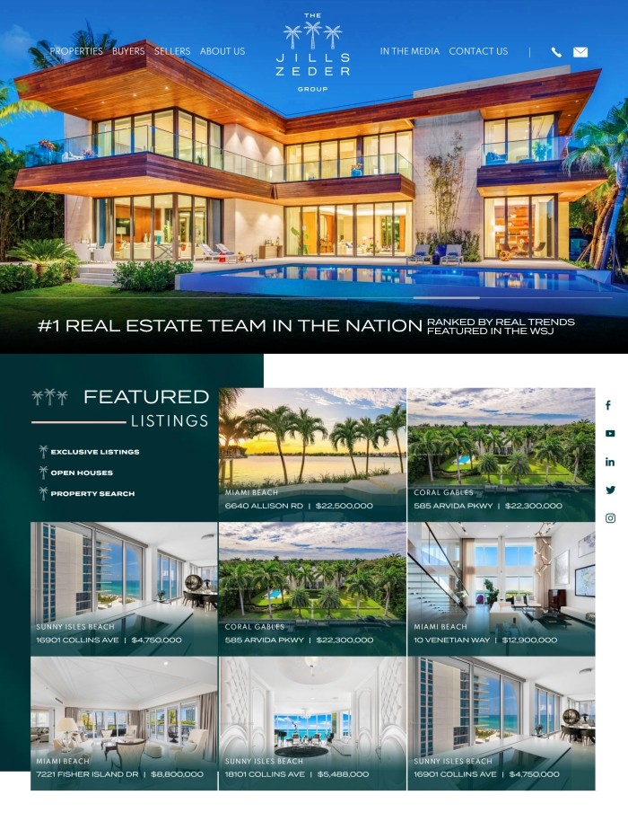
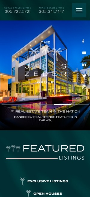
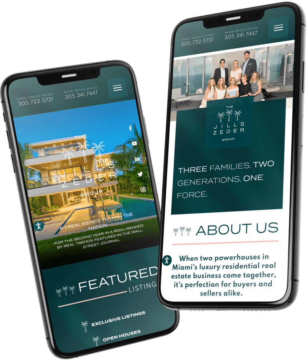
The Jills Zeder Group
Miami, FLThe Jills Zeder Group is the #1 team in the nation with the sales volume and real estate website to back it up. The site retains its image resolution and vibrant colors on smaller mobile screens, sacrificing none of the quality or the experience of browsing on desktop. From listing information to site navigation, JillsZeder.com lets you browse with ease. With sleek and user-friendly design, their mobile site landed the #1 spot on the 2021 RealTrends Website Rankings.
-
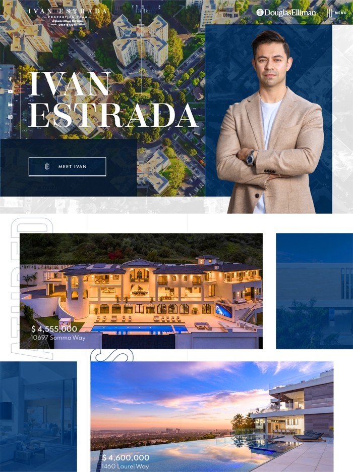
Ivan Estrada
Beverly Hills, CAWith prestigious awards and five-star reviews, Ivan Estrada is an agent at the top of his game. He also knows the importance of investing in a mobile site for clients on-the-go. IvanEstradaProperties.com provides valuable, easy-to-digest content on the mobile screen. With a clean layout and high-resolution images, the mobile site makes contacting Ivan and his team a breeze. With easy navigation and eye-catching design, the site was given a Best Mobile honorable mention on the 2021 RealTrends Website Rankings.
-
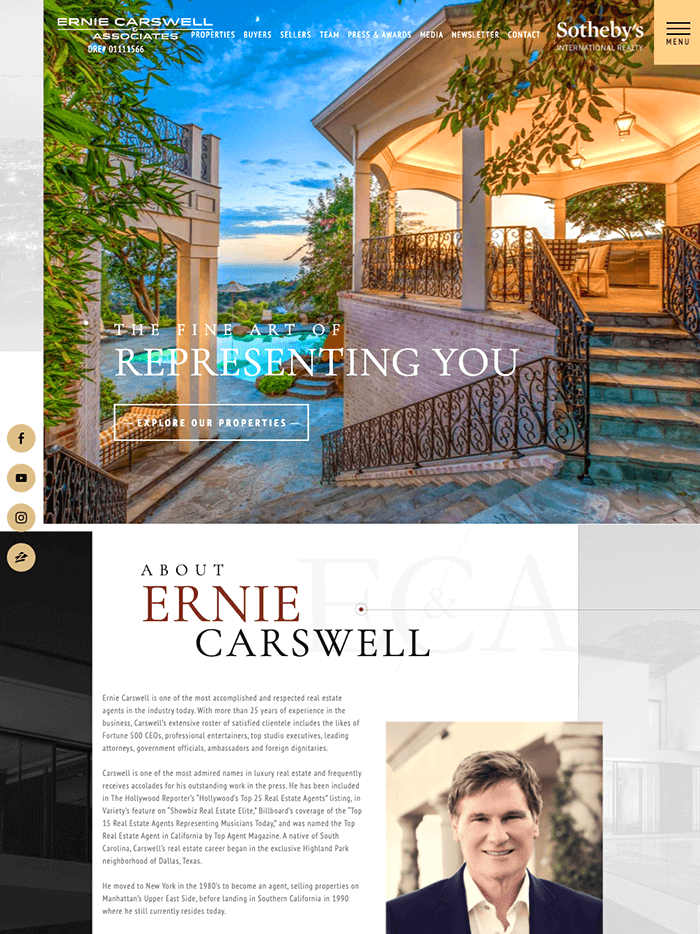
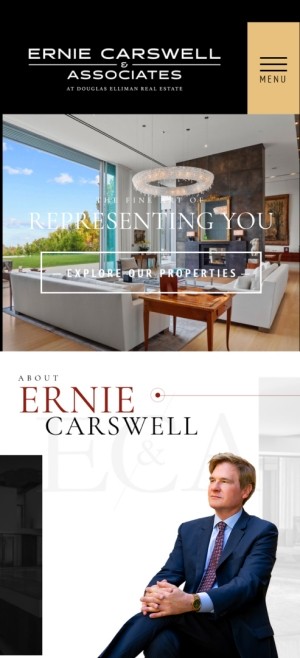
Ernie Carswell & Associates
Beverly Hills, CAErnie Carswell & Associates caters to an elite clientele and its mobile site certainly reflects this. CarswellAndAssociates.com offers smooth navigation from start to finish. The transition from desktop to mobile doesn’t compromise image quality, layout, and design. Users can expect the same experience on mobile, whether they’re browsing or communicating with the company. This website is a goldmine of blog and video content which helped it land the 9th spot for Best Mobile on the 2020 RealTrends Website Rankings, and then again in 2021, leveling up to the top 4th spot.
-
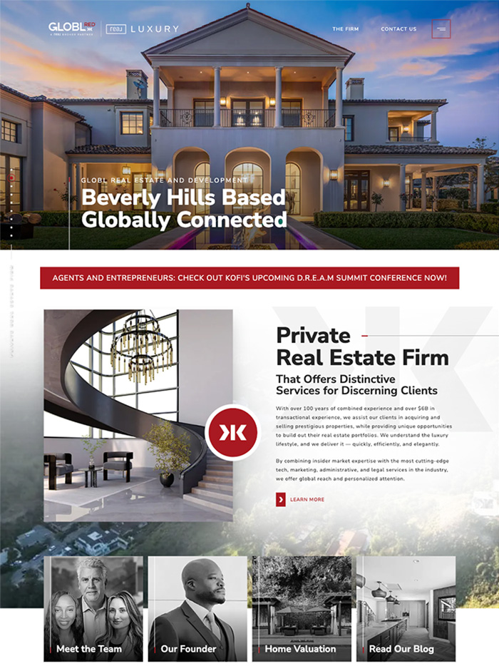
GLOBL RED
Beverly Hills, CAGLOBL RED’s website redefines luxury real estate with its sleek, modern design and responsive functionality. Showcasing extraordinary properties worldwide, the site combines striking visuals, intuitive navigation, and ample white space to create a sophisticated user experience. Designed for effortless accessibility across devices, GLOBL RED sets the standard for innovation and excellence in the global real estate market
-
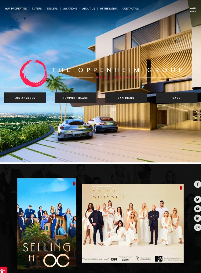
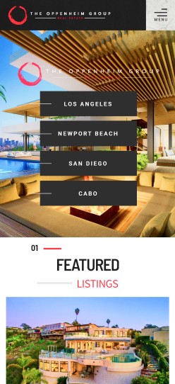
The Oppenheim Group
West Hollywood, CAThe Oppenheim Group’s real estate website exudes a confidently modern vibe that’s evident in its bold, eye-catching design. Of course, the aesthetic stays true to the team’s refined taste, as you can see from the sleek lines and grayscale imagery. The stylized "O" logo resembles a brushstroke, which goes to show that Jason and his team understand that luxury real estate is an art form. Elsewhere, there’s a before and after slider that powerfully demonstrates The Oppenheim Group’s mastery of staging a home to sell.
-
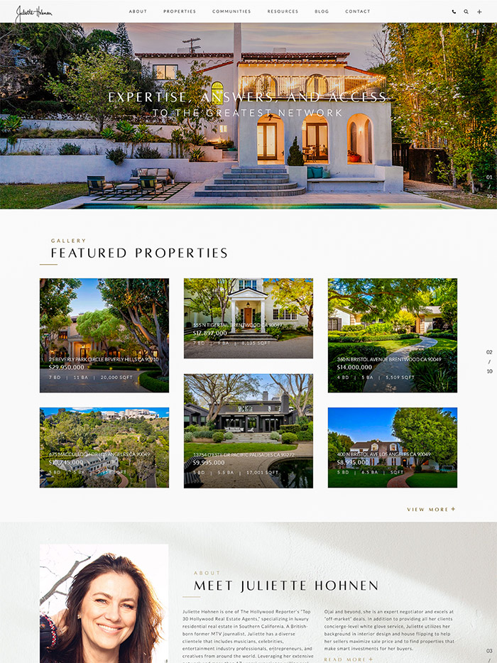
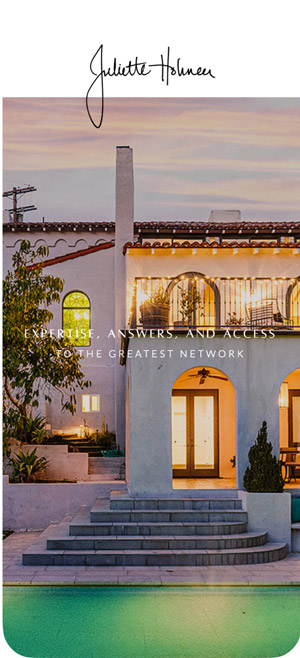
Juliette Hohnen
Los Angeles, CAJulietteHohnen.com captures both expertise and personality. A longtime Beverly Hills agent and former MTV VJ, Juliette’s site stands out for how it represents each community—not just with listings, but with lifestyle-driven visuals. Think Malibu’s coastline, Beverly Hills palms, all color graded for a nostalgic, almost cinematic feel. The design feels curated without being overly polished, giving visitors a sense of place and personality right away. With the tagline “Expertise, Answers, and Access,” the site reflects exactly what Juliette offers: deep market knowledge, direct insight, and a clear sense of what makes LA living so iconic.
-
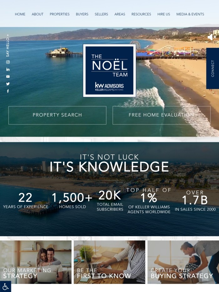
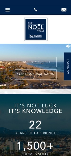
The Noël Team
Santa Monica, CAEver wanted to hold paradise in the palm of your hand? Check out The Noel Team’s breathtaking website from your phone. Ranked sixth among RealTrends’ 10 Best Mobile websites of 2019, TheNoelTeam.net draws you in with crisp, high-definition videos of the vibrant Pacific Palisades lifestyle at the top of the home page. Scroll further down and be mesmerized by animation effects that introduce the site’s various features. Each new page element inspires action as it slides into view, inviting visitors to
explore featured properties, read relevant
real estate resources, and more. Now
that’s smart design. -
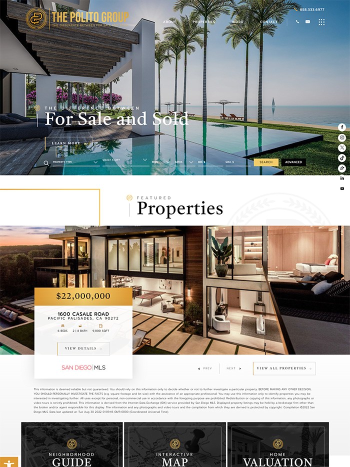
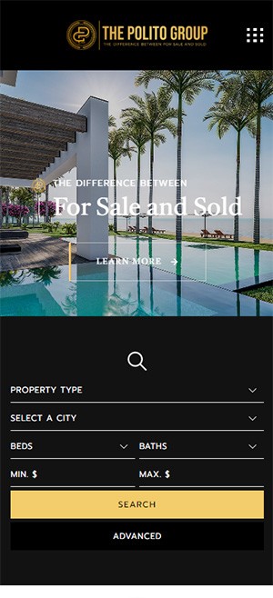
Simon Polito
San Diego, CASimon Polito’s website is a bold expression of innovation and sophistication, seamlessly blending striking design with powerful functionality. Featuring high-impact visuals and effortless navigation, it highlights Simon’s expertise in real estate auctions and exclusive property listings. Optimized for all devices, the site delivers a seamless user experience, reflecting Simon’s commitment to excellence in every interaction.


Websites That Look Amazing EVEN ON THE GO!
Responsive design lets you adapt to a world gone mobile.
Desktop computers and mobile devices couldn’t be more different. But that doesn’t mean you have to develop separate websites for them.
That’s because responsive design allows website elements to resize themselves to suit whatever screen they're being viewed on. The result? Optimal browsing experience – on a laptop, a tablet, or a smartphone!

It’s not magic — but it is coding wizardry!
Auto-resized images. Navigation bars tucked into a collapsible menu. Strategically placed navigation buttons.
These are just some of the ways that responsive design keeps your website looking and functioning perfectly no matter the device.
And the best part? Mobile responsive design is baked into each of our website packages.
See our website packages