World Class Website Design Powerful branding and lead generation
-
RE/MAX Island Real Estate
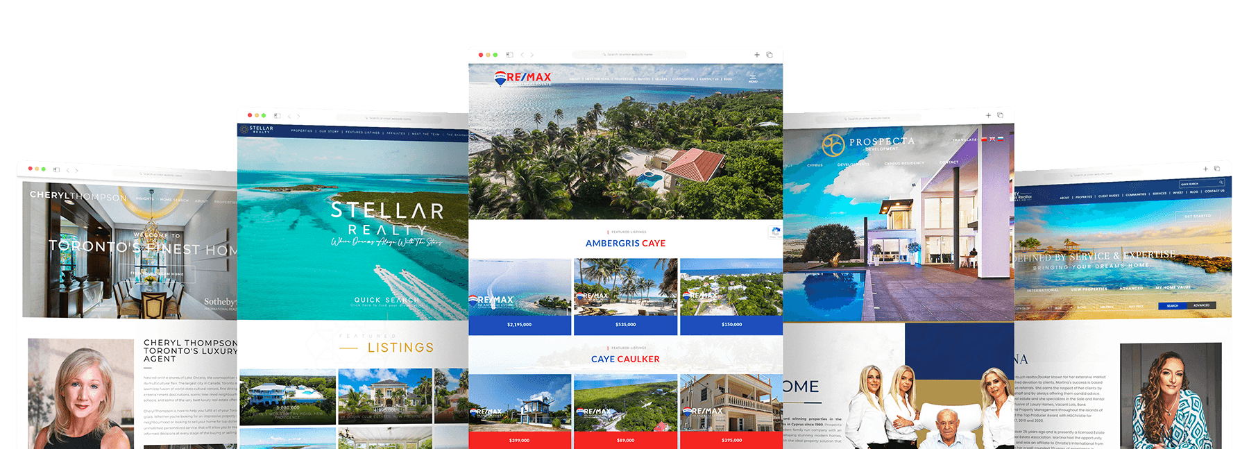
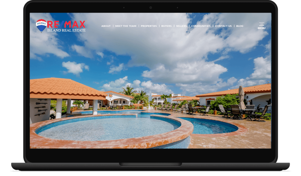
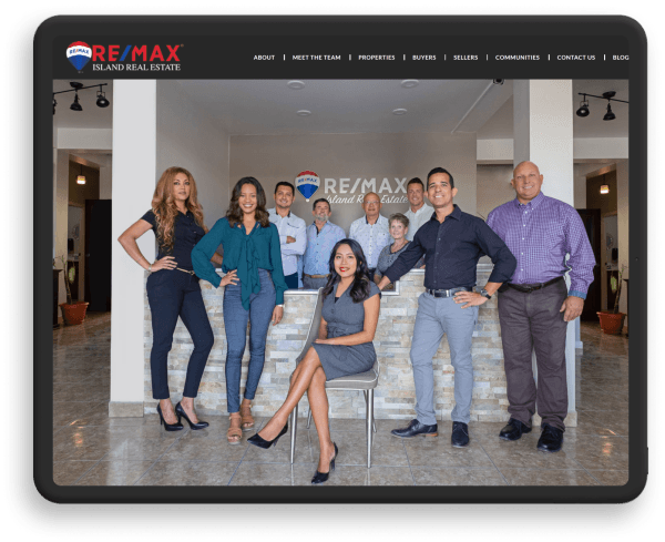
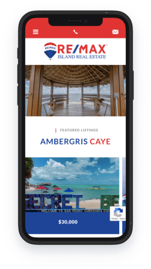
RE/MAX’s instantly recognizable red, white and blue is used to great effect on RE/MAX Island Real Estate’s BelizeRealEstateSearch.com alongside breathtaking images of Belize’s tropical beauty. These, along with resources such as detailed community pages, property listings, guides, and answers to FAQs, work together to highlight the team’s local expertise and international reach.
-
Property Experts
On PropertyExperts.co.uk, a dynamic homepage video introducing the Property Experts team and their area of expertise (London and the Home Counties) immediately captures one’s attention. The overall impression of exceptional professionalism that it conveys is underscored by the site’s smooth animation effects, intuitive layout, and sophisticated colour scheme of green and gold balanced with black and white.
-
Casa Solutions
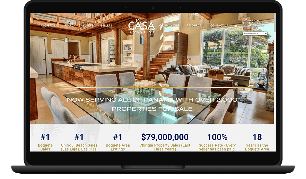
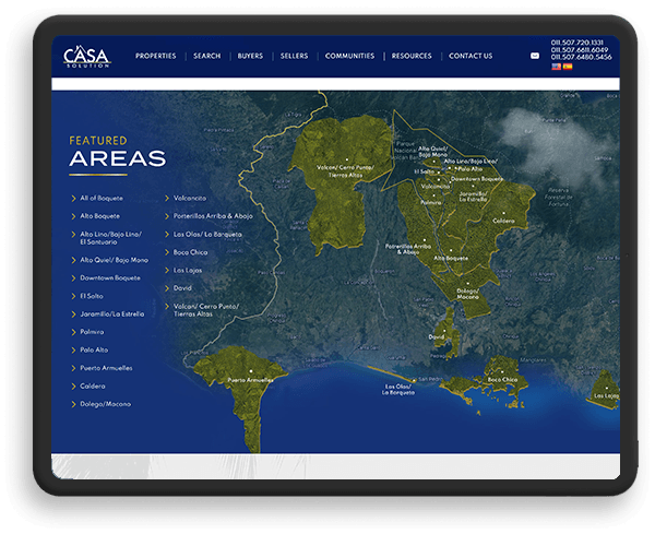
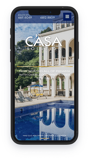
This real estate website serves as a portal to the Panamanian dream, capturing the country's exotic beauty and luxurious lifestyle. The color scheme, reminiscent of turquoise waters and sun-kissed sands, evokes a sense of luxury and tranquility. Featured communities are showcased like idyllic vacation destinations, highlighting the breathtaking scenery that awaits potential residents.
-
Copperstones Properties
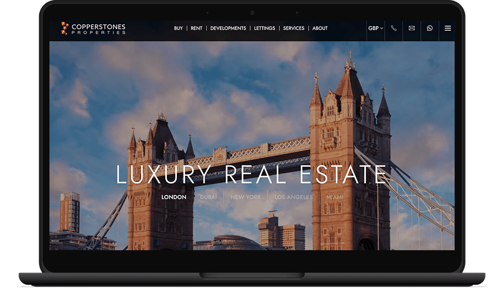
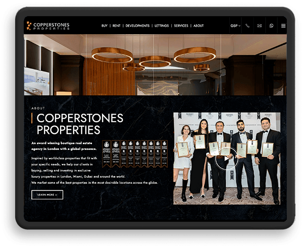
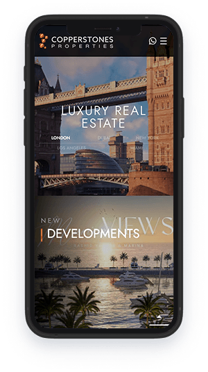
Copperstones Properties’ global reach demanded a real estate website as sophisticated and dynamic as their portfolio. We crafted a digital space that mirrors their international prestige. A sleek black-and-white canvas, accented with the signature copper hue, creates an atmosphere of luxury and refinement. The homepage is a dynamic showcase of their properties, with a video montage highlighting their expertise in high-end markets and an interactive banner that effortlessly transports visitors to different global destinations. The website’s clean lines, animated elements, and prominent awards section perfectly reflect Copperstones Properties’ forward-thinking approach to real estate.
-
Bahamas Realtor
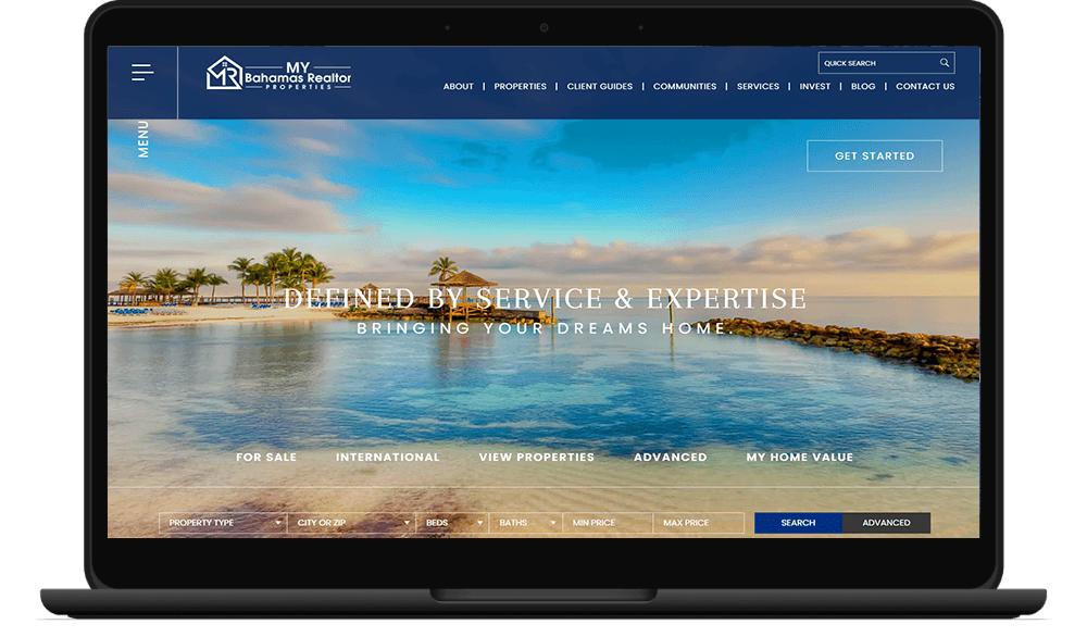
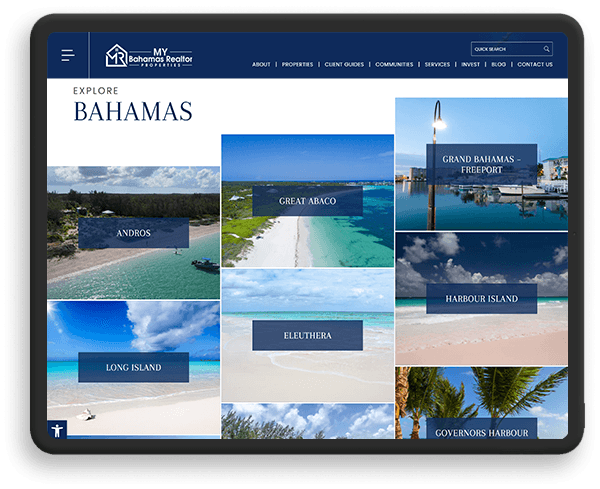
Thoughtful service is at the heart of Martina Reichardt’s success. So it was only proper that her website exhibits the same care and attention that she lavishes on clients. Notice the property search function integrated into the banner or the “Client Guides” section — features that make finding a home in the Bahamas a breeze. Visitors can also get a valuation for their current house or reach out to real estate lawyers. Great care was paid to the design of the site, too. Its regal blue palette is both an homage to the sea and a nod to luxury, two things that buyers will enjoy in this island getaway. Featured listings and communities are arranged like postcards, highlighting their scenic location.
-
Seahorse Realty
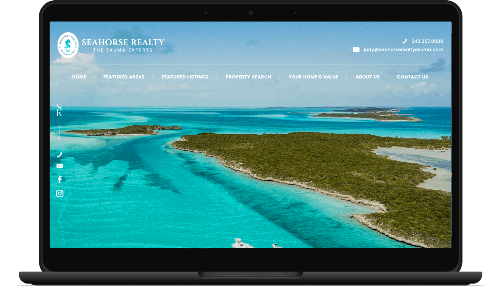
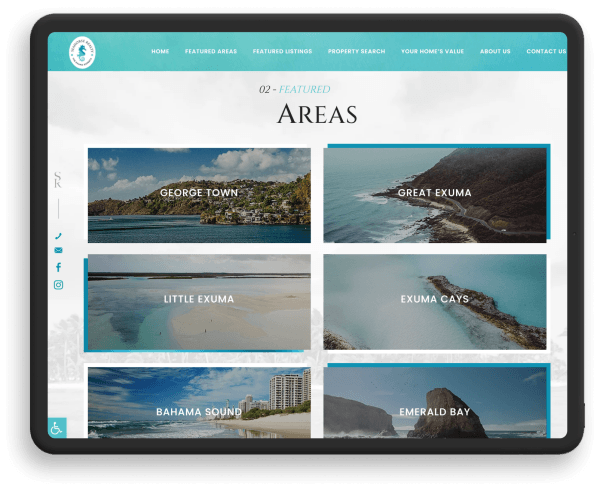
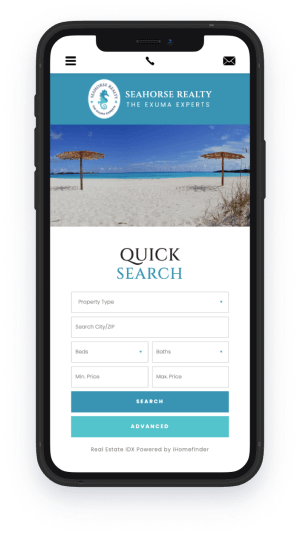
Exuma and stunning beaches go hand in hand, which is why SeahorseRealtyExuma.com prominently features stunning shores on its banner. Naturally, we went for a blue-and-white color palette to reflect the breezy lifestyle that defines this island paradise. Featured areas, highlighted listings, and advanced property search filters also make finding your dream home a cinch.
-
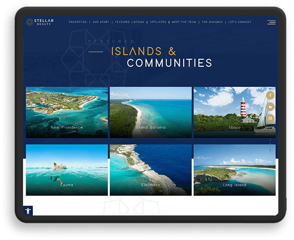
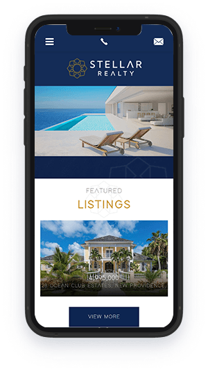
Stellar Realty
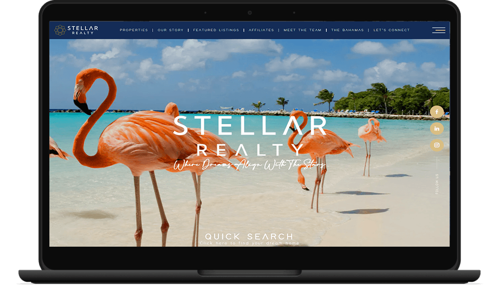
Visiting StellarRealty.net is like being whisked away to an island paradise. Stunning seaside vistas, flamingos frolicking in the sand, coconut trees swaying in the wind — the banner section alone is a preview of the lifestyle that awaits you in The Bahamas. The picture-perfect featured listings are arranged in an Instagram-like grid, as are the spotlighted island communities. Blue and gold hues connote luxury and prestige, while the team’s logo is tastefully integrated throughout the site. Want more details about The Bahamas? This website also has a dedicated portal that answers all your questions.
-
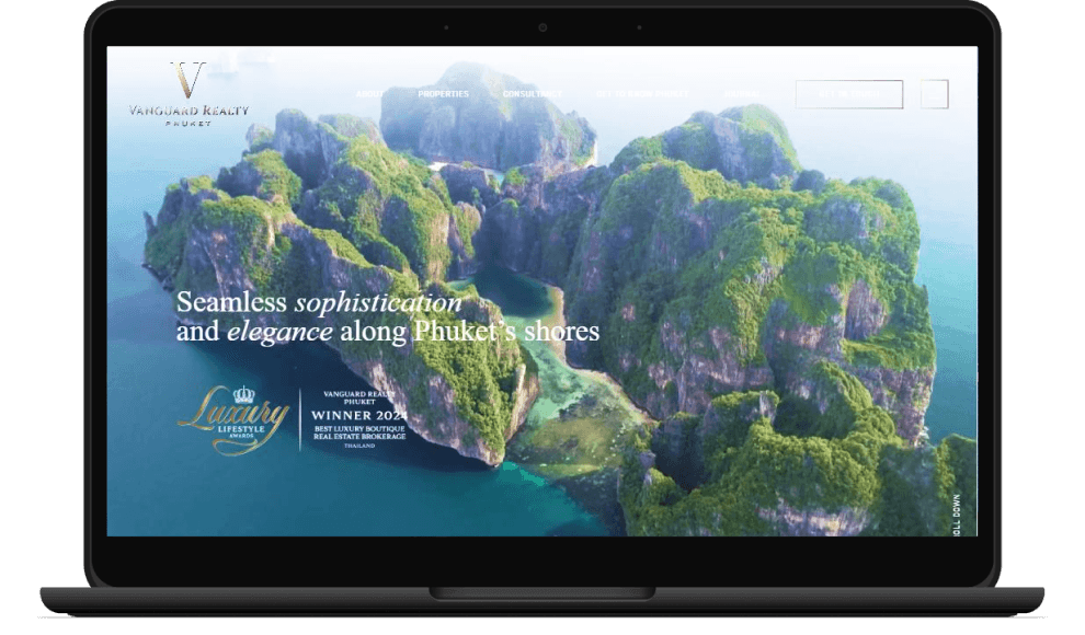
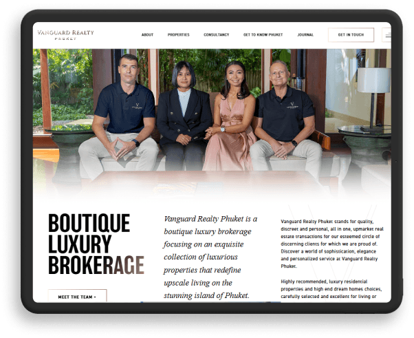
Vanguard Realty Phuket
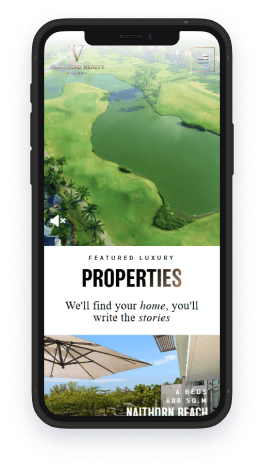
Vibrancy and vision — two words that perfectly capture the essence of Phuket, Thailand. They also define VanguardRealtyPhuket.com, as your ultimate gateway to luxurious properties on this tropical paradise. Awash in ocean blue, pristine white, and sandy beige shades, this website encapsulates the allure of island living. Subtle animations and dynamic scrolling effects bring a sense of modern sophistication, mirroring Vanguard Realty Phuket’s commitment to curating exceptional homes in one of Southeast Asia’s most sought-after destinations.
-
Cheryl Thompson
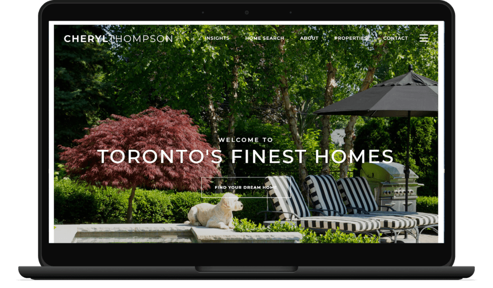
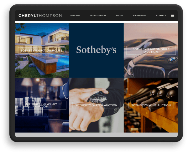
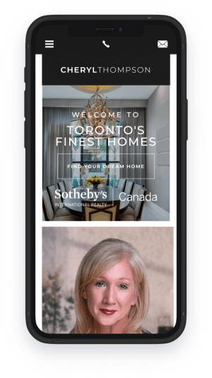
With its crisp and elegant style, TorontosFinestHomes.com is a joy to navigate. The classic black and white color scheme makes
it easy to focus on the key sections of the website, including Featured Listings, Neighborhoods, and a Video of the Month, among others. The site makes sure it contains all the helpful features and local real estate information visitors need so they won’t have to search elsewhere for material related to Toronto luxury real estate. What really makes Cheryl’s site so exceptional is the
seamless flow within and between web pages, thanks to its contemporary design. -
Red Frog Beach
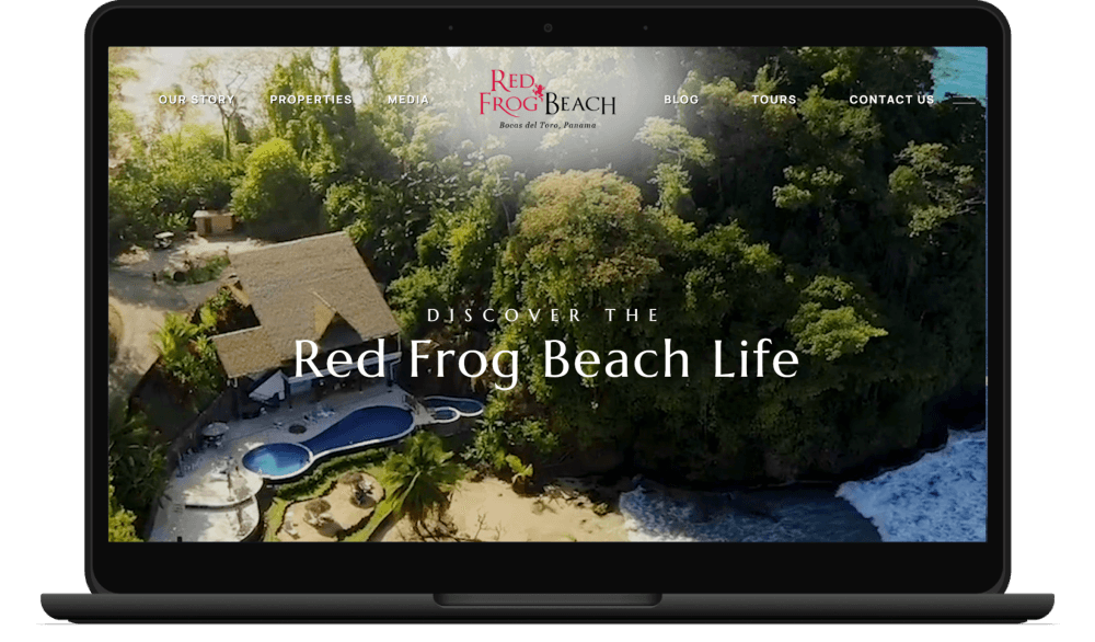
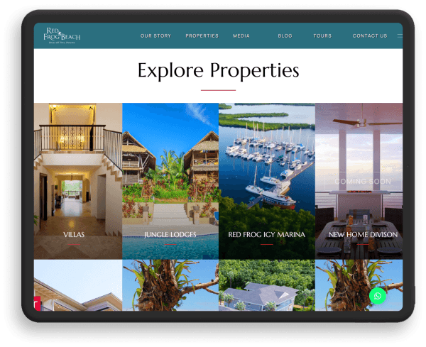
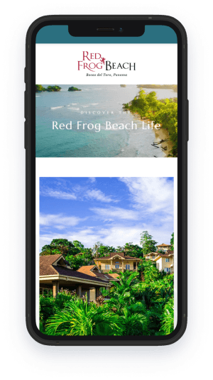
To visit RedFrogProperty.com is to be whisked away to the scenic shores of Bocas del Toro in Panama. The full-screen banner video serves as a preview of the lush tropical forests, pristine beaches, and stunning homes that await you in this island paradise. A section on green initiatives clearly communicates Red Frog Beach’s dedication to nature conservation as well. All in all, this website serves as the premier source of information for resort-like living in Panama.


