Powerful Branding Built To Stand Out
-
Yawar Charlie
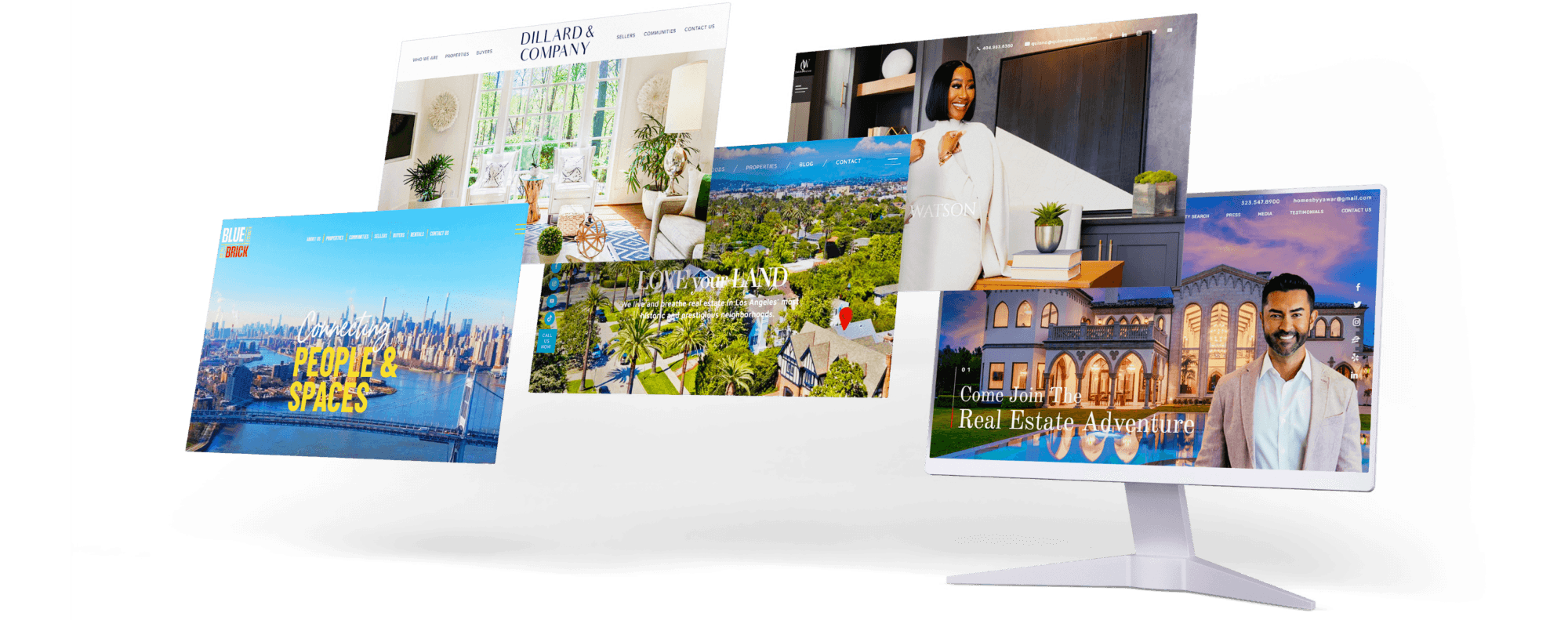
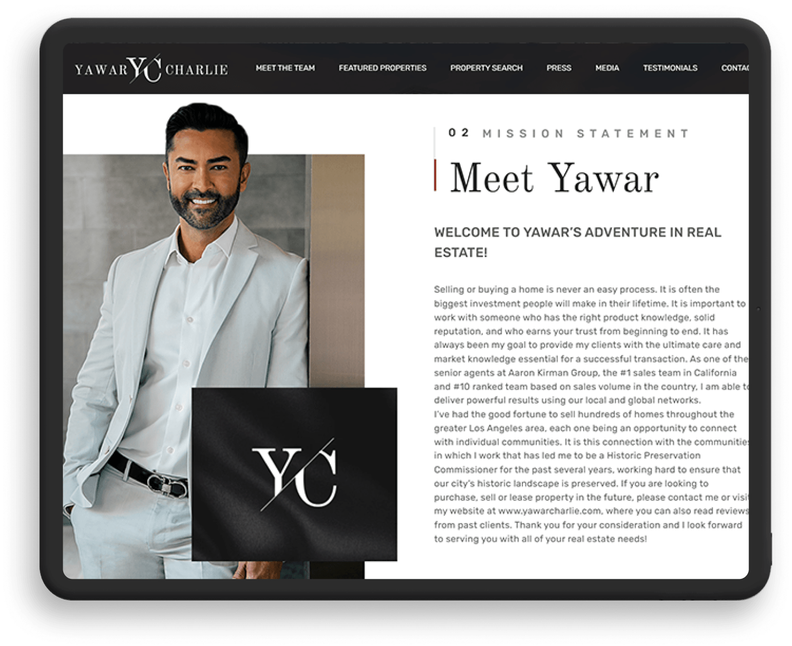
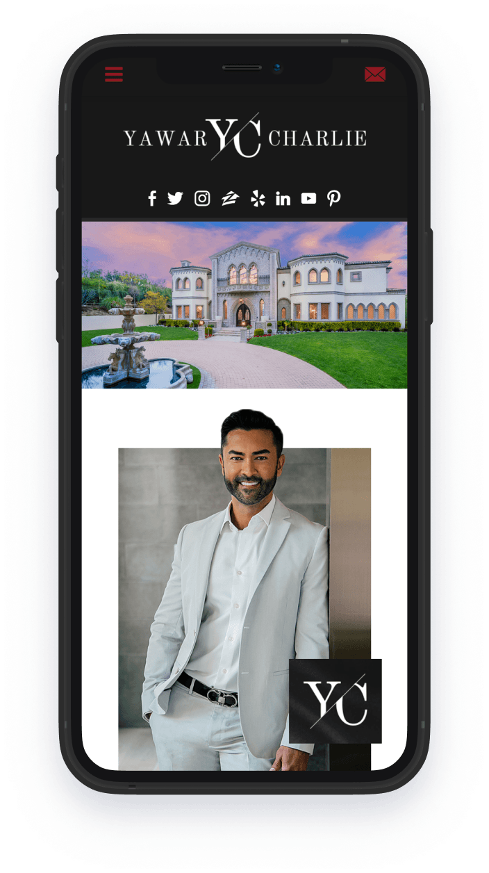
Los Angeles, CAThis realtor site perfectly captures Yawar Charlie’s personality: suave, confident, and refined — the same qualities that landed him on the hit show “Listing Impossible.” Clever touches, like the column of social buttons and animated visual elements, hint at the thoughtful service clients can expect from him. Likewise, the content is neatly organized, ensuring that everything a visitor needs is but a few clicks and scrolls away.
-
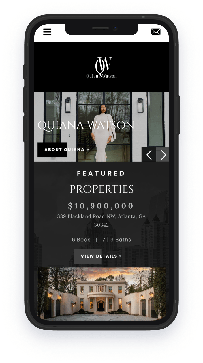
Quiana Watson
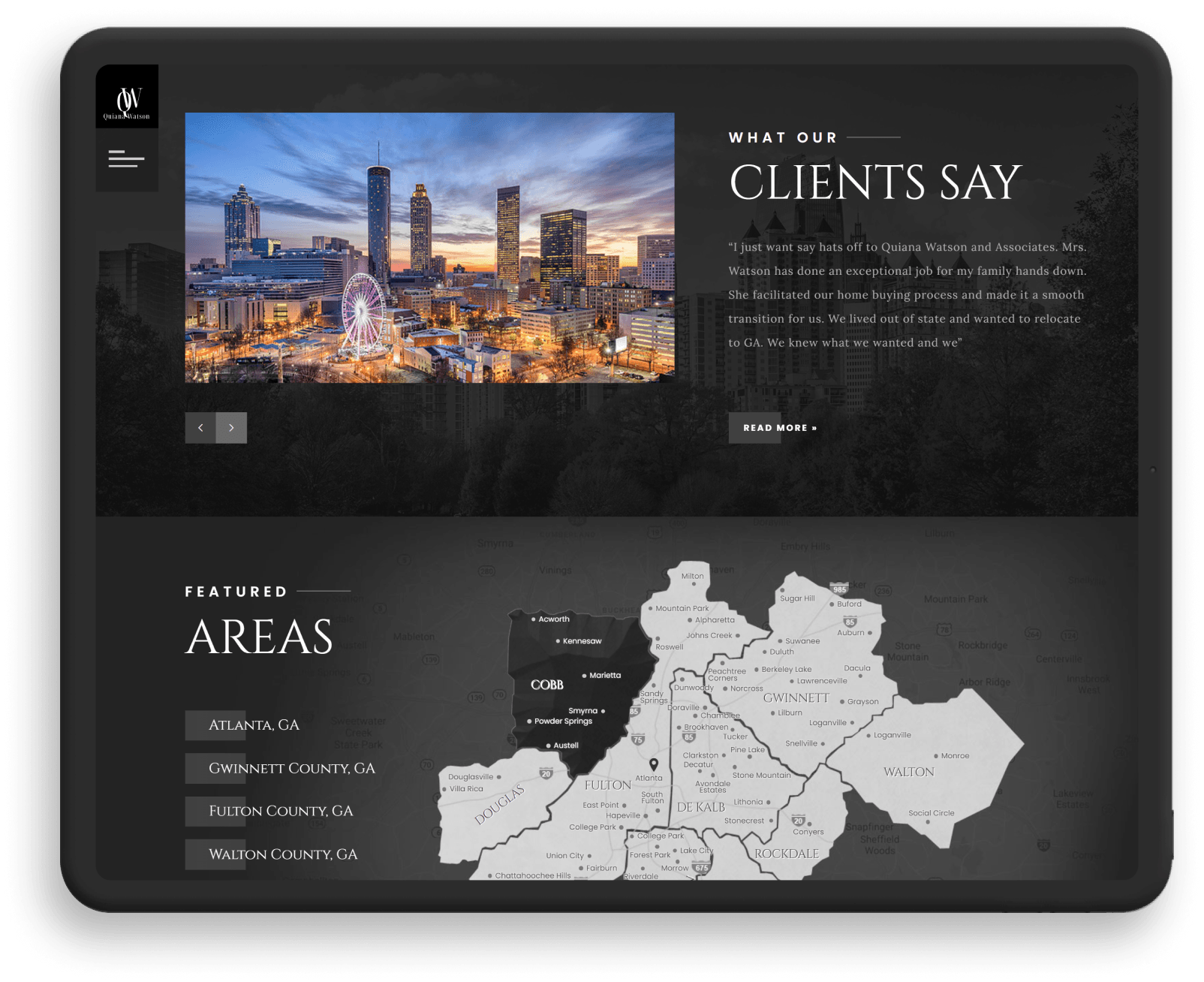
Atlanta, GAQuiana Watson’s beautifully designed site gives us a slice of life through heartwarming photos of families and home interiors. It also gives us a closer look at Quiana Watson, MBA, who ranks among the National Association of Realtors’ top 2% producing agents. A restrained black and white palette gives the site an upscale feel in line with the luxury properties on offer.
-
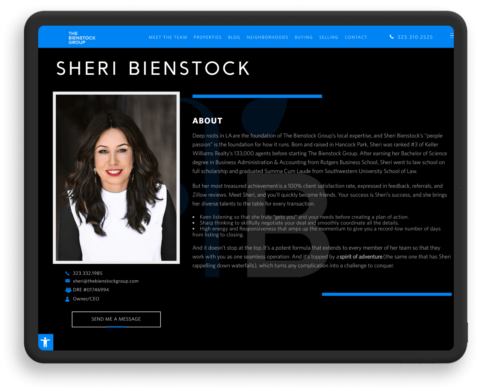
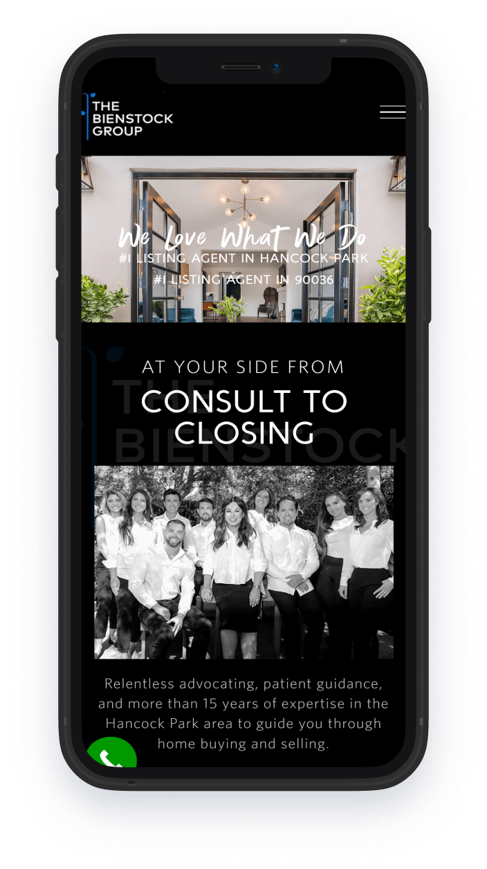
The Bienstock Group
Los Angeles, CATheBienstockGroup.com is a case study in interesting contrasts. Its black-and-blue palette is inspired by both the deluxe homes the team represents and the signature clear skies of Los Angeles. The design is markedly modern, but the site communicates its dedication to good, old-fashioned customer service.
-
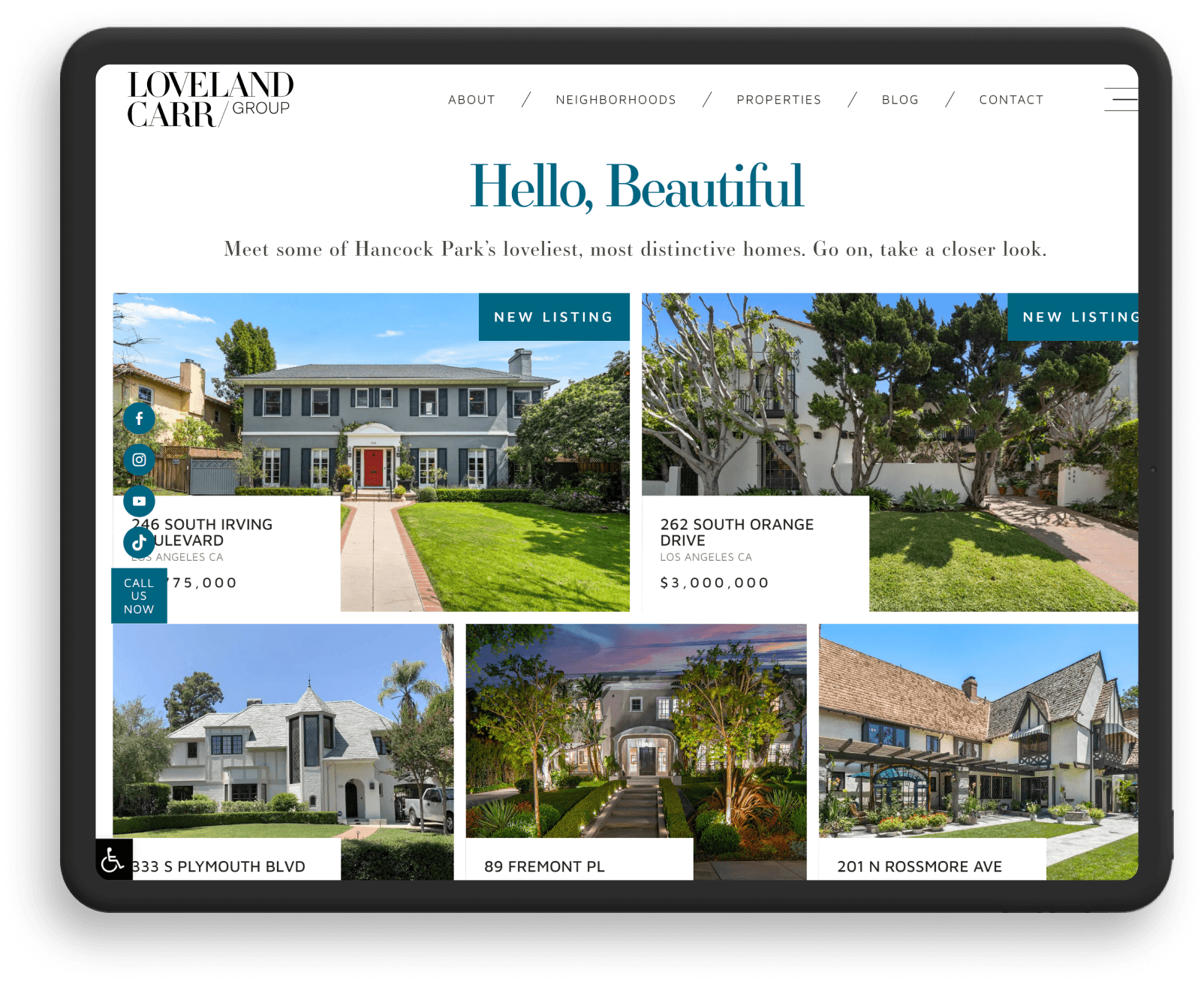
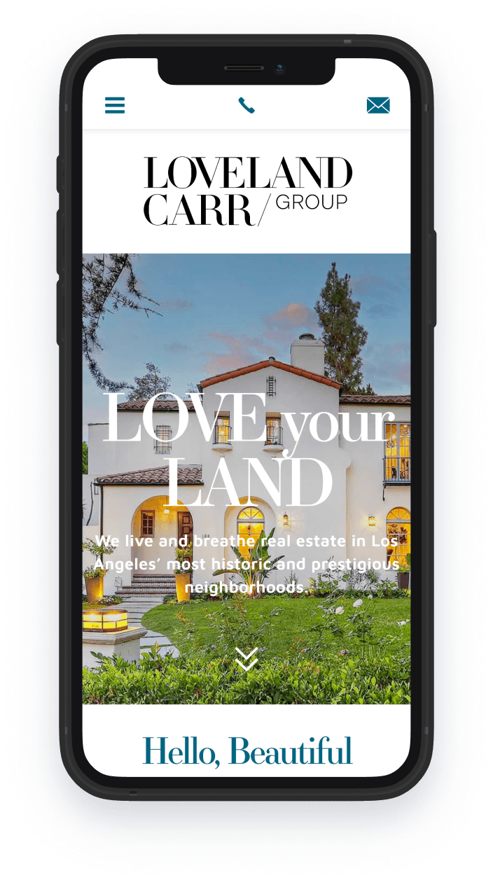
Loveland Carr Group
Los Angeles, CAAs a team that specializes in historic neighborhoods, Loveland Carr needed a website that reflected its impressive pedigree. That’s why our design features a contemporary look inspired by glossy real estate magazines. Generous white space, high-definition photos, and an elegant blue color scheme lend this website even more elegance.
-
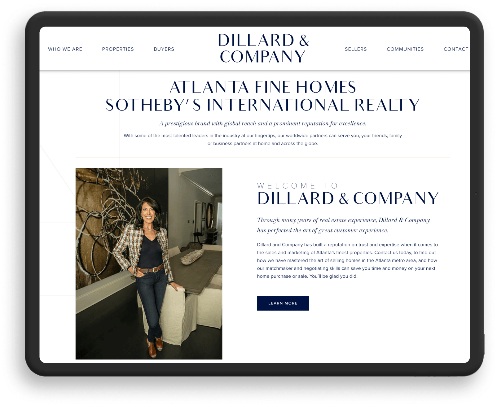
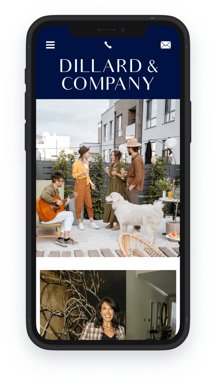
Dillard and Company
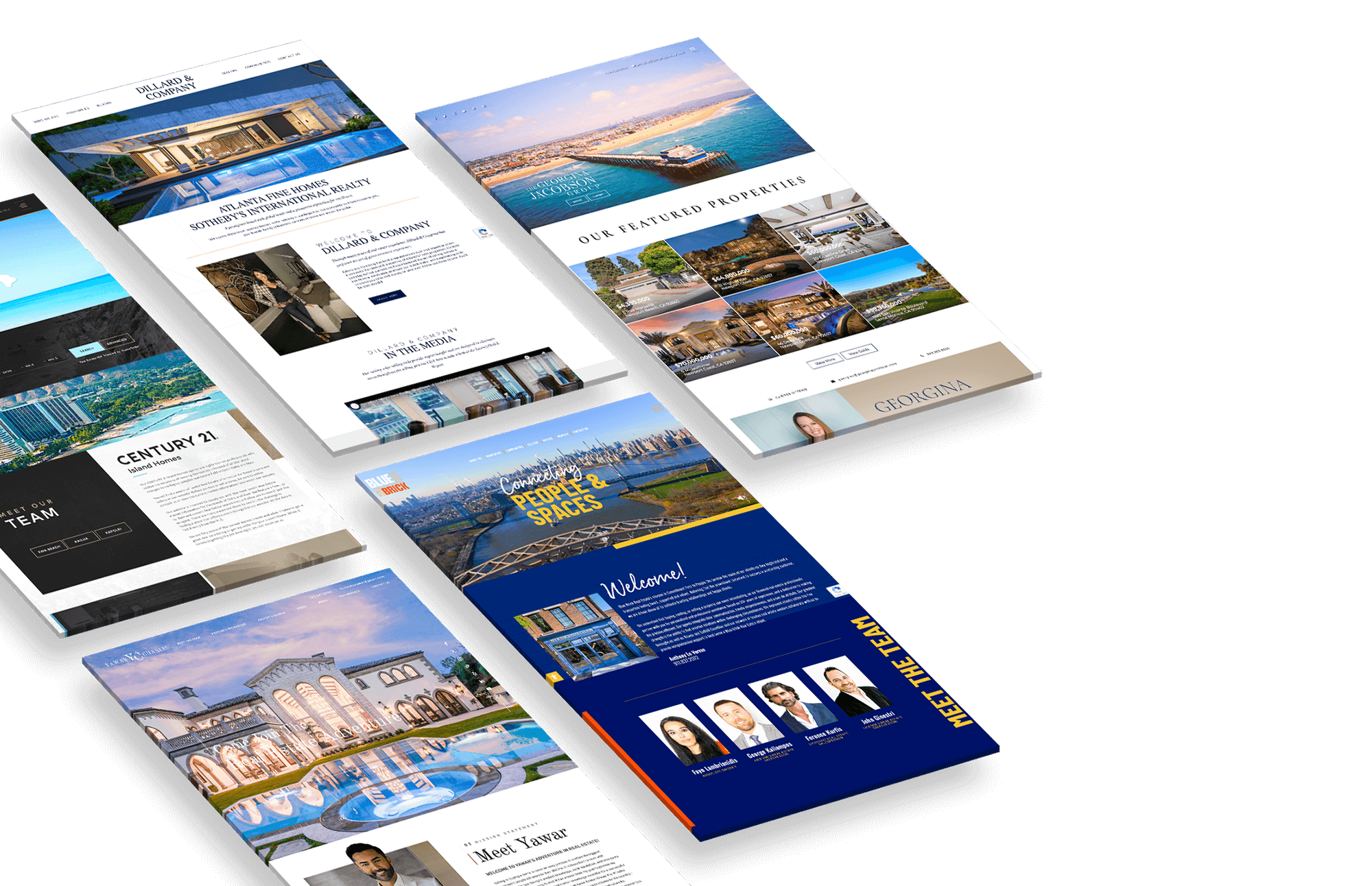
Atlanta, GAA luxury home is a lifestyle choice as much as it is an investment. Fittingly, Dillard & Company’s website has the look and feel of a lifestyle site, showcasing not just ultra-deluxe properties but the good life that comes with it. The stark white color palette is tempered by subtle gilded elements and geometric shapes that add visual appeal.
-
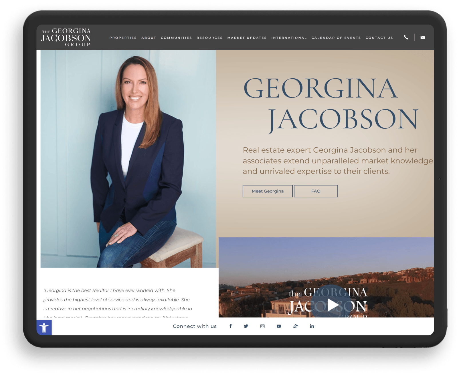
Georgina Jacobson
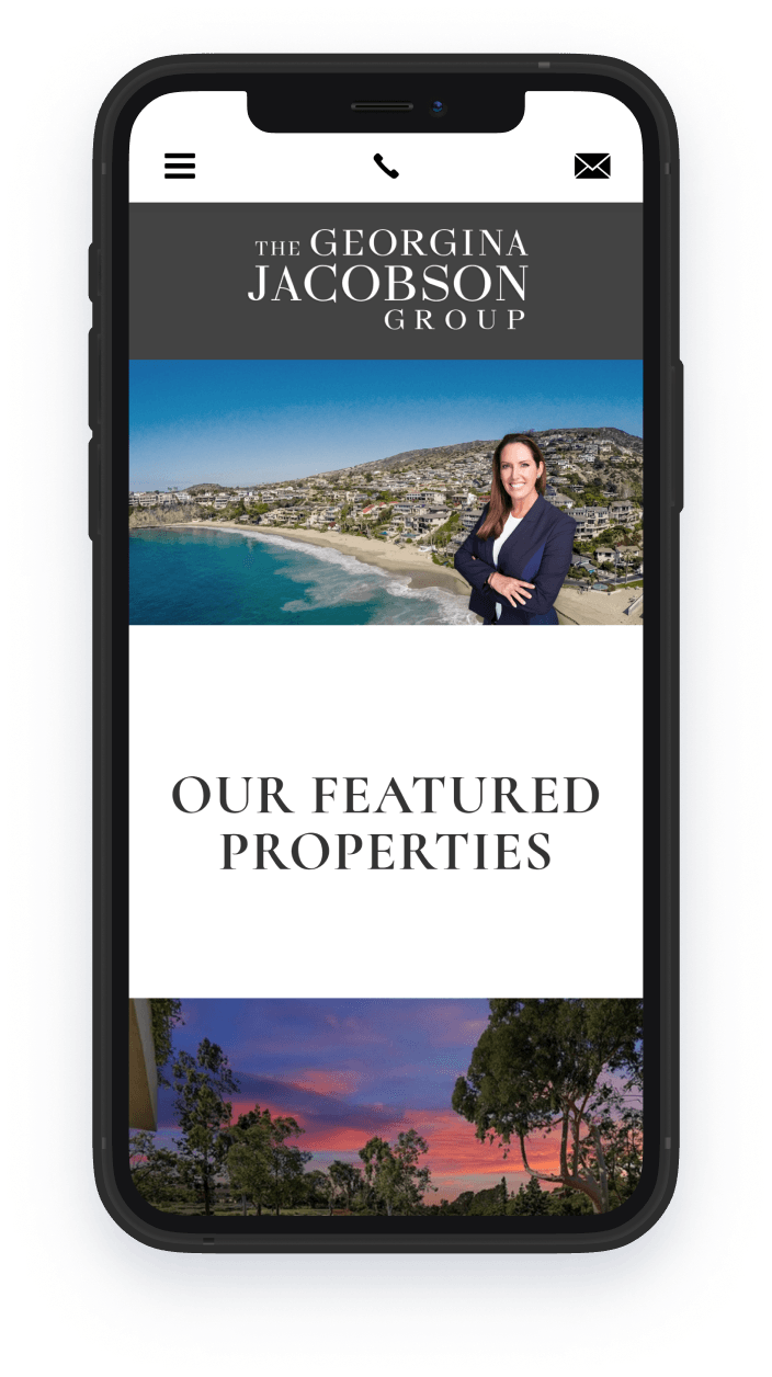
Los Angeles, CaliforniaGeorgina Jacobson is all about the properties, so we made sure to reflect this on her website. We chose a classic color palette so the spotlight is firmly on the luxury estates she represents. A neat feature is the Property Organizer, which makes it easy to save all your saved searches for easier reference.
-
Blue Brick Real Estate
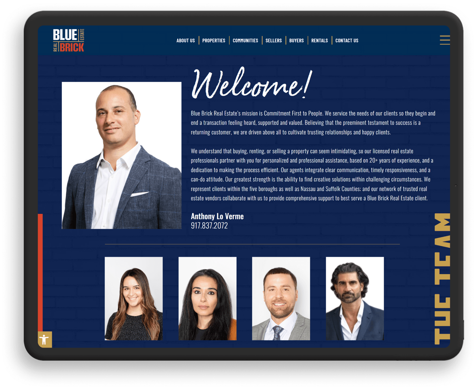
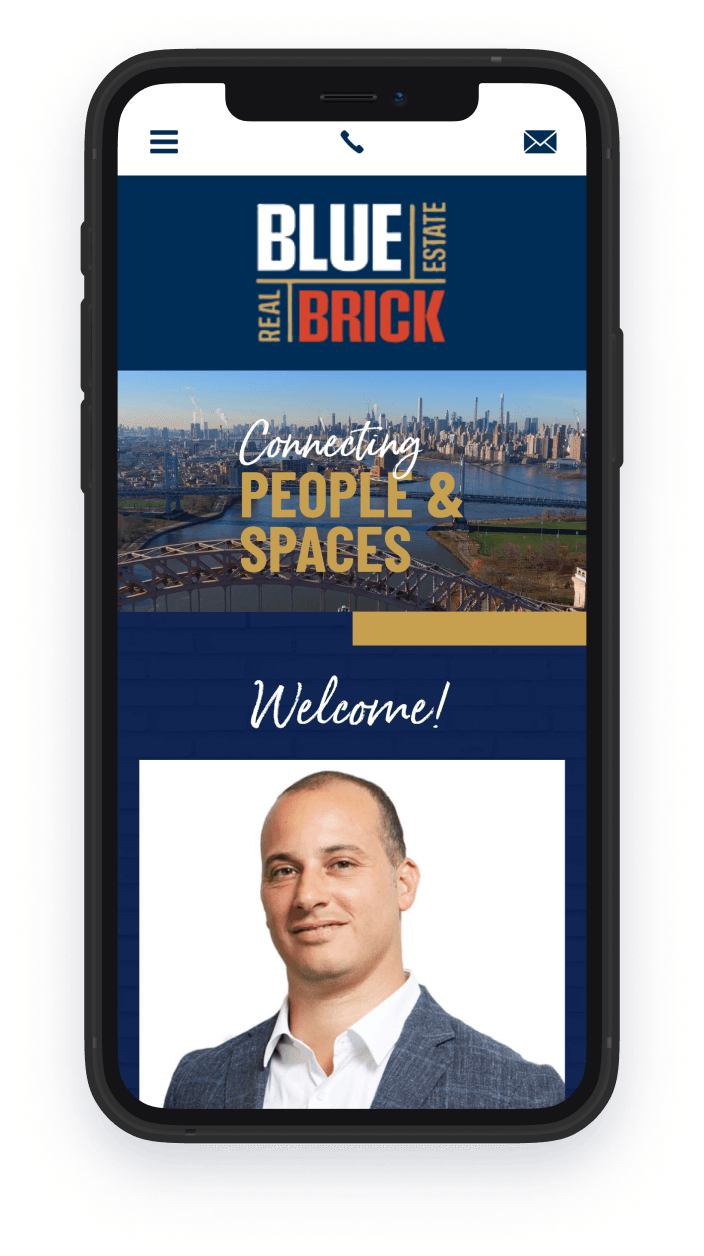
Roslyn Heights, NYBlue Brick Real Estate’s standout feature is its adherence to flat design, which creates a clean and sleek aesthetic. Another feature worth noting is its interesting use of blue and gold, two colors that denote prestige and class. True to the team’s name, we incorporated a brick-like texture to lend the site an old-fashioned charm – a nice counterbalance to the flat design style.
-
Bella Estates
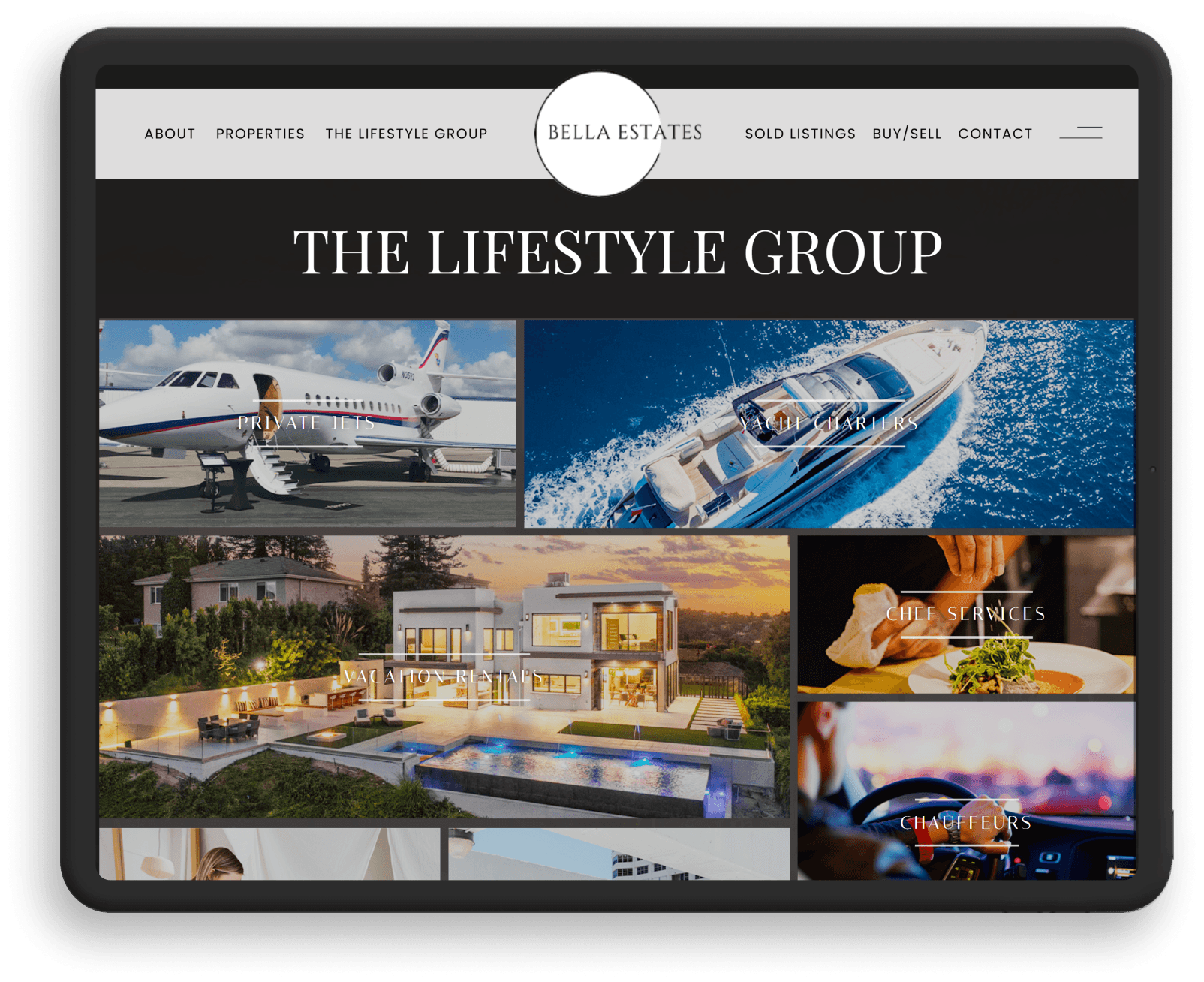
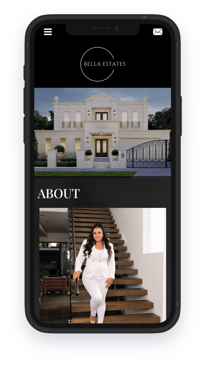
Los Angeles, CALia Vasdekis, Broker and CEO of Bella Estates, brings 20 years of luxury real estate expertise to her clients, including entertainers and athletes. The Bella Estates website exudes elegance with a bold black-and-white palette, seamlessly guiding visitors through intuitive property searches and showcasing elite lifestyle services like yacht charters and chef arrangements.
-
Century 21 Island Homes
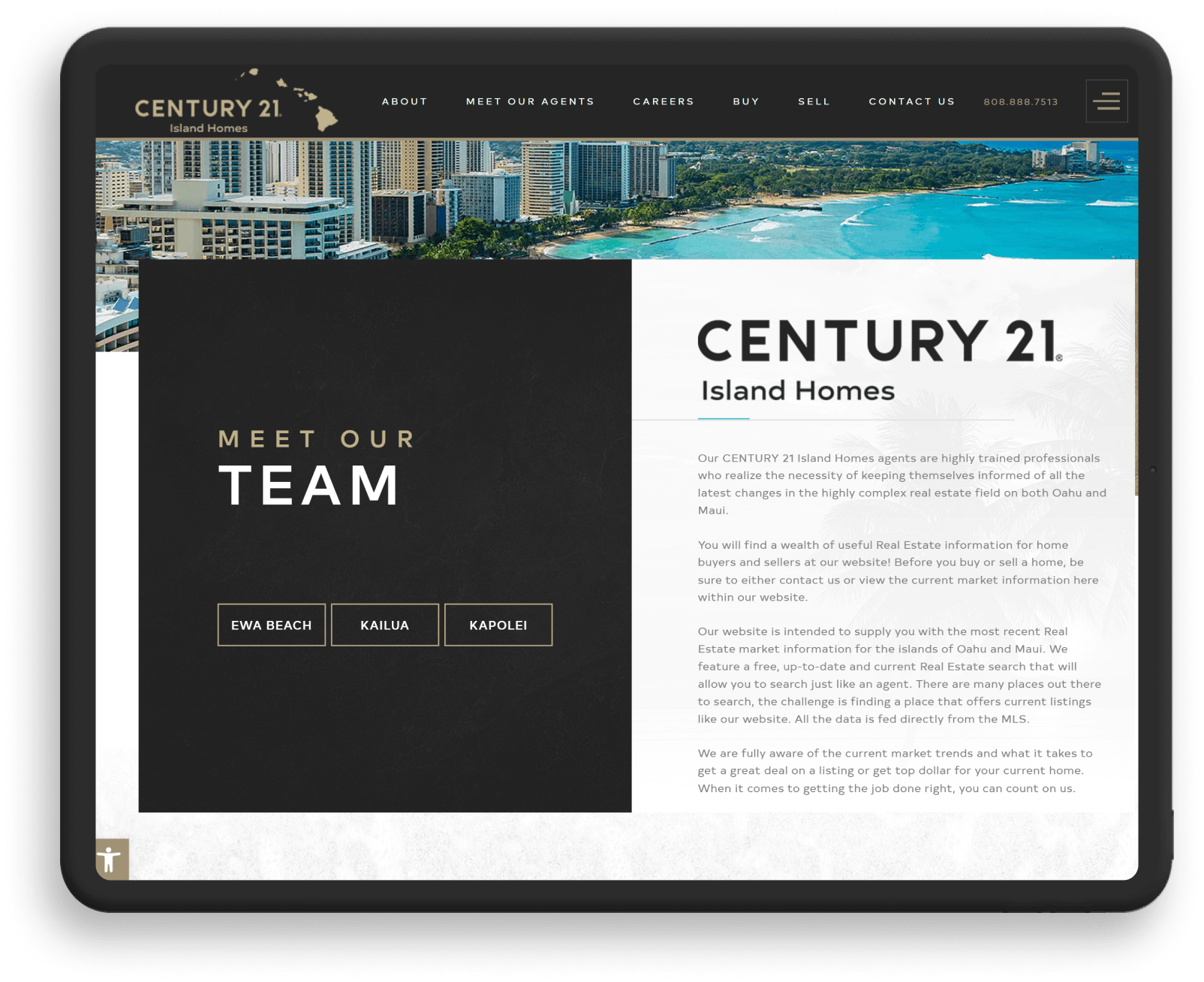
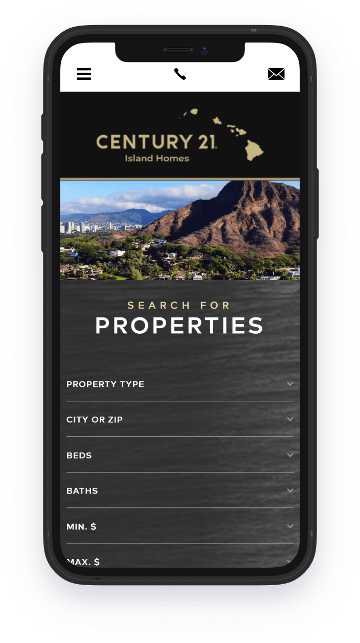
Ewa Beach & Kailua, HICentury21IslandHomes.com is the little black book of Hawaii luxury real estate. Dark tones and textured elements give the site a prestigious look, which is further heightened by the black-and-white photography. The site also pays homage to the beauty of Hawaii through the cinematic banner video, scenic background images, and postcard-perfect snapshots of island life.
-
No Limits Realty
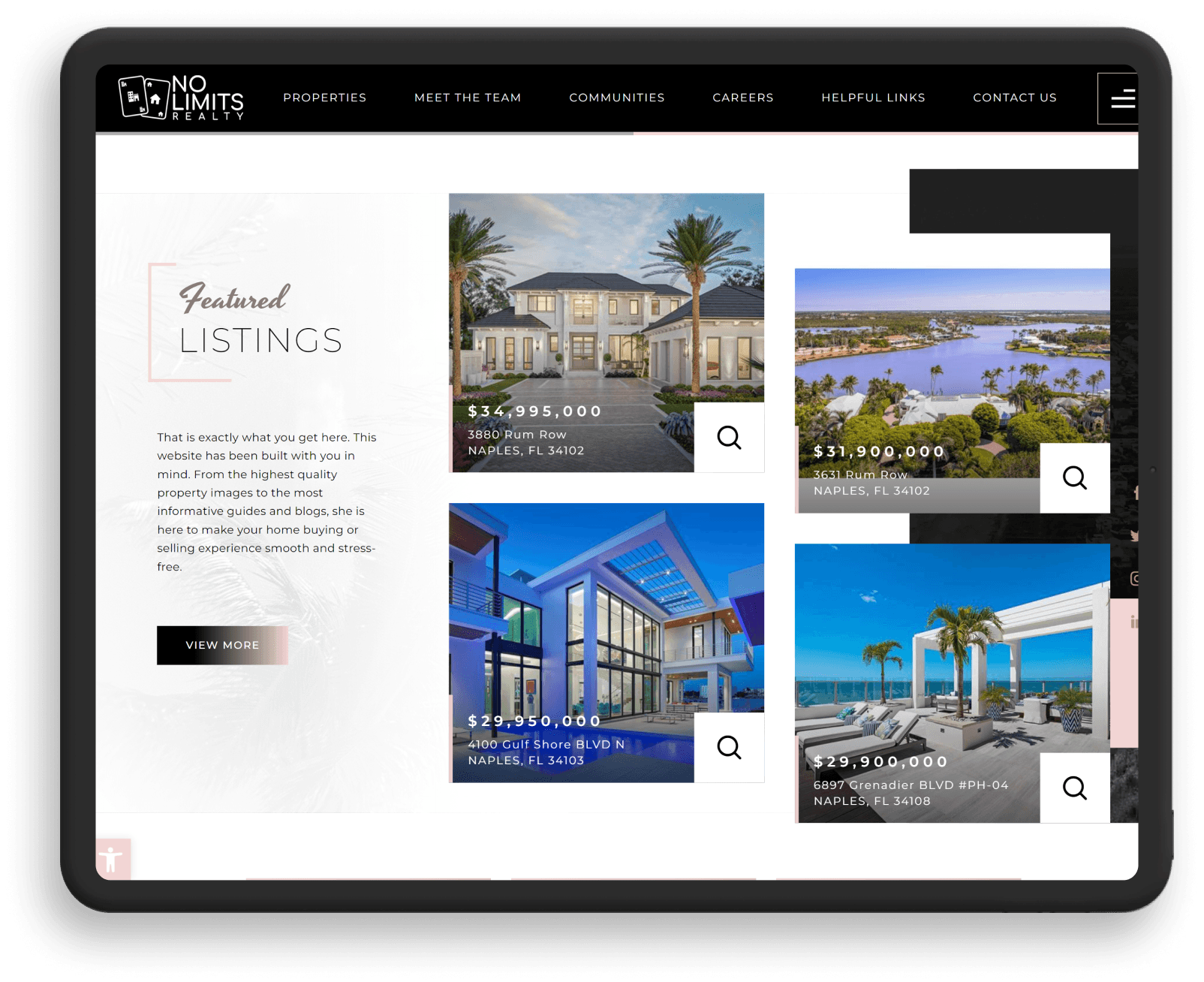
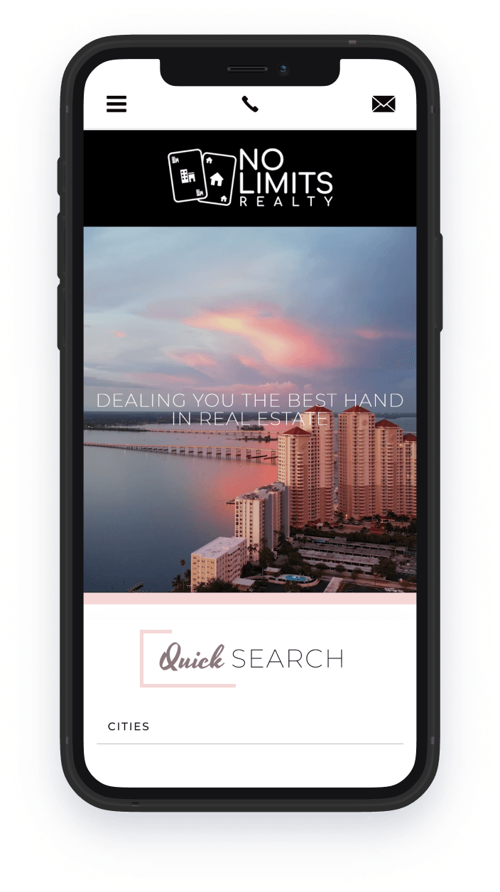
Fort Myers, FLFort Myers is known for its scenic beachside vistas and we put this front and center on No Limits Realty’s website. The champagne tone that graces the site is definitely worth toasting to as it lends a subtle yet impactful touch of sophistication. A cluttered layout was a no-no for this client, so we made sure to strip the design of extraneous elements so the layout flows like fine wine.


Semi-Custom Real Estate Websites Our Most Popular Website Ever
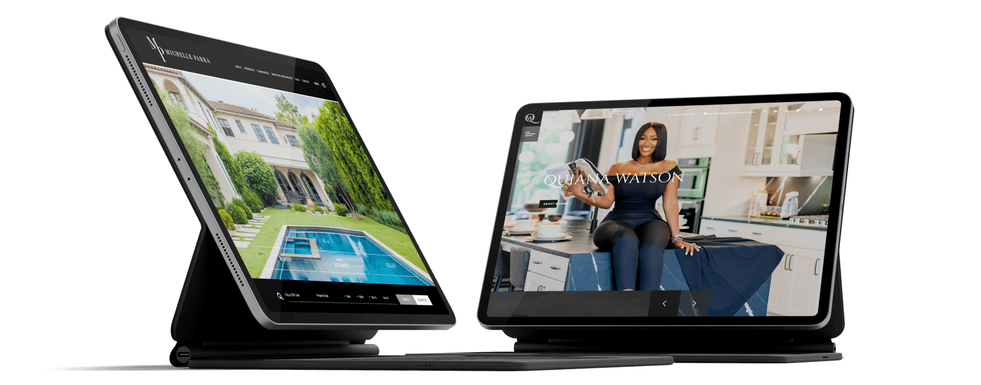
Agents and brokers just love our hybrid real estate websites! Enforce your online branding with a website that represents you and your professional style.
Best for
- A professional who wants more freedom to create a unique home and inner page designed to create a point of difference from market competitors.
Highlights
- Custom Home Page
- IDX Compatible
- Fully Responsive So Users Can View On Multiple Screen Sizes
Custom Built For Agent Branding
Our Semi-Custom websites are conceptualized by our experienced team of Art Directors and Web Designers. We can help bring your ideas to life while crafting a one-of-a-kind design that no template website can rival.
Learn About Our ProcessReady to rebrand your agent website? Chat with a Web Marketing Strategist.


