Top 10 Most Requested Real Estate Website Features
What do the best real estate websites have in common? A full stack of must-have web design elements! Check out this list of website features our clients– both returning and new– just can't get enough of. You might want to include them in your own real estate website, too.
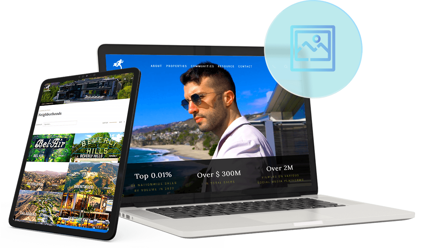
Photos With Personality
In an ever-changing real estate market, dynamic service is a must. Chase Rogers’ real estate agent website reflects the go-getter attitude that has made him one of the most sought-after realtors in Los Angeles.
This is evident from the moment you open his website, thanks to a banner video composed of fast cuts. Tasteful animations are also used to add further dynamism to the website, such as in the auto-scrolling featured properties gallery. There’s also an interactive map to make the home search process a more engaging experience.
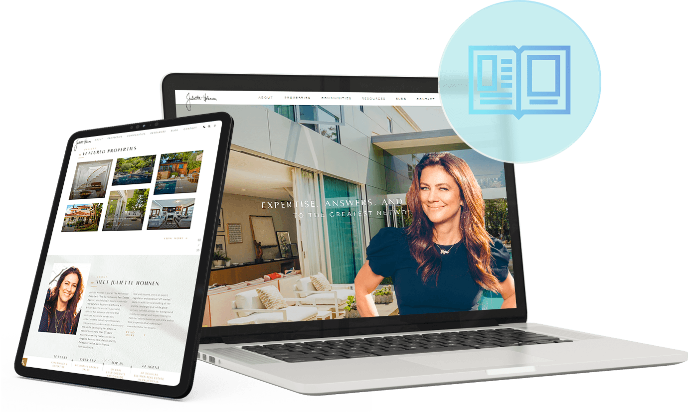
Elegantly Displayed Featured Properties
When designing a real estate agent website, how you present listings is of utter importance. After all, most people visit your website to look specifically for available properties. How you present listings is a delicate balancing act, however: how can you display as many listings as possible without depriving the properties of the spotlight they deserve?
Juliette’s website has an elegant solution to this problem. Featured properties are displayed like picturesque postcards; interact with any of them and you get a zoomed-in version of that listing plus the option to get more details. This means that the Featured Properties section is information-dense without being cluttered.
Layers
& Cutouts
With custom real estate websites, sky is almost the limit in terms of things you can do. You tell us what you want to see in your site, and our design team will do their best to make it happen. If you want creative design elements such as layers and cutouts, trust that we will make it work. That's what Kofi Nartey did.
Overall, Kofi wanted a layered look for his company's website to keep things dynamic and visually appealing. Some of the features incorporated include a custom K cutout that is prominently displayed, layered on top of the hero banner. Another way we achieved that layered look is through the use of dual-tone typography for the headers.
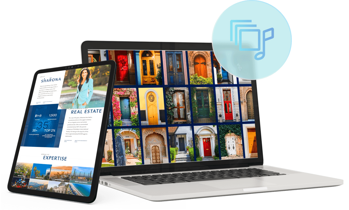
Eye-Catching Animation & Music
If pictures can paint a thousand words, animation and music can probably convey twice or even thrice as many. Both of these design elements add tons of excitement to custom real estate websites. Moreover, they can set the tone not only for your website, but for your website as well.
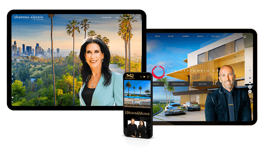
Take a leaf out of Sharona Alperin's website. My Sharona by The Knack, which was inspired by her, can be played in the background through the website's audio plug-in. But before that, visitors are treated to a short but effective animation that ends with Sharona's tagline: "We open doors for you."
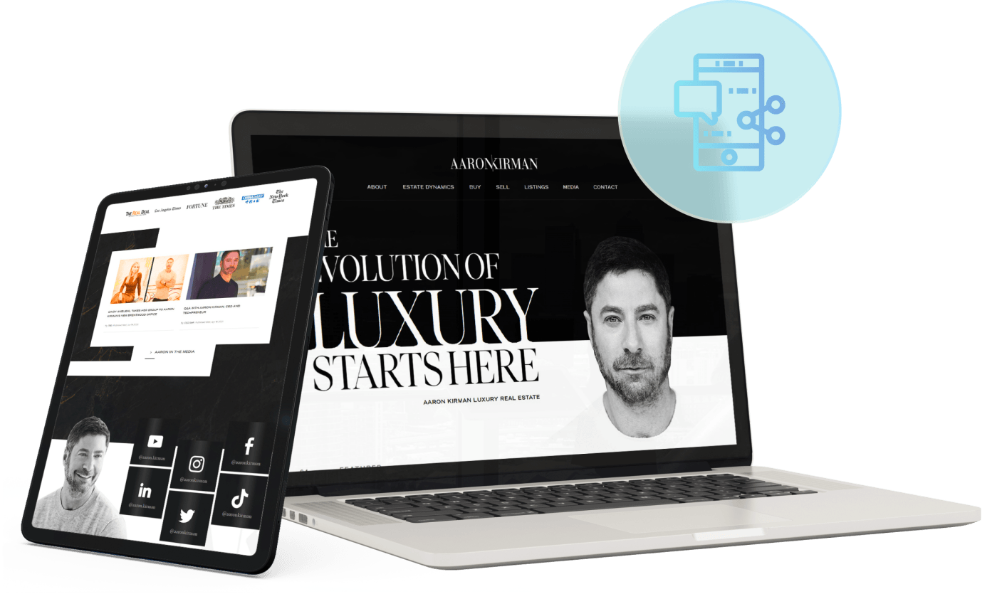
Creative Social Media Display
Custom real estate websites serve as important touchpoints for any agent, company, or brokerage. Aside from leading to helpful inner pages and resources, it should also redirect visitors to other platforms where they can follow your work, including your business' social media profiles.
At Agent Image, our clients often request for creative social media displays. Take Aaron Kirman, for instance. In lieu of indistinct buttons, he opted for a magazine-style layout for his website's social media display. Each profile has a dedicated box and features hover animations appropriate for the platform– Instagram's iconic gradient and TikTok's 3D-style look.
Custom Maps & Neighborhood Guides
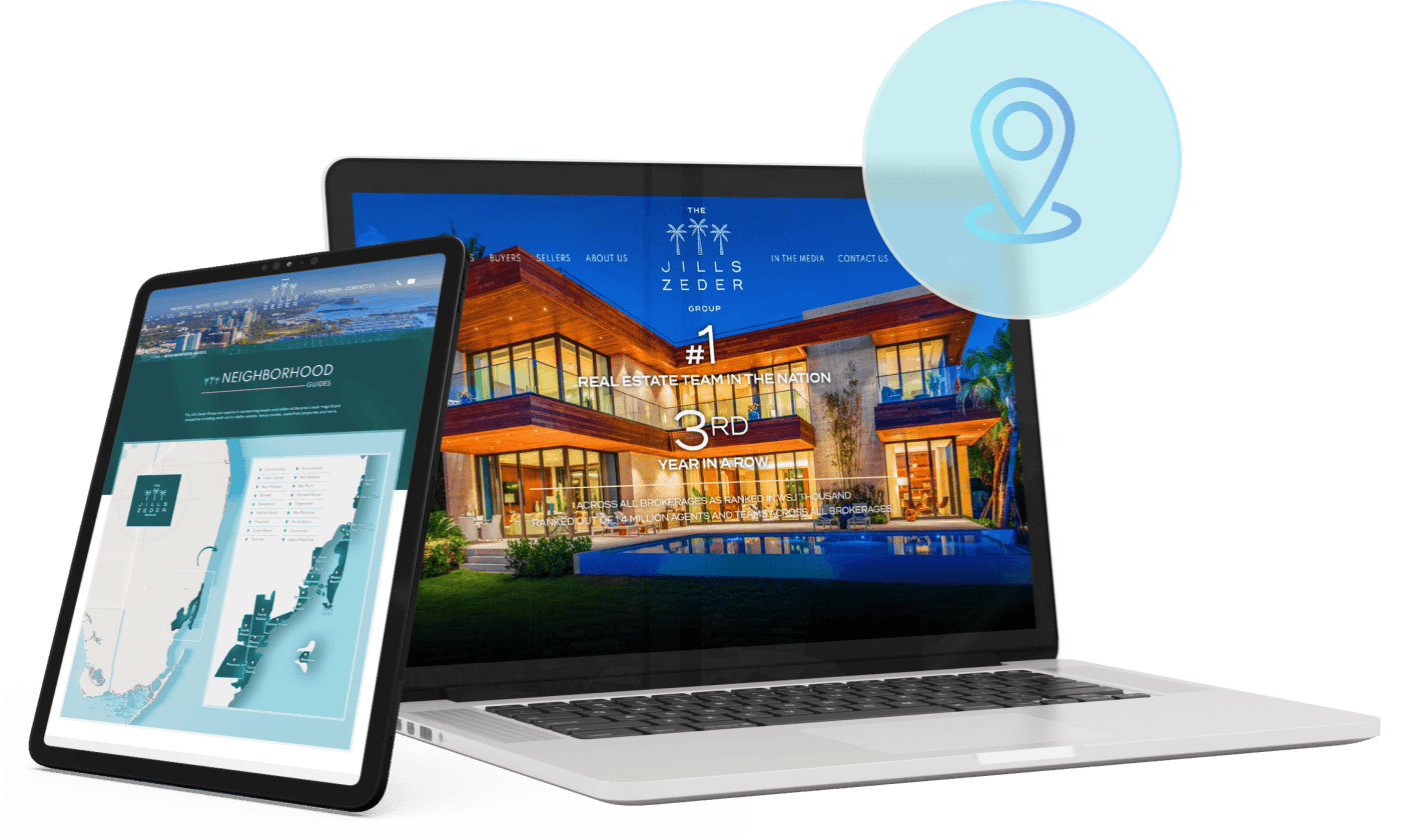
Neighborhood guides and custom maps are not only highly requested– they're absolutely essential to any custom real estate website. Having such content brings many benefits to your business, from solidifying your position as a go-to expert in your area to increasing your website's trustworthiness and domain authority.
With these advantages, it's easy to see why The Jills Zeder Group wanted their neighborhood overviews to be as comprehensive as possible. It starts with an interactive map of South Florida in their chosen color palette (teal and coral). Click a community and it will redirect you to the neighborhood guide, where you can learn about the area and request for information.
Exquisite Form And Function
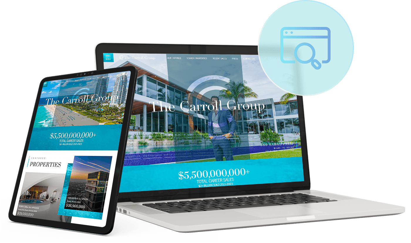
You see a lot of photo galleries used in website banner sections. That said, many of them are static experiences. Not so with Chad Carroll’s website, though!
As you’ll see, the banner section lets you select which property to view. Not only does this make for greater interactivity, but it also gives ample screen real estate to the impressive properties Chad and his team represent. Even better, clicking on the image takes you to the actual listing page, where you can find crucial details about the property.
Tiktok-Inspired Design
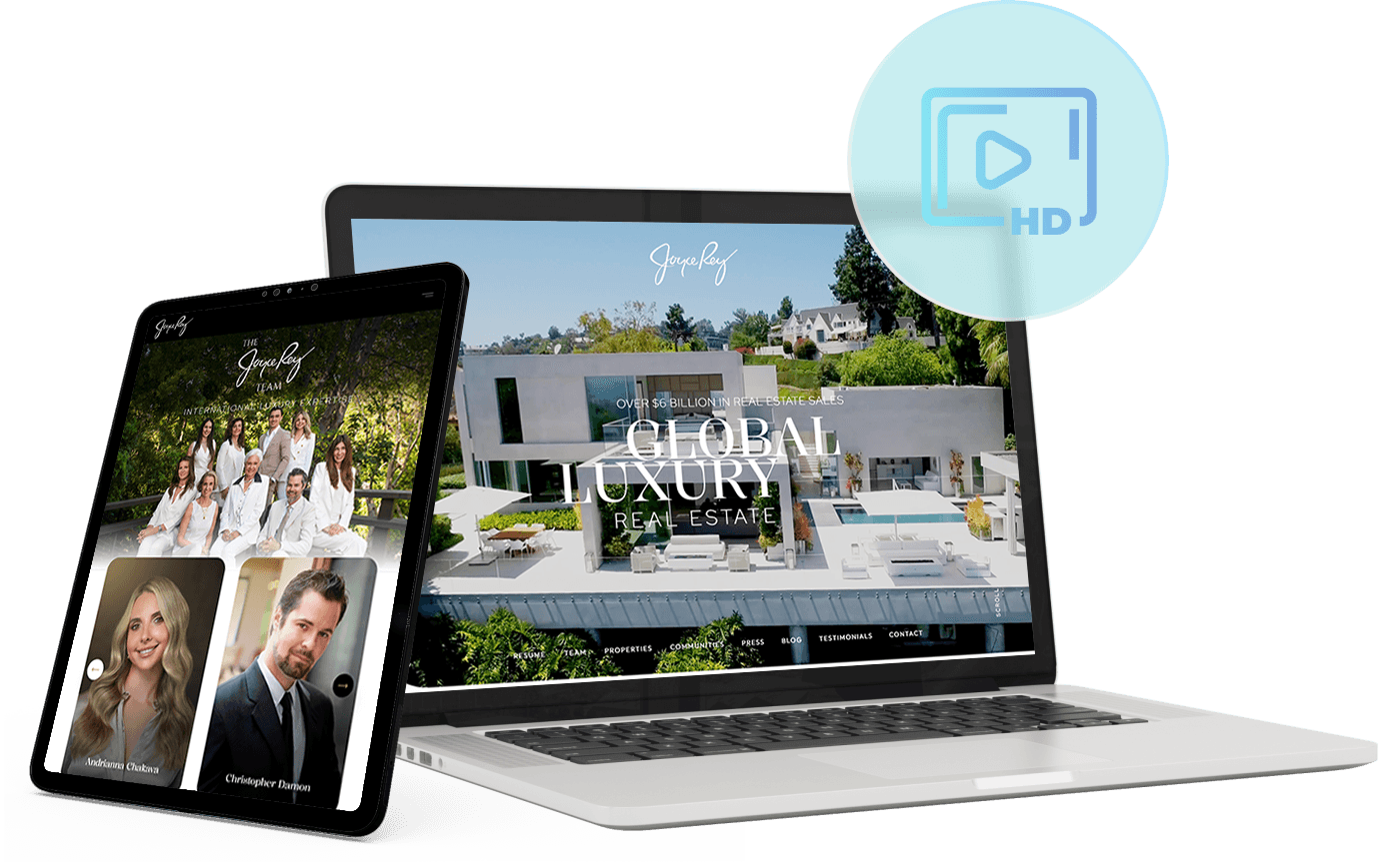
There’s no denying that TikTok has become a force in social media. Taking note of this, we created a design that adapts the concept of vertical videos and repurposes them as content cards.
Take a look at how vertical cards are used to showcase Joyce’s coveted listings and introduce her talented team. By orienting these crucial content vertically, we’ve also made them more intuitive to browse and explore on mobile devices, which now account for most online website use.
Parallax
Effects
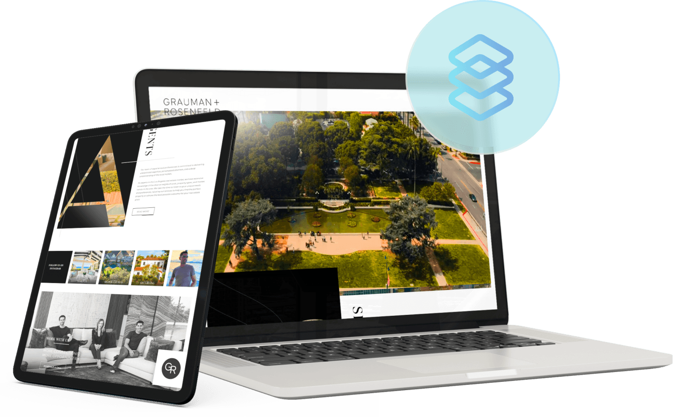
Parallax effects layer multiple page elements to simulate a 3D experience, making any custom real estate website look exciting and dynamic. That added pizzazz makes it one of the most requested design features here at Agent Image. The best thing about parallax effects, however, is that it can be applied multiple ways, opening lots of opportunities to create a stunning site.
One way you can incorporate parallax effects is to do how Grauman + Rosenfeld did. Their hero banner– a video presenting the laidback LA lifestyle– continues to play on loop in the background and can be seen through typographic cutouts the further visitors scroll down the homepage. This way, users can shift their attention easily from video to important text.
Horizontal Scrolling & Single-Page Navigation
Vertical scrolling is the norm in general real estate web design. But with the push to stand out, be unique, and offer a different user experience, more and more agents are experimenting with horizontal scrolling. Instead of navigating through multiple pages, visitors are presented with all the information they need in a single page. It's convenient, user-friendly, and looks great.
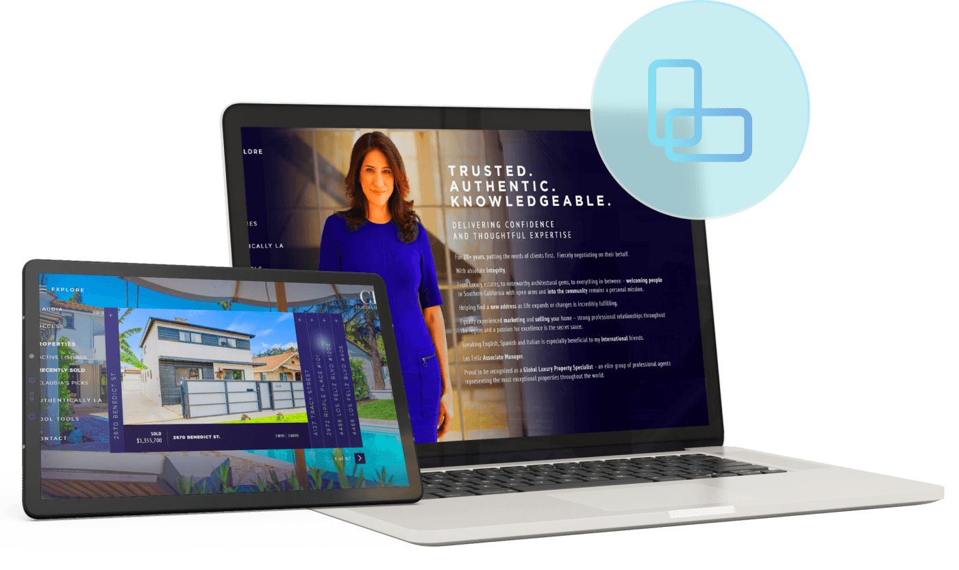
One of the best applications of horizontal scrolling and single page-style navigation is Claudia Hipolito's website. It looks and feels like a smooth slideshow that first introduces visitors to Claudia, then walks them through featured properties and the highlights of living in Los Angeles. This website also features high-resolution displays, animation, and parallax effects.
These are the real estate website features people ask for:
Ready to create your own custom real estate website? With the help of our dedicated and highly experienced team, you can incorporate all of these highly requested features or push the boundaries of real estate web design and set the trends.
For a FREE consultation
Call1.800.979.5799

