How Responsive Website Design Makes Your Website Future-Ready
People today wonder how they ever managed without a smartphone. And yet, they’re a fairly new invention; while the first prototype was produced in 1992, it truly became mainstream with the introduction of the iPhone in 2007.
How something so new can change the world so quickly comes down to a simple fact: smartphones efficiently solve so many problems simultaneously. If you wanted to search for new listings in an area, get in touch with an agent, take photos during the viewing, and share these snaps with your inner circle, you could do all that with your phone.
Unsurprisingly, smartphones (and similar devices like tablets) ushered us into the mobile-first era. But just as these gadgets solved problems, they also created new ones. Case in point: how do you design websites for a smaller screen? It’s an important question since roughly 60% of all website traffic now comes from a mobile device.

Responsive design to the rescue
Initially, the response to this conundrum was to create a separate mobile-friendly version of a website. But as screen sizes proliferated, this approach proved unsustainable, paving the way for a new paradigm called responsive design.
This approach is grounded in the idea of flexibility; that is, a website should be flexible enough to adjust its content to suit whatever screen it's being viewed on, thereby creating an optimal browsing experience. It does so using the following design strategies:
-
Using relative units – Designers essentially instruct the browser that certain things must occupy the same space regardless of the screen size. For instance, if an image occupies 50% of the screen on a desktop computer, it must occupy 50% of the screen on a mobile browser, too. The actual size of the image may change, but its ratio relative to the screen does not.
-
Prioritizing content – Designers carefully decide which items must be displayed at all times and which ones do not. The quintessential example of this is the “hamburger,” a collapsible menu where the main navigation links are tucked into unless clicked. This creates a streamlined browsing experience that’s more suitable for smaller screens.
-
Establishing breakpoints – At some point, the website’s layout must change to better fit on a mobile screen. When it does so is determined by breakpoints. For instance, featured listings are often displayed as a grid, which works well on a desktop but would be impractical on a smart device. Breakpoints instruct a browser to display these items as a single column on mobile screens for easier browsing and clicking. Just take a look at how The Jills Zeder Group’s website seamlessly handles this transition:
-
Optimizing interactive elements – A mouse cursor is more precise than a human thumb, which is why designers ensure that clickable portions of a responsive website are not only immediately visible but easy to tap as well. The first dilemma can be solved by using bold colors, while the latter can be addressed by making call-to-action buttons bigger on mobile screens (among other tactics).
Mobile-first website features
Of course, the principles above are guidelines that designers use to make responsive websites. But they are also jump-off points for features specifically made for mobile browsers. As we become an increasingly mobile-first world, you can expect more clever features like these to emerge.
-
Click-to-call buttons – Your smartphone is both a communication device and an internet browser. That’s why click-to-call buttons are a perfect fit for mobile responsive design. People no longer have to leave the browser, open the dialer, and manually input a phone number — they just click the button to connect to an agent. Ivan Estrada places his click-to-call button on the main navigation bar for ease of use.

-
Chatbots – Chatbots can be a godsend since they automate engagement with potential leads. But beyond answering basic questions, they can also point people to the landing page that has the information they need. That way, people don’t have to waste time clicking through a site’s various sections on their own. In Linsey & Leake’s case, the chatbot starts out minimized so as not to overlap with other content on-screen.
-
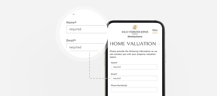
Optimized forms – It’s no secret that typing on a mobile device can be imprecise. That’s why a smartly designed mobile website tries to reduce typing to an absolute minimum. Notice how Sally Forster Jones’ website uses a combination of drop-down menus, radial buttons, and tick boxes to create a more mobile-friendly form.

-
Strategic button placement and gestures – You often see galleries on websites with navigation buttons embedded on either side. In mobile view, these buttons might be too small to click and might cause the user to inadvertently click something else. That’s why some designers will either incorporate swiping functionality or place the buttons below the gallery to avoid such problems.
-
Nested copy – Rather than displaying an entire text block at once, you can add a “Read More” option should site visitors need more information. This keeps your website compact and allows users to see more content with each scroll. This example from The Oppenheim Group shows some short teaser text, but gives visitors the option to read the full copy.
-
Bigger font sizes – Speaking of text, another hallmark of responsive website design is enlarging font sizes to make them easier to read on a smartphone or tablet. The goal here is to make the copy readable without having to zoom in on a page.
Don’t be left behind!
Do you have a mobile-responsive website that can impress and convert prospects? If not, Agent Image’s team of expert web designers and developers can help. Just call 1.800.979.5799 or send us a message to get started!


