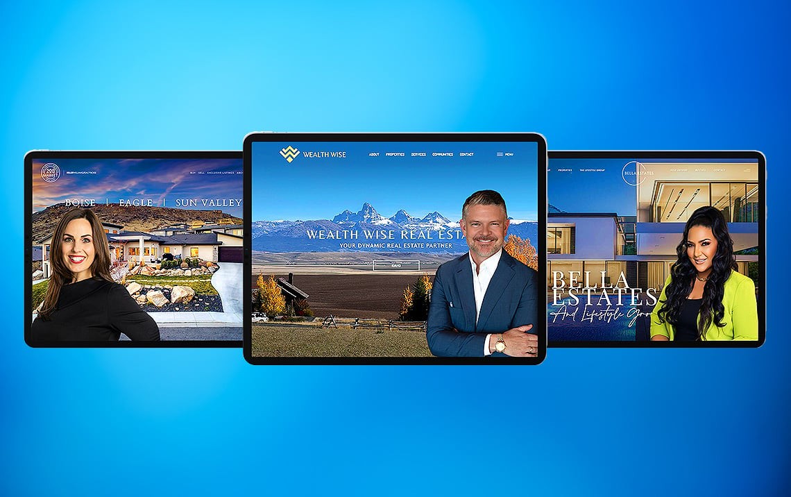
6 Incredible Real Estate Website Before & After Transformations
Is your website a placeholder for your business card or is it doing business for you? That’s the question many of our clients asked themselves before they turned to us to completely redesign their websites. Some did an admirable job attempting to create a professional website on their own, while others…let’s just say they needed a little help.
In today’s fast-paced, ever-evolving online marketing environment, having a robust, highly engaging and easily navigable real estate website is crucial. If it is not, you are not only missing potential clients, your web designs may be turning your leads away. As a real estate professional whose livelihood depends on the quality of their leads, that’s the last thing you want!
So, we felt rather than to tell you the difference our web design services can make, we would show you 6 incredible real estate website before and after transformations, so that you can see the amazing transformations for yourself. These clients are now reaping the rewards that having a stellar real estate website can bring to your business. We believe that the transformations below speak for themselves.
#1: Starr Group Iowa
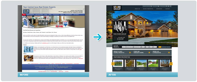
There is a method to creating page layouts that will encourage viewers to stay on your page and to browse around. The old Starr Group website illustrates an outdated web design and layout that does not work the way that your eyes do. On top of that, the content needed some updating, there are no calls-to-action to drive engagement, no prominent listings or contact information displayed, and it was not mobile-friendly.
After the transformation, you can see that the new site is visually stunning. The calls-to-action are now prominently displayed, and listings are quickly accessible from the homepage. There is a much better use of images to create a contemporary, streamlined website design that is more luxurious and mobile-friendly.
#2: Las Vegas Home Store
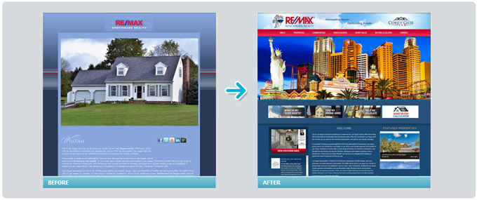
One of the major problems with the old Las Vegas Home Store site is immediately evident upon entry onto the website. The video was slow loading, which is a huge no-no in web design. In fact, statistics show that if a page takes more than three seconds to load, users will leave the page and keep searching. Not only was the initial page slow loading, all of the pages loaded slowly.
The old site also utilized fonts that are hard to read, and there was a lot of negative, unused space. Notice that the new design loads very quickly. The property photos are used to attract the eye down the page. The slideshow banner with action buttons that lead directly to the property page, as well as the IDX quick search box located just under the banner, offer an ideal layout for this real estate website. There are great CTAs that lead to useful information that visitors want to see like:
- Find My Dream Home
- What is My Home Worth?
- Help Me Relocate
- Short or Stay Calculator
#3: House Facts Realty
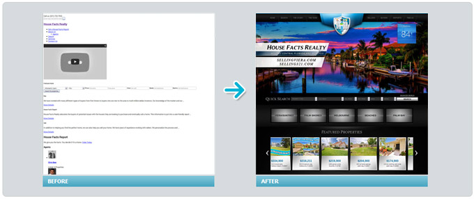
We gave the House Facts Realty website an extreme makeover for their woefully outdated website. The problems with their old site touched all of the biggies of real estate website design:
- No Images
- Disorganized Layout
- Empty Content
- Slow Loading Images
- Broken Links
Among our many fixes to make this site work for House Facts Realty was to add large, high quality scrolling property images at the top of the home page. We prominently display action buttons leading to different neighborhoods with quality information listed under each including things like geography, history, economy, tourism and government.
Their neighborhood pages even include the names of the state and federal representatives in those areas. We included an IDX search bar right under the home page image banner and a sleek modern looking interactive map. Informative animated videos scroll on the left-hand toolbar.
These website design changes allow the visitor to quickly and easily find the information that is most valuable to them, and offer a number of opportunities for them to “raise their hand” and ask for assistance.
#4: Howard Homes Eastbay
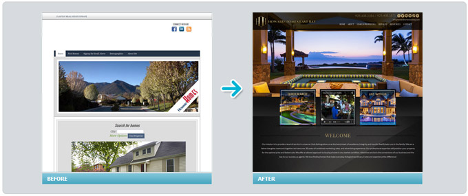
The Howard Homes website started out with a bad layout. While there was a search box included on the homepage, it was not IDX optimized and gave no option for selecting price range, number of bedrooms, etc. There was a loan calculator included on the old site, but you had to scroll halfway down the page to see it.
The only images were pictures of the team, not the properties, and the content only highlighted listings but did not provide quality, helpful blog posts. The transformation is a complete 180 from where it was. Upon entering the new site, the wow factor resulting from the color and design draws visitors in and encourages them to explore the site.
We displayed contact numbers in the banner, added call-to-action buttons right beneath the home page image scroll which include: quick search, video, and a prompt for sellers.
The links to listings are very easy to navigate and we added useful community information, tools, and social media icons to foster engagement.
#5: Lewis Residential
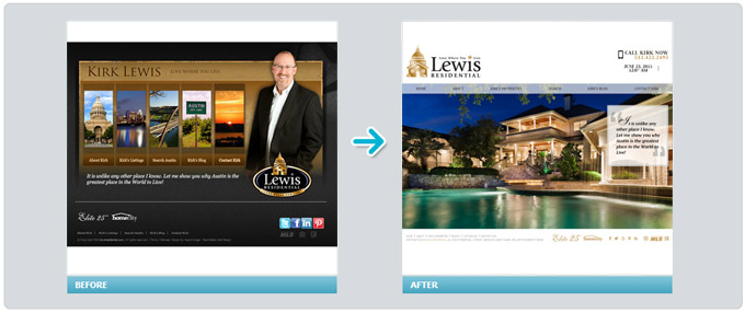
With the Lewis Residential website, the slow loading entry was meant to look futuristic and cool, however it took too long to load and was not mobile-friendly. The fancy opening would probably not be viewable on a mobile device or, at best, would take a long time to load. In addition, there was no blog, the color scheme was not appealing, and there were not enough quality images or links to helpful information.
What we did was revamp the color scheme to brighten up the site. We used premium images of their properties at the top of the home page. The new banner includes the date, time, and temperature in Austin – not to mention easily accessible contact information. The site is still very streamlined, but much easier to navigate and is visually stimulating.
#6: RH Properties
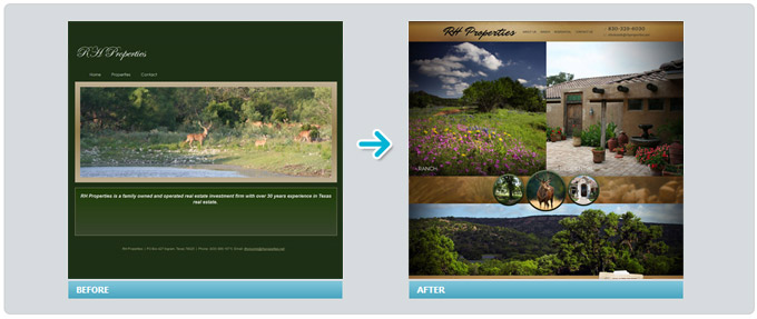
For RH Properties, who specialize in ranch properties, the image quality of the landscape views of the area was very low. The colors were not appealing, and it had an overly simplistic design. There were no links to social media, no helpful calculators or neighborhood pages. There was not even enough information about the agent or agency.
Our goal in redesigning this website was to keep the original intent of displaying beautiful ranch landscapes as a backdrop to highlight openness and a ranch or country-style feel. Using professional grade photos we used a split image shot across the top page where the left side of the image scrolls through breathtaking landscape photos while the right side is a static image of a beautiful ranch style home.
We included prominent call-to-action buttons for sellers, buyers of residential homes, and those looking for ranch properties. The news feed at the bottom of the page leads to relevant real estate news and the home page includes a featured property displaying the number of acres and price. The website redesign now allows for visitors to easily find the information they’re looking for, and welcomes engagement.
What about Your Real Estate Website?
Is your website doing business for you? Find out how our top rated team of web designers can turn your outdated real estate website into a lead generating machine! Contact us now for a free consultation.