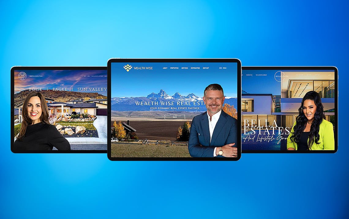
5 Real Estate Website Styles to Look Out for in 2016
Trends come and go and website styles change on a seemingly day-to-day basis. However, there have been a number of trends that have emerged over the course of 2015 that bode well for the coming year as well. Staying ahead of the curve when it comes to real estate website design is crucial to competing with other agents in your area.
That is why we have come up with this list of the top 5 real estate website styles to look out for in 2016. Are you prepared for the upcoming year? Perhaps after reading this post you will be anxious to get started revamping your real estate website. Now is the time to get the jump on next year and a leg up on your competitors.
#1: Rich Animations
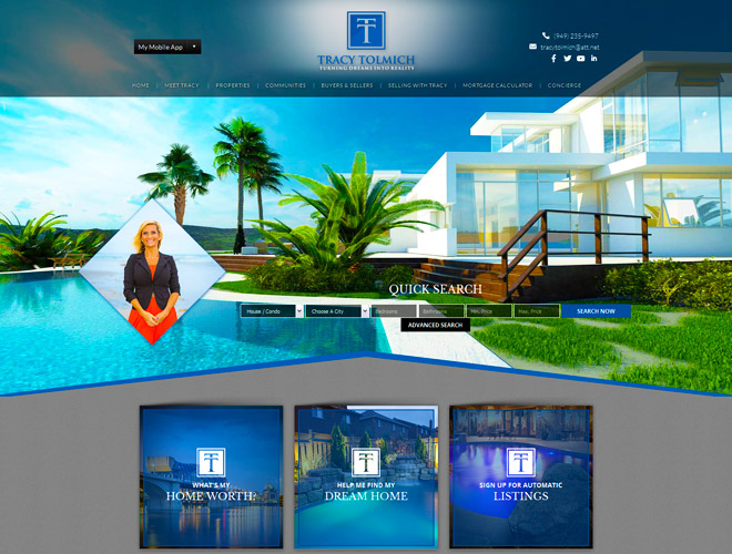
One of the trends that have started to heat up as 2015 wraps up is the use of rich animations to tell a story. Some sites go big creating an all animated experience while others like carlsbadhomesbytracy.com utilize animation on a smaller scale, such as tastefully designed hover effects.
Here are some of the ways in which rich animations are being incorporated into real estate website design. Expect this trend to only get bigger and more creative into 2016.
- Loading animations: intro animations or logo animation that show up before the homepage fully loads
- Motion Animation: Used to attract the user’s attention to a particular section of a page with an animated graphic or illustration
- Animated Video: A short often silent video plays in the background for visual impact
- Hover Animations: This small animation effect is used to make CTA buttons or links more prominent and is excellent for jazzing up minimalist and flat web designs.
#2: Long Scroll

Mobile devices have been reshaping the way we design websites. Instead of clicking through page after page, the trend is moving towards greater use of scrolling to make surfing on mobile devices easier. This has translated to the desktop website experience as well.
Take for example the sanantonioliving.info website, where different sections are displayed across the height on the page:
- The Quick Search bar takes prominence on the top portion, with Call-to-Action navigation boxes following below it.
- Graphic links to Featured Community pages takes the middle portion of the site, allowing users to view at a glance which areas the agent’s expertise are in. A featured property also takes it’s own space, as well as a gallery of featured videos.
Take note that long scrolling pages won’t be a bore for users to navigate as long as the graphics and text elements are balanced.
#3: Minimalism

The madoringroup.com website takes advantage of all of the advanced technology needed to pull off a minimalist website that is rich and full of features. The goal with minimalism is to eliminate as much clutter as possible to offer a simple yet appealing website design.
You’ll notice when you enter the site that there is no scrolling needed. Every page is linked directly from the landing page using a hamburger menu layout. The hidden menu is accessible from the upper left corner, language translator on the bottom left, property search in the middle, contact information on the upper right corner, and a fly out menu on the left (for buyers) and on the right (for sellers).
In 2016 you can expect the material design to gain steam on the popular minimalism and flat website designs. This style uses font effects to create depth and adds richness to the simplistic minimalism design.
#4: Parallax

When it comes to trends that made their mark in 2015 that will continue long into the next year, parallax effects are at the top of the list. Notice how on the garyfinkelstein.com website the parallax scroll effect is used to create angles and patterns that induce users to continue scrolling down the page.
Most real estate parallax websites use static property background photos behind scrolling text. Others use parallax techniques to keep banner headers or sidebar menus visible from every point on the page.
Unlike many parallax real estate websites, garyfinkelstein.com does not use a static or scrolling property photo as a background. Instead the parallax effect is used to make the lines and angles on the page appear to be in motion creating new shapes. Used to stimulate visitors visually, the parallax scroll technique is going to continue to evolve and expand into 2016.
#5: Vibrant Colors

For years the trend has been to tone down loud colors but that tide is turning. Just take a look at jasdipproperties.com:
- Their logo and site colors use teal green and a pink shade that mirrors the vibrant life in the Cayman Islands. To make the site look fresh, the designer used a light background color partnered with images of sunny skies.
- The color scheme is carefully coordinated so that the vibrant colors are not distracting or annoying but blend seamlessly into the overall website design.
On top of the use of vibrant colors, using unique typography, animation, see-through ghost buttons, and hover techniques are all part of the trends gaining steam going into the next year.
Get ahead of the Trends Now
All of these real estate websites have benefited from the expertise and know-how of our extraordinary team of website designers at Agent Image. Our attention to detail and artistry at creating visually stunning real estate websites is unmatched.
Yet making gorgeous websites is just half of what we do. We offer website packages to cover all of the bases including:
- SEO Packages
- Blogging Packages
- Social Media Packages
- PPC Packages
- Content Development
- And Custom Solutions
Don’t start 2016 behind the curve. Get ahead of the trends now by giving our team at Agent Image a call or by requesting a free consultation.