10 Best Real Estate Websites for November 2022
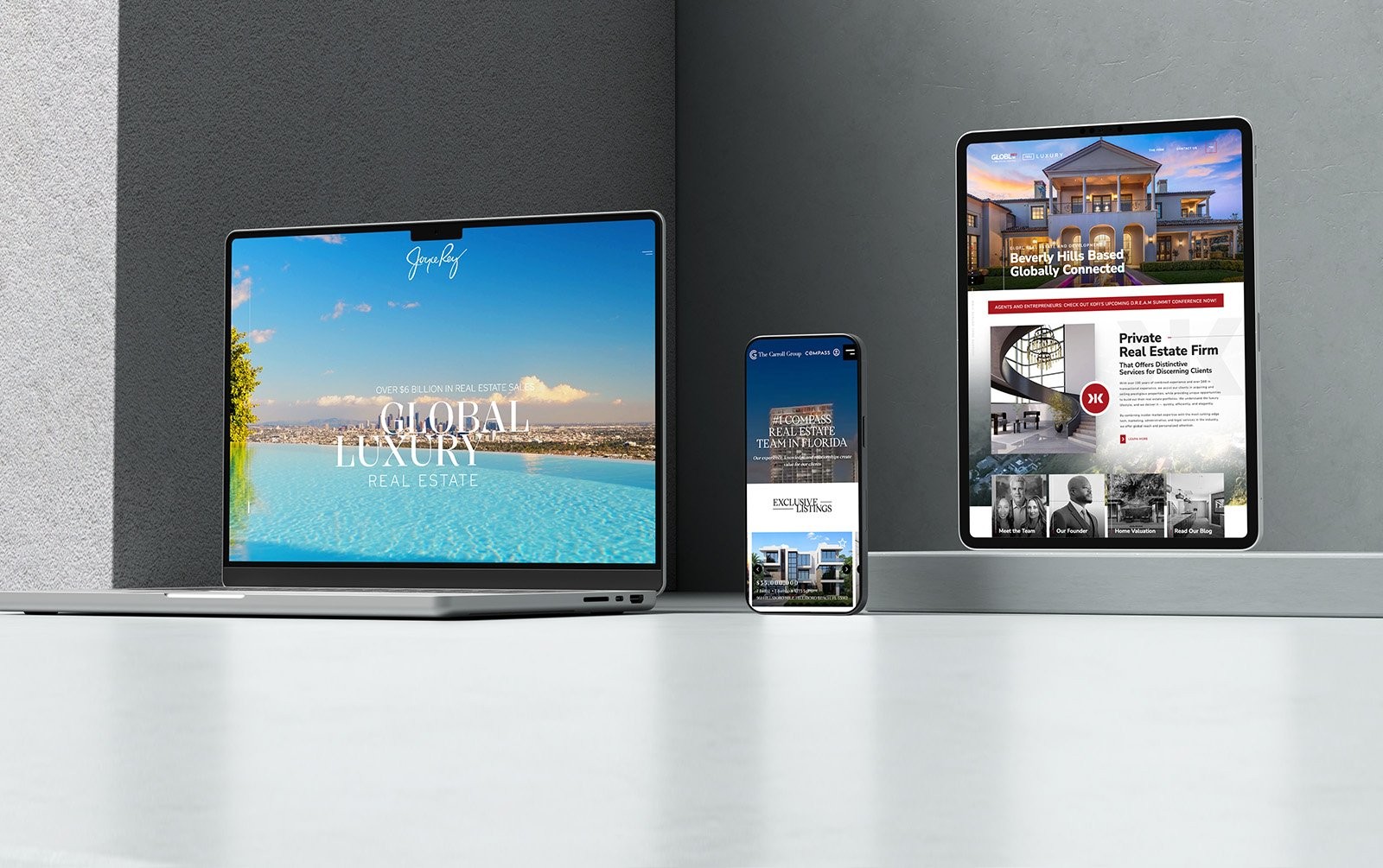
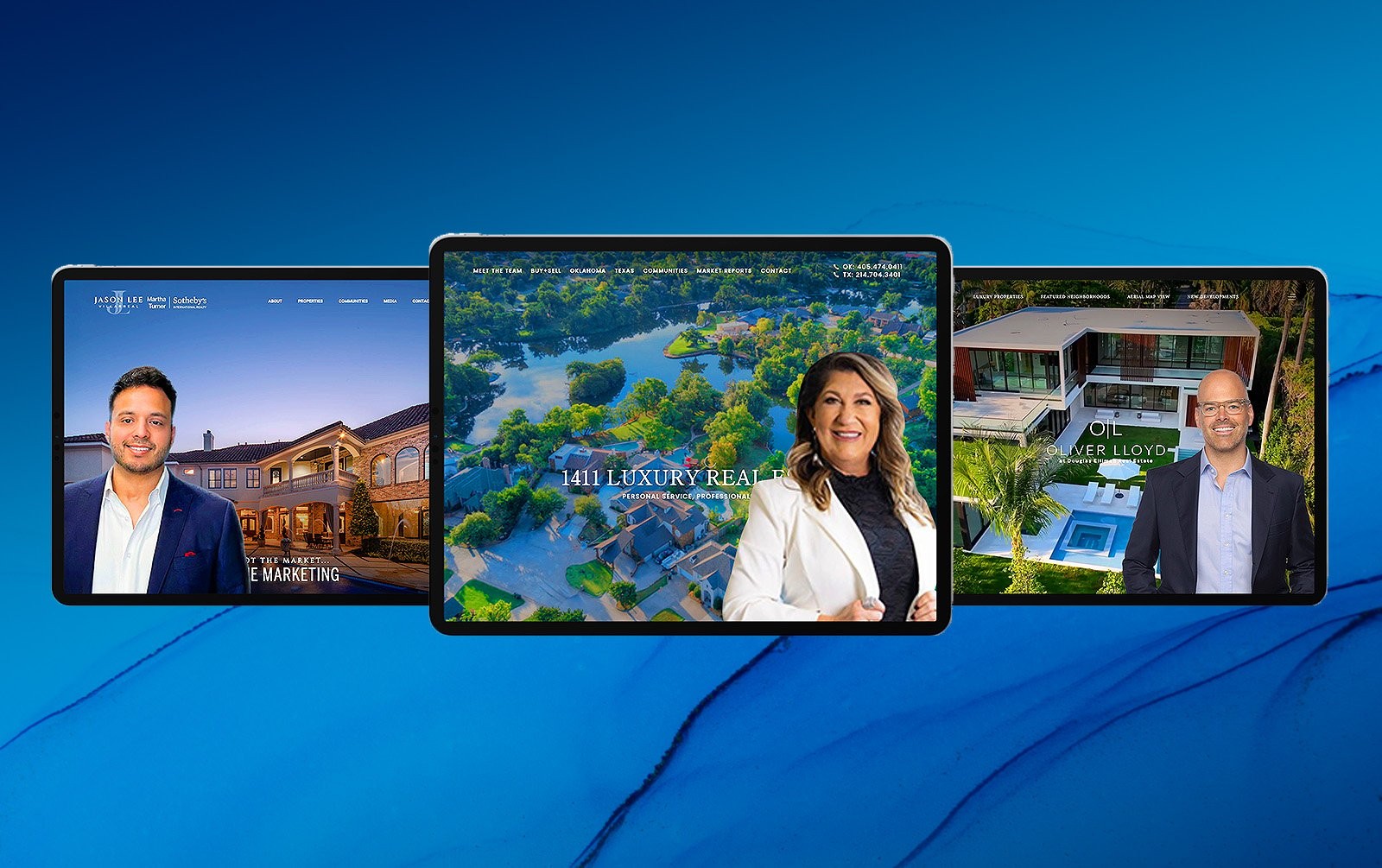
It’s never too late to breathe new life into your website. This month’s selection of the best real estate websites is proof of that. If you want to welcome 2023 with a strong start, let these amazing examples serve as an inspiration.
Joanna Pallante Los Angeles, CA
As a luxury agent with The Altman Brothers, Joanna Pallante delivers service beyond the expected — something that her website clearly demonstrates. Horizontal scrolling gives the website an almost gallery-like feel, with each frame giving visitors ample opportunity to truly absorb and appreciate what’s on screen. The browsing experience is also reminiscent of flipping through a glossy magazine, which we capitalize on by using crisp photography and modern fonts. We use the horizontal layout to great effect, too, filling the backgrounds with expansive vistas or team photos. And if you need to quickly view other sections of the site, the collapsible main menu on the upper left makes navigation a cinch.
What’s unique about this website? A horizontal website isn’t something people regularly encounter, so we made sure navigation was foolproof. In addition to the arrow buttons, you can also flip between pages by scrolling up and down or left and right.

Laura Papritz Team Issaquah, WA
Laura Papritz Team’s website evokes the cool weather, the explosion of colors, and the cozy vibe of fall in Issaquah, WA. It’s full of design touches that embody this magical time of year, from the prominent leaf motif, to the use of autumnal colors, to the photos of striking fall foliage. We also amped up the coziness factor with a banner video that features lush forests, old-fashioned fireplaces, relaxing hikes, and heart-warming scenes from everyday life. Laura Papritz Team proves a website can have not just a strong brand, but a distinct vibe as well.
What’s unique about this website? To further set this website apart, we used circular patterns in the Featured Communities and Work With Us sections. These lend a friendlier, more approachable feeling than typical block-style design could accomplish.

The Spheeris Team Oconomowoc, WI
A picturesque place like Wisconsin’s Lake Country deserves an equally stunning website. And that’s exactly what SpheerisTeam.com is. Its classic dark-toned theme complements the stately homes that line the waterfront, while gold hues serve as a reminder of the exclusive listings The Spheeris Team has access to. We also made sure to keep the browsing experience simple and uncluttered, using a gallery layout to present a wealth of content in an intuitive manner. From top to bottom, this website embodies the prestige that only lakeside living provides.
What’s unique about this website? We took extra effort to highlight that The Spheeris Team is a family business that treats clients like family. “The Team” section features two generations of real estate mavericks who share the same purpose: to deliver outstanding service.

Rachael Waller Florissant, MO
Rachel Waller’s website marries sleek and professional design with tasteful feminine touches. Indeed, the predominantly black color scheme is accentuated by the rose-gold hues utilized in the text, buttons, and icons, creating a luxurious-looking contrast. Her logo also plays a big role, as it’s subtly overlaid on featured properties and the icons for the buyer, seller, home valuation, and property search portals.
What’s unique about this website? Rachel’s website makes the home search process more engaging and intuitive through its interactive map. Furthermore, hovering over a neighborhood highlights that spot in her signature rose-gold color.

Drea’s Estates Ontario, Canada
How do you communicate that a real estate team offers modern services without skimping on personal touch? By creating a website that marries the best parts of contemporary and classic design, of course! Animated typography, gradients, and trendy colors communicate that Drea’s Estates understands today’s buyers and sellers. At the same time, dark tones, textured backgrounds, and black-and-white photos evoke dedication to good, old-fashioned customer service. The result? A website that’s impactful from the first scroll to the last.
What’s unique about this website? Numbers tell a story — and in the case of Drea’s Estate, it’s a success story. Its website has a section that showcases the team’s sales achievements, which is the ultimate proof of its prowess.

Teri Anderson Palm Desert, CA
The California desert is a place of stark beauty, something that we wished to capture with Teri Anderson’s website. Fittingly, we went for a black-and-white theme to evoke serenity and exclusivity, while the generous white space hearkens to the wide plains of the desert. If you hover over any of the featured communities, however, they burst into color – almost like an oasis in the sands.
What’s unique about this website? One of the biggest perks of working with a luxury agent like Teri is getting access to exclusive properties, many of which are yet to be publicly listed. That’s why we made sure to make a landing page just for these elite listings.

Keaty Real Estate Lafayette, LA
Lafayette is not only historic and scenic, but it also boasts friendly residents and top-notch cuisine. It’s only appropriate, then, that we designed Keaty Real Estate’s website to highlight the amazing lifestyle this city offers. Visitors are greeted by a video montage of aspirational living: reeling in the day’s catch from the lake, exploring the countryside on horseback, and taking a dip in the pool. The simple layout and sleek design is reminiscent of a glossy magazine, as befits a team that has sold over $1.5 billion worth of luxury properties.
What’s unique about this website? Most parallax websites use a static image for their background. KeatyBlog.com, on the other hand, uses the banner video instead to make each scroll more enticing.

Jaymore Realty New York City
Jaymore Realty wanted a website that deftly embodies New York City: rooted in history but always looking to the future. That’s why our design deftly melds contemporary design with classic touches. The use of block-like shapes gives the site an avant-garde appeal, but this is tempered by the luxurious marble-like background and the judiciously used script font. This website is polished yet welcoming, which is exactly what this elite team asked for.
What’s unique about this website? In addition to showcasing beautiful homes, JaymoreRealty.com’s banner section also spotlights the rave reviews the team has received — the ultimate proof of its world-class service.

Devicenti Lagomarsino Team San Francisco, CA
Selling multi-family properties can often be a challenge, but not if you’re working with Devicenti Lagomarsino Team. That’s why we chose an easy, breezy look for its website to embody its seamless service. The simple layout ensures that people can easily find what they need, while the blue-and-white palette connotes brighter days ahead for sellers. The large photos in the banner section also communicate that Devicenti Lagomarsino Team sees the big picture — and has big ideas to match.
What’s unique about this website? The best measure of any real estate team is its results. Luckily, Devicenti Lagomarsino Team has case studies that detail its surefire strategies.

Reyburn Real Estate Lexington, KY
Reyburn Real Estate specializes in farm and luxury properties, so its website needed unparalleled sophistication. Instead of cluttering the design with extraneous design elements, we decided to pare things down. We arrived at a streamlined layout with a black-and-white color scheme that places the focus on what really matters: the stunning estates that the team sells.
What’s unique about this website? The featured communities are rendered like a grid of postcards, giving visitors an idea of the real estate available in the area.

Recap of standout features
There’s a lot to admire with this month’s selection of the best websites, so let’s go over their unique features again:
-
Joanna Pallante – Providing multiple ways of scrolling from one page to another ensures intuitive navigation for this horizontal website.
-
Laura Papritz Team – Using circular patterns lend a friendlier and less formal appeal to the website.
-
The Spheeris Team – The team takes pride in being a family business and we made sure to highlight this on the website.
-
Rachael Waller – An interactive map gives visitors a more intuitive way to look for their dream home.
-
Drea’s Estates – We highlight the team’s sales achievements in the “Why Work With Us” section to further establish its credibility.
-
Teri Anderson – A landing page for exclusive listings showcases Teri’s access to pre-market properties.
-
Keaty Real Estate – Using the banner video as the parallax background makes the design more immersive.
-
Jaymore Realty – By putting testimonials on the banner section, visitors immediately know that this team gets excellent results.
-
Devicenti Lagomarsino Team – Case studies not only prove the team’s impressive selling skills, but they also emphasize its strategic approach to transactions.
-
Reyburn Real Estate – Featured communities are rendered like a grid of picturesque postcards.
Elevate your website, elevate your business
Your amazing business deserves an amazing website to match. Allow Agent Image to bring your vision to life with our 23 years of design expertise. With an extensive list of elite clients, a treasure trove of design awards, and thousands of five-star reviews under our belt, you can expect nothing short of world-class service.
And the best part? We offer FREE consultations! Just call 1.800.979.5799 to book an appointment.


