10 Best Real Estate Websites For June 2022
Consumer touch points have proliferated in today’s digital-first world. But before you chase the latest trends, make sure you’ve got your foundations covered. And the best place to start is your website.
Indeed, a great website is the cornerstone of a great online presence. This month’s list of the best real estate websites is compelling proof of this principle.
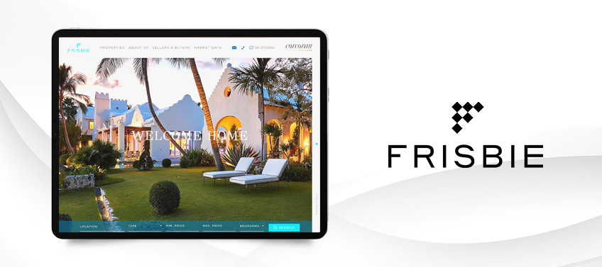
Suzanne Frisbie Palm Beach, FL
Suzanne handles real estate transactions with the calm, thoughtfulness, and precision of an agent who has 30-plus years of experience. That’s why we chose a serene blue palette for her website, which reflects Suzanne’s prestigious career while also capturing the sheer beauty of Palm Beach. A simple, grid-focused layout makes navigation easy — a nod to the seamless experience of working with one of Florida’s top agents.
What’s unique about this website? This stellar agent has kept close tabs on the Palm Beach real estate market since the late 1980s, publishing insightful reports that help clients and investors get the best deal possible. All of these are collected under a dedicated section called Market Data.

Drew & Ingrid Homan Cincinnati, OH
Perhaps the best way to describe Drew and Ingrid Homan’s website is warm yet aspirational. After all, their service lies at the intersection of real estate and interior design, hence their slogan “From house to home.” Neutral tones like beige create a welcoming vibe, while touches of gold highlight the couple’s expertise in luxury homes. The stencil-like typography that’s sparingly used throughout the site also adds a distinct handcrafted feel.
What’s unique about this website? The banner section features exquisitely designed interiors that feel sophisticated yet lived-in — a testament to Drew & Ingrid’s impeccable taste for design.

Harmony Estates West Covina, CA
Sandra Williams is a consummate professional who also values balance. As such, HarmonyEstates.co represents these two different but important aspects of her personality. The design is decidedly sleek and polished — as befits an agent with Sandra’s business acumen. At the same time, photos of scenic vistas and aspirational luxury homes are a taste of the good life that awaits in West Covina, CA.
What’s unique about this website? Sprinkled throughout the site are design accents that resemble wood. This little touch adds a lot of elegance to this already impressive website.

Alexandra Shaban Chicago, IL
To say that Alexandra Shaban has the golden touch is an understatement. She is, after all, one of the youngest top-producing luxury agents in Illinois and is renowned nationally for her ability to leverage social media marketing into sales. True to form, her website features a black-and-gold color scheme that perfectly encapsulates her mastery of the high-end real estate market. Similarly, the marble-like background image — with streaks of gold, but of course — adds further opulence to the site.
What’s unique about this website? Alexandra is a digital native through and through. Nowhere is this more apparent than in the video section, where the young and powerful agent takes viewers on a tour of Chicago’s most coveted homes.

Jeremy Johnson Siesta Key, FL
Jeremy Johnson’s website opens with panoramic drone videos of Florida’s urban landscape. It’s a fitting choice, as he is a trusted consultant that helps clients see the big picture so they can make smart investments. The black-and-white theme connotes the straightforward and practical advice Jeremey offers, while the textured background adds style and sophistication. The featured communities are arranged in a neat grid, making navigation simple and easy.
What’s unique about this website? The property search function is tucked just under the banner section, allowing visitors to quickly find properties that suit their needs and real estate goals.

Linda Lam San Francisco, CA
Linda Lam is a native San Franciscan, so she’s immersed in the culture and lifestyle of this iconic city. As such, we made sure to make her website as immersive as possible through thoughtful design and engaging user experience. For starters, there’s the aerial video of San Francisco Bay and its sought-after neighborhoods. Then there’s the interactive map that lets site visitors freely explore different communities. Click on one and you’ll be presented with a detailed guide that gives the inside scoop on recreational options, retail centers, dining destinations, and more.
What’s unique about this website? Linda made sure to add the Compass Concierge feature on her site. This value-added service fronts the cost of improving a house so it can be sold faster and for a higher asking price.

Michael Gomez Nashville, TN
Dynamic, in-touch, creative. These are just some of the words you could use to describe Michael Gomez who, apart from being a successful agent, is also an accomplished musician. Hence, it was imperative that we infuse his colorful personality into his website. Touches of yellow add verve to the design, while animation effects denote the enthusiastic energy Michael brings to any real estate transaction.
What’s unique about this website? Michael asked us to put his social media handles on the banner section above the fold – a testament to his digital prowess.

Michelle Graci Beverly Hills, CA
Michelle Graci has always had a taste for the finer things in life, so it’s unsurprising that she would eventually turn her eye toward the luxury real estate market. And where better to practice her skills than in Beverly Hills, Los Angeles’ most prestigious zip code. As you’d expect, her website has a refined touch that’s reminiscent of glossy magazines. In fact, each scroll corresponds to a different section, almost as if you’re flipping a page. Furthermore, each one has a full-sized image that draws the eyes and gives visitors a preview of the high-end homes in her portfolio.
What’s unique about this website? The parallax effect is used to create a more visually immersive browsing experience.

UpMarket Realty Group Beverly Hills, CA
UpMarket Realty Group’s website is proof that less can indeed be more. Its minimalist website, which features generous white space and a simple layout, has an undeniably chic look. This aesthetic is further heightened by the teal blue-and-white color palette that communicates both sophistication and trustworthiness. An interactive map, meanwhile, makes it easy to find your dream home in your dream community.
What’s unique about this website? The featured homes are presented as postcards, complete with white borders. This design treatment highlights just how stunning these properties are and makes them even more desirable.

Robbyn Battles La Crescenta, CA
The best way to describe Robbyn Battle’s website is intimately elegant. Her banner video features interior shots of beautiful homes that give people a feel of what it’s like to live there. It then zooms out to show La Crescenta in all its mountainside glory. Of course, Robbyn herself makes an appearance, welcoming people into this scenic neighborhood. The agent’s warm persona comes through in the design as well thanks to the use of orange in the header copy, call-to-action buttons, and image gradients.
What’s unique about this website? Understanding the selling power of video marketing, Robbyn made sure to dedicate an entire section of her site to walkthrough videos. Each one gives viewers a clear idea of what makes a listing special and why it should be their next home.

Recap of standout features
This month’s selection demonstrates how clever features can create a more engaging browsing experience. Which of these features would you like to implement on your own website?
-
Suzanne Frisbie – Valuable property market insights are collated and shared via a dedicated “Market Data” section.
-
Drew & Ingrid Homan – Photos of exquisitely designed interiors highlight this team’s mastery of both real estate and interior design.
-
Sandra Williams – Design elements that feature a wood-like texture elevate this website’s style.
-
Alexandra Shaban – Immersive video walkthroughs led by Alexandra showcase her strong grasp of digital marketing.
-
Jeremy Johnson – The property search feature is strategically located for ease of use.
-
Linda Lam – The Compass Concierge demonstrates this agent’s dedication to selling her clients’ homes ASAP.
-
Michael Gomez – Placing his social media channels on the banner section makes it easy for site visitors to connect with him.
-
Michelle Graci – Applying the parallax effect creates a more immersive and visually impressive browsing experience.
-
UpMarket Realty Group – Featured properties are presented as sleek postcards, making them even more attractive to buyers.
-
Robbyn Battles – A dedicated video walkthrough section allows would-be buyers to better appreciate Robbyn’s already-impressive listings.
Want a website that works as hard as you?
Your website is your online calling card. Make sure it presents you in the best light.
If you’d like to give your site a much-needed makeover, allow Agent Image to do its magic. With over 20 years of experience under our belt, we have created countless award-winning websites for many of the industry’s most illustrious agents.
We’d love to give you a website that looks amazing and serves as a lead generation machine. For a FREE design consultation, just call 1.877.317.4111 or send a message here to get started!


