10 Best Real Estate Websites for July 2024
Some say that having any website is good enough. Our picks for the best real estate websites of July beg to differ. When it comes to impressing prospects and communicating the value you deliver, there’s simply no substitute for a best-in-class realtor website. Besides, a standout agent like you deserves no less than a standout online presence.
10 Best Real Estate Websites for July 2024

Paula Handel Southern California
Paula Handel wanted a website that exudes luxury without looking cluttered. Our response? A website that’s thoughtfully designed to highlight what’s important while stripping away what’s extraneous. Notice how each scroll you make roughly corresponds to a different section of the homepage, creating a focused yet intuitive browsing experience. Text is kept to a minimum by displaying additional information as popups when you hover over interactive elements, such as in the featured communities section. Red is the primary color on this real estate website, capturing Paula’s undying love for all things Southern California.
What’s unique about this website?
Giving back to the community is vital to Paula, so we featured her charitable work on the homepage.

Nan Properties Houston, TX
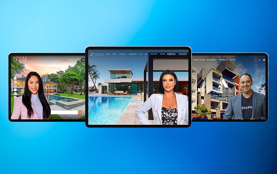
Nan Properties wanted a website inspired by luxury handbags: striking without being garish. So we delivered a site filled with exquisite details that provided a streamlined experience. Bold design was the order of the day, brought to life by extra-large photos and an orange palette reminiscent of scenic sunsets. Function is at the forefront, too, as you can see from the search bar integrated into the banner and the home valuation tool.
What’s unique about this website?
We placed navigational nodes on the right to make it easier to explore the various sections of the homepage.

Advani Real Estate San Diego, CA
Flat design has been all the rage these past years, but Prem Advani wanted a website with more character. We integrated design touches that added dimension to the site, such as the silk-like backgrounds and layered animations. The banner video further adds dynamism to the site, while also giving would-be clients a peek into Advani Real Estate’s prestigious listings.
What’s unique about this website?
Advani Real Estate is all about results. That’s why we created the “Notable Sales” section to highlight its ability to get the best deal possible for clients.

Julie Ciarallo Miami, FL
The goal was clear for this project: to capture the seaside splendor of Miami in all its glory. From the moment you load the site, you are entranced by the video gallery which showcases not just the beautiful Miami shoreline, but also the ultra-deluxe homes that line it. At the same time, the background imagery evokes water ripples, while golden hues hearken to the stunning sunsets that cap each day in this special place.
What’s unique about this website?
Featured properties are rendered as vertical cards – a nod to the popularity of TikTok videos.

Lindsay Buchanan Truckee, CA
Lake Tahoe isn’t just a place – it’s a lifestyle. Unsurprisingly, we took a distinct lifestyle approach when designing the website for Lindsay Buchanan. With sweeping views of pine-covered slopes, ice-capped mountain peaks, cerulean skies, and crystalline waters, this real estate agent website evokes a resort-like vibe. Featured communities are rendered like postcards, further highlighting the picturesque views of Lake Tahoe’s different neighborhoods. The homepage is uncluttered and streamlined, but the different inner pages offer a wealth of resources to find your dream home.
What’s unique about this website?
Even the property search bar has been customized to reflect the scenic views of Lake Tahoe.

Lisa Otte Sarasota, FL
Lisa Otte envisioned a modern and minimalist design for her website, allowing Sarasota to be the true star of the show. You can see this in the full-screen banner and large photos, which show off the thriving city and its scenic surroundings. All the same, we elevated this site’s simple design with deluxe touches such as gold tones, black-and-white imagery, and sleek parallax scrolling.
What’s unique about this website?
As an innovative agent, Lisa asked us to include a chatbot to serve as a 24/7 concierge for website visitors.

Bremis Collection Somerville, MA
There’s a professional yet approachable quality to Bremis Collection’s real estate website. On the one hand, you have a straightforward layout and grayscale color theme; at the same time, you have the cursive tagline in green, as well as photos of the friendly team. The image-centric design also enables visitors to fully appreciate the featured and sold properties displayed on the homepage. Eagle-eyed visitors will also notice clever design touches, such as the textured backgrounds and the gray filter that overlays interactive elements.
What’s unique about this website?
The “Let’s Get Started” section offers a one-stop resource for buyers, sellers, and investors.

The Richards Group Santa Rosa Beach, FL
The Richards Group is all about the properties, so we built a website that serves as the perfect canvas for some of the most coveted luxury homes in Santa Rosa Beach. The banner section is an immersive video featuring picture-perfect oceanfront views and magazine-worthy properties. Meanwhile, the featured listings and communities are arranged in a grid – almost as if they’re on exhibit. We chose a black-and-white theme for this site, which connotes sophistication without stealing attention from the real estate on offer.
What’s unique about this website?
Want to know more about the local property market in Santa Rosa Beach? The Richard Group’s “Luxe TV” video section is where to get the latest scoop.

Campbell Wellman Pacific Palisades, CA
Effortlessly elegant best sums up Campbell Wellman’s real estate website. There’s an artistry in its minimalist look, where every element is carefully considered for both aesthetics and functionality. Ample white space is employed to make sure each component has enough room to “breathe,” creating a layout that’s easy to navigate and a delight to behold. Subtle design touches lend an upscale vibe to the site, such as the use of gradients and the silk-like background textures.
What’s unique about this website?
Each property listing gives you the option to book a viewing, creating a seamless user experience.

Heidii Smith Sacramento, CA
The website we created for Heidii Smith exudes opulence from top to bottom. There’s the black-and-gold color palette that signifies credibility and luxury. Or the marble-like background used throughout the site. But the undisputed focal point is the multi-million-dollar listings, which take up almost the entire screen, emphasizing their grandeur. Parallax scrolling and video tours add dynamism to the site, a reminder that this top-producing agent doesn’t sit on her laurels.
What’s unique about this website?
Your white-glove real estate experience starts with Heidii’s website. The “Concierge” page offers everything you need, from personalized services to the latest market reports.
Recap of standout features
Each of our featured websites has a special touch that makes it a cut above the rest. Here’s a quick rundown of these innovative features:
-
Paula Handel – Her charitable work is prominently featured right on her homepage.
-
Nan Properties – Navigational nodes offer an easy way to explore the homepage.
-
Advani Real Estate – Notable sales are given their section to emphasize this team’s deal-closing savvy.
-
Julie Ciarallo – TikTok-esque content cards are used to display Julie’s premier listings.
-
Lindsay Buchanan – Thanks to IDX customization, the property search bar was given the Lake Tahoe treatment, too.
-
Lisa Otte – A chatbot serves as a 24/7 concierge for website visitors.
-
Bremis Collection – A section called “Let’s Get Started” has helpful tools for buyers, sellers, and investors.
-
The Richards Group – “Luxe TV” offers informative videos discussing the latest in Santa Rosa Beach realty.
-
Campbell Wellman – All listing pages allow users to book a property viewing.
-
Heidii Smith – The “Concierge” page demonstrates the VIP-level visitors can expect from Heidii.
Why not you?
You, too, can have a real estate agent website worthy of being recognized among the best. And Agent Image is more than capable of helping you achieve that goal. Want a website that stands out in a sea of sameness?
Book a FREE consultation – call 1.800.979.5799
or send a message here.


