10 Best Real Estate Websites for February 2022
Being a real estate agent is a lot like being a matchmaker. After all, you help clients find “the one” — whether that’s their dream home or the perfect buyer.
So for the month of hearts, we wanted to showcase agents whose amazing websites allow people to find the home where their happily ever after begins. Each of these websites is a labor of love, carefully crafted by our team of talented designers.
Without further delay, let’s take a look at the best real estate websites for February!
Kristi Luman Miami, FL
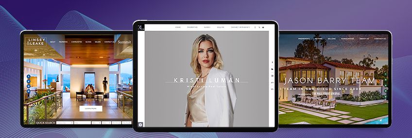
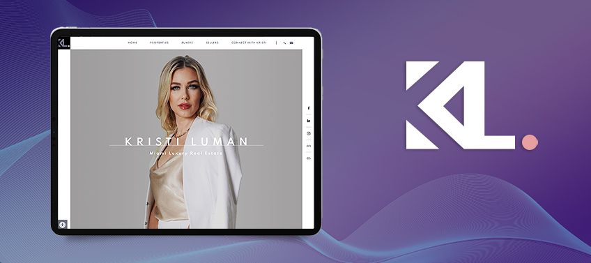
It’s said that the essence of good taste is discretion. That’s why for Kristi Luman’s website, we went for a sleek design that eschews the extraneous in favor of an ultra-sleek and high-end look. Subtlety was the lynchpin of our design, from the dip-to-white transition in the main slideshow, to the social media buttons tucked away on the side, to black-and-white photos integrated into the background. And the addition of the parallax effect proves that minimalist websites can indeed be engaging to browse.
What we love about this website: Sleek doesn’t just apply to KristiMiamiRealtor.com’s design but to its features as well. Take a look at the property search function, for example, which is cleverly tucked alongside the featured listings.
Linsey & Leake Park City, UT
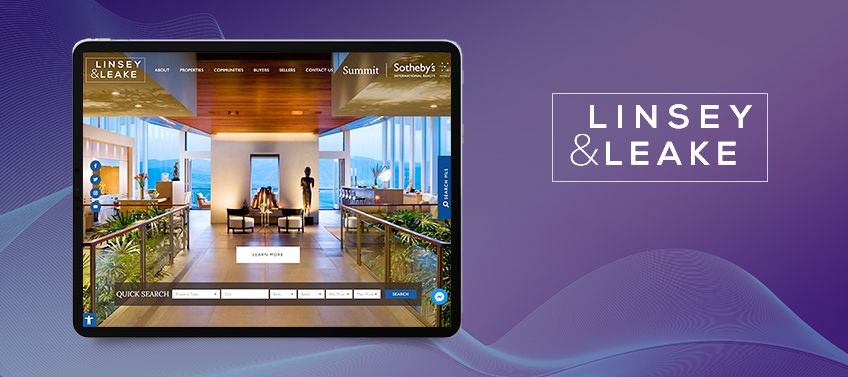
The scenic slopes of Park City have to be seen to be believed, so we wanted LinseyAndLeake.com to give visitors an immersive peek into this locale. It was crucial to make the header section as hardworking as possible, hence the use of full-screen photos that showcase mountain views and home interiors that are equally impressive. To achieve the modern but luxurious feel throughout the website, we opted for a sleek design and added subtle geometric details, too.
What we love about this website: In keeping with the website’s modern look, we thought it fitting to include modern features as well. Upon loading the site, visitors are greeted by a chatbot that serves as an AI-powered concierge.
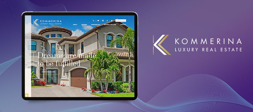
Kommerina De Jong Beverly Hills, CA
Chic but cool — that’s how we’d describe Kommerina De Jong’s website. It’s an apt description, too, as she sells some of the finest homes in iconic neighborhoods like Beverly Hills, Santa Monica, and Malibu. Inspired by California’s balmy weather, we added warm tones and gold details throughout the site. The layout, meanwhile, is clean and easy to navigate, whether you’re buying, selling, or investing.
What we love about this website: We wanted to imbue Kommerina.com with understated elegance and our team came up with a clever solution: each time you hover on a featured community, Kommerina's logo in her signature gold accent, makes a quick cameo to punctuate her branding.
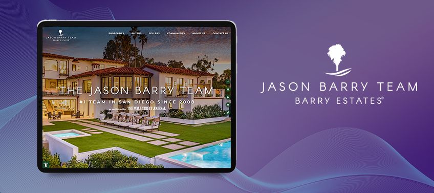
Jason Barry Team Rancho Santa Fe, CA
You don’t become the biggest name in San Diego real estate without focus and dedication. So when designing the Jason Barry Team’s site, we knew that every single element had to be perfectly dialed in. The color scheme, the fonts, the images, and the streamlined layout all come together to create a sophisticated website befitting the area’s #1 real estate group. Further proving this team's prowess is a section that highlights its impressive sales records and glowing testimonials.
What we love about this website: The Jason Barry Team thrives in the digital age thanks to its deft use of social media. Not only are its YouTube and Instagram feeds integrated into the site, but there’s also a column of buttons that offer quick access to the group’s Facebook, LinkedIn, and TikTok accounts.
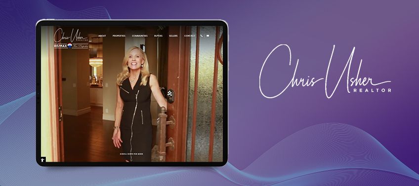
Chris Usher Scottsdale, AZ
Luxury buyers might have sophisticated tastes, but their needs are simple: a home that supports the lifestyle they love. That’s why UsherHomes.com sports an open and uncomplicated layout where everything you need is just a few clicks away. Of course, that’s not to say simplicity can’t be stylish. Check out the Arizona scenery that’s fused into the background and the parallax effect that breathes life into every scroll.
What we love about this website: After living in Scottsdale for over 40 years, Chris is more than just an agent — she’s your future neighbor. That’s why her website opens with a video of her giving walkthroughs of listings, attending to clients, and showcasing the city’s sights and sounds.
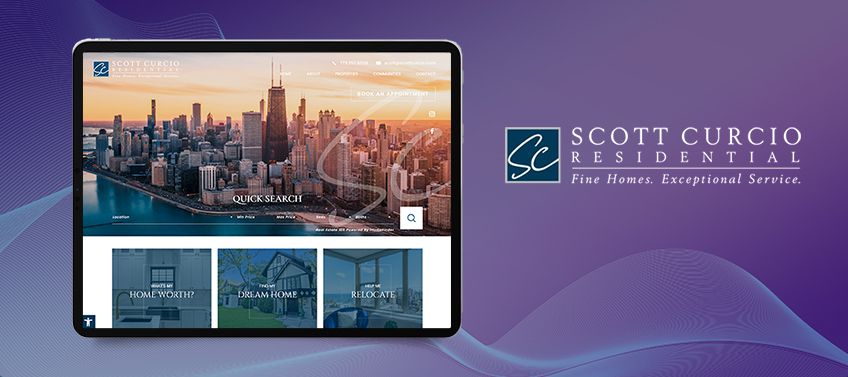
Scott Curcio Chicago, IL
ScottCurcio.com is the leading destination for people who want the most exquisite homes in Chicago. As such, we made sure to give this website a modern look that’s both elegant and austere. The blue color palette is a nod to the windy city’s expansive skies and the calm waters of Lake Michigan. Meanwhile, the generous white space serves as a canvas that frames the stunning properties only an elite agent like Scott has access to.
What we love about this website: As a leading realtor, Scott wanted to capitalize on his brand. We made this happen by emblazoning his logo on the header image as well as on his featured listings.
Stacy Fleisher Altamonte Springs, FL
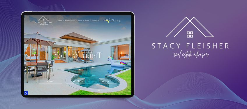
“Experience You Can Trust” is more than just Stacy Fleisher’s tagline, it’s her personal mantra. When you visit her website, you discover a simple but modern layout that’s free of clutter, a design decision inspired by her straightforward and credible advice. While her website has a distinctly contemporary look, she’s a firm believer in good, old-fashioned customer service. That’s why her featured listings and communities look like polaroids or postcards - a little feel-good nostalgia if you will.
What we love about this website: The header section for StacySellsIt.com is chock-full of features without taking the spotlight away from the slideshow of highlighted properties. Case in point: there are specific portals for home valuation, buyers, and sellers above the fold so you can access them without having to scroll further down.
Andy Bovender Charlotte, NC
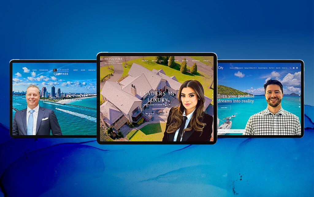
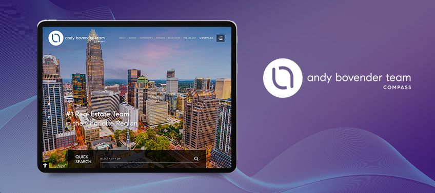
When we asked Andy Bovender to describe his ideal website as if it were a person, he said: “He would wear a dress shirt but nothing too formal. He’s a go-getter who gets things done.” Knowing this, we designed his site to be stylish but easy to use. A classic black-and-white color scheme was a natural choice since it evokes class without being intimidating. Clever features like access to Compass Concierge and Compass Bridge Loan Services further highlight that Andy is as determined as his buyers to close a deal.
What we love about this website: Unlike other agent websites, it has a section that discusses its story. More than just giving a peek into its history, this feature also clues people in on the values that drive this top-producing team.
Elizabeth Monteleone Baltimore, MD
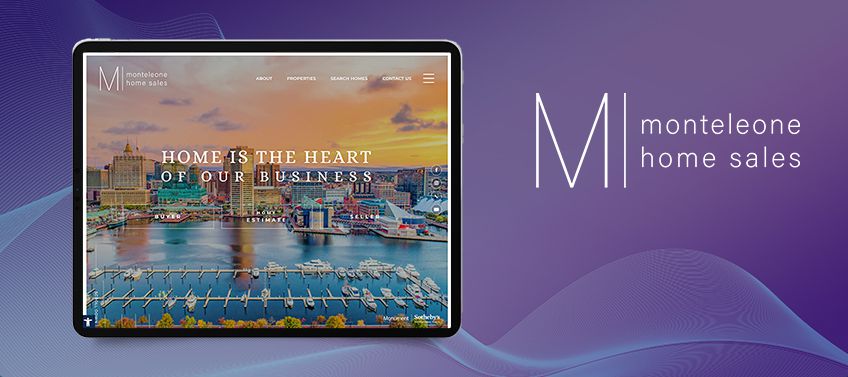
Elizabeth Monteleone’s website artfully marries a luxurious contemporary look with a uniquely cozy feel. Full-sized images in the header section spotlight the caliber of her listings, while the pairing of serif and sans serif fonts create a modern-meets-classic aesthetic. We also chose a combination of neutral and warm tones like pink, gray, and white to inspire a sense of comfort and relaxation. The addition of the parallax effect creates a soft and sophisticated sense of depth—a dynamic touch befitting a world-class team with dynamic service.
What we love about this website: Elizabeth understands that in the cut-throat world of real estate, there’s no better endorsement than word of mouth. So she proudly displays her glowing reviews from past clients in large cards that immediately draw attention.
Black Book International San Francisco, CA
Few real estate teams understand the ultra-high-end market quite like Black Book International. True to its name, this group caters to VVIP clientele, offering the most prized listings while rendering white-glove service. It was clear to us that its website had to be perfect down to the last detail, just like the homes in its impressive portfolio. Naturally, we went with a black-and-white theme to capture the exclusivity that only Black Book International can offer. Thanks to tasteful animations, design elements like headers, photos, and text blocks snap elegantly into view as one browses through the site. To ensure that its logo is present no matter where you scroll, we added it to the main navigation bar and made this feature “sticky.”
What we love about this website: True luxury is all about the little details. As you’re browsing this site, you’ll notice that the background features a marble-like texture — a flourish that draws inspiration from the opulent finishings of luxury homes.

Recap of standout features
Why settle for a good website when you can have a great one? We hope these outstanding features inspire you to give your site a much-needed refresh, too.
-
Kristi Luman — Clever placement of the property search function proves you can fit a lot of features even on a minimalist site.
-
Linsey & Leake — When the client asked us to create a modern and sleek website, we knew that an AI-powered chatbot was a must-have feature.
-
Kommerina De Jong — Good branding doesn’t have to be loud. In the case of Kommerina’s website, her distinctive logo appears whenever you hover over her listings.
-
Jason Barry Team — For a social media savvy client, it was imperative that the Jason Barry Team’s social feeds and handles were seamlessly integrated into the website.
-
Chris Usher — A video of Chris giving a tour of both the homes she sells and the city she calls home make for an engaging introduction to her website.
-
Scott Curcio — Our clever application of Scott’s logo on the header image and listings is a reflection of his attention to detail and impeccable taste.
-
Stacy Fleisher — This website is all about user-friendliness, as exemplified by buyer, seller, and home valuation portals located above the fold.
-
Andy Bovender — This top-notch agent’s website gives visitors a deep-dive into his team’s story and what makes it tick.
-
Elizabeth Monteleone — By shining a spotlight on her glowing reviews, Elizabeth further burnishes her reputation as a leader in the Maryland high-end property segment.
-
Black Book International — Delightful details like a marble-like background texture lend opulence and elegance to Black Book International’s site.
You, too, can have a website that prospective clients will absolutely love. Our team has deep expertise in all aspects of website development, from art direction, to UX optimization, to good old-fashioned coding. With Agent Image’s help, your website will be the cornerstone of your online presence and will help you edge out even the stiffest competition.
We’d love to tell you more! For a FREE and no-obligation consultation, just call 800.979.5799 or fill out our signup form.
