There are 1 billion websites out there today. How does yours compare?More to the point, how do you make your website the go-to source for buyers & sellers?The key, of course, is to stand out – in
a big, bold way. Luckily, Agent Image
is an expert at creating websites that wow visitors and win awards.
Just take a look at these trendsetting
sites we designed for these elite agents:
a big, bold way. Luckily, Agent Image
is an expert at creating websites that wow visitors and win awards.
Just take a look at these trendsetting
sites we designed for these elite agents:
- 01
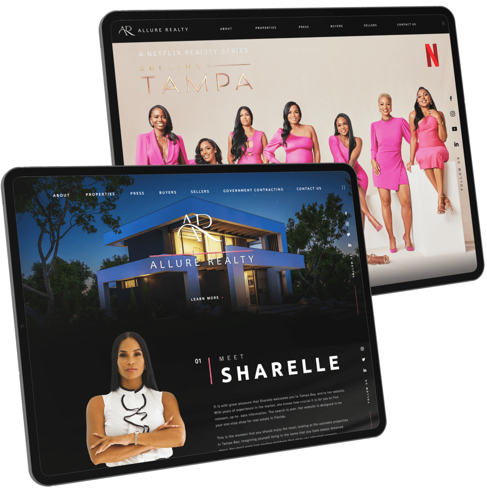
Allure Realty Homes
Why it's differentThere’s nothing more alluring than elegance, and AllureRealtyHomes.com perfectly embodies this principle. The masterful use of dark tones and muted colors create a look that’s simultaneously evocative and exclusive.
Browse through this website to find- Powerbroker Sharelle Rosado striking a power pose
- A gallery of high-end listings
- The entire Allure Realty Homes team, stars of the Netflix hit “Selling Tampa"
- A rundown of the team’s impressive sales record
The website stays true to Sharelle’s vision of an all-female brokerage where each agent is empowered to succeed. The dark theme is tempered by touches of pink – the perfect interplay of power and femininity.
- 02
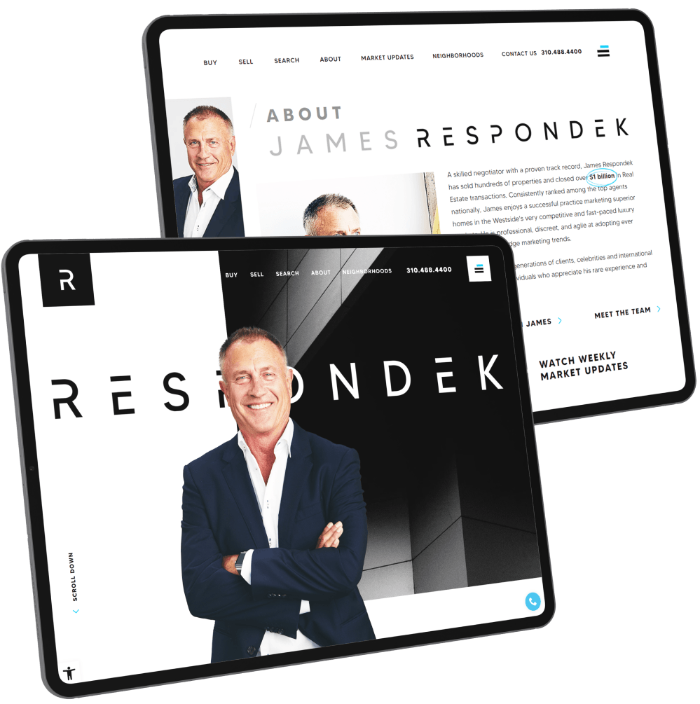
James Respondek
Why it's differentThis realtor website is an interesting mix of classic and modern design sensibilities. You have the timeless black-and-white color scheme and annotation-like design touches, which are complemented by contemporary fonts, parallax scrolling, and an interactive map.
Browse through this website to find- Sleek design and streamlined layout
- Useful tools like home value calculator
- Impressive listings with scenic views
- Weekly market updates
By merging two seemingly different design approaches, this website embodies James’ cutting-edge approach to real estate and his old-school dedication to customer service.
- 03
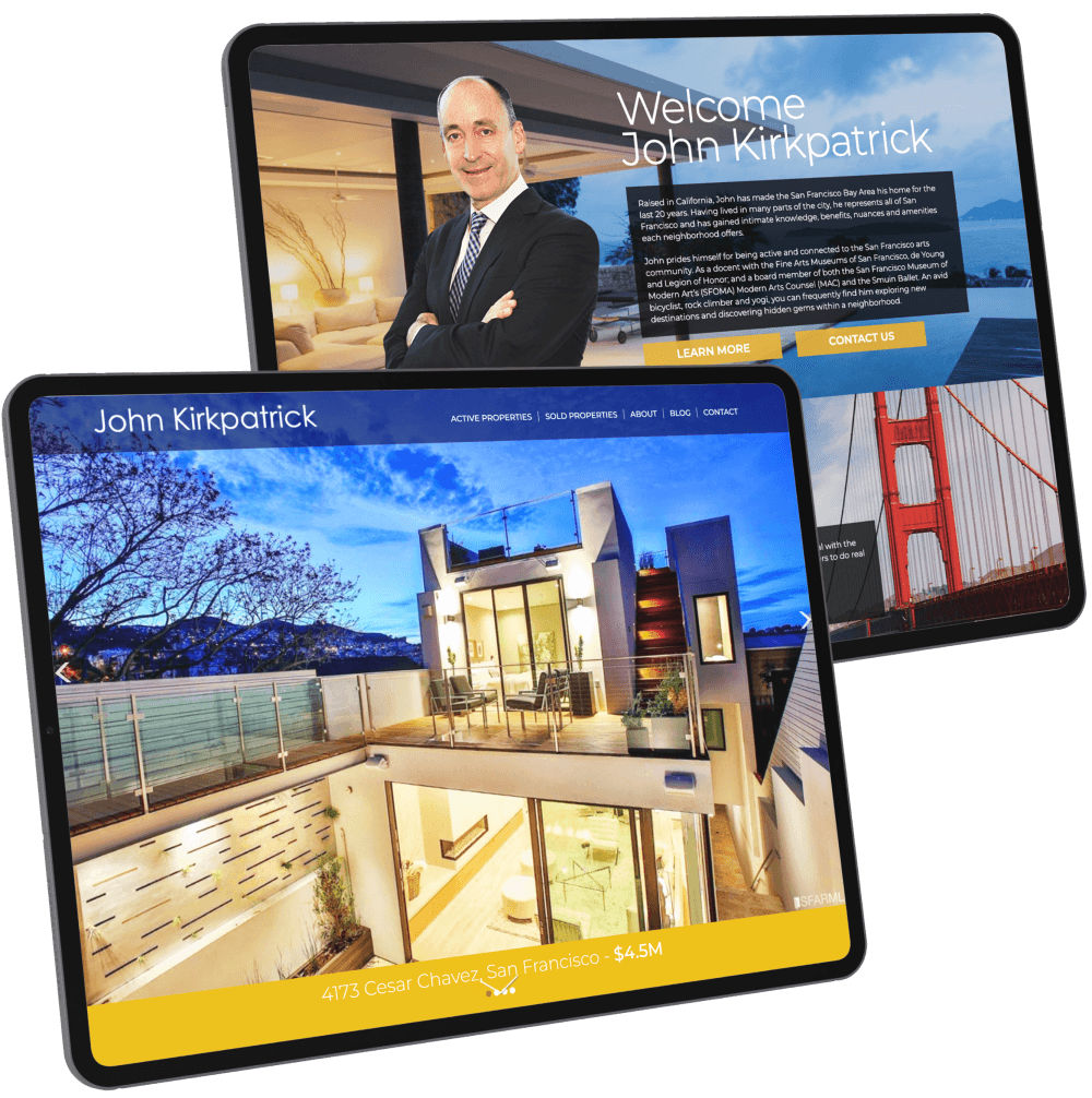
John Kirkpatrick
Why it's differentJohn Kirkpatrick is a patron of San Francisco’s arts scene, and this love manifests itself in his site’s web design. Architectural lines cleanly divide sections of the home page, opening up to a warm welcome and the starting line to home searches.
Browse through this website to find- Active and recently sold luxury listings
- A welcome note
- Client testimonials
John Kirkpatrick’s real estate website immediately grabs the attention of prospective clients through a beautiful display of high-definition photography. This slideshow actually showcases the featured properties. Although rich in images, the site’s layout is classic and straightforward, with easy navigation and clean fonts.
- 04
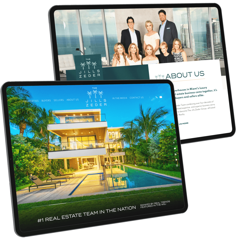
Jills Zeder Group
Why it's differentTwo things set apart The Jills Zeder Group: its access to the most prestigious listings and its world-class client servicing. And we made sure to highlight both in JillsZeder.com, the preeminent online resource for luxury real estate in Florida. Our work for this client garnered national attention, too, bagging the #3 Best Overall Website award at the 2021 RealTrends Website Rankings.
Browse through this website to find- Magazine-like presentation of high-end listings
- User-friendly quick search feature
- Rundown of the team’s impressive sales record
- Handy features like neighborhood guides and interactive maps
The strategic use of color allows the website to embody the breezy seaside living that awaits buyers in Florida. Our design was also built to showcase the stunning homes The Jills Zeder Group has access to.
- 05
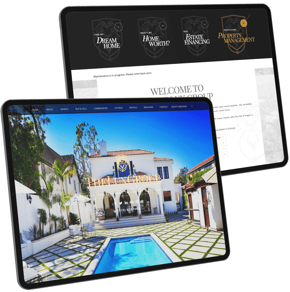
The Lux Group
Why it's differentThe site’s sleek, modern look combines seamlessly with a dynamic scrolling effect, which makes it a joy to browse through. The site’s seamless layout entices people to explore its various sections — and encourages them to take a closer look at the listings on offer.
Browse through this website to find- A stylish Featured Communities section highlighted by some of LA’s most iconic landmarks and destinations
- Animated links to the site’s essential sections
- Featured Properties slideshow
- Blog article previews
Everything in this site just gels together flawlessly, creating a natural flow enhanced by gorgeous images and attractive yet subtle animations that provide that much needed visual flair.
- 06
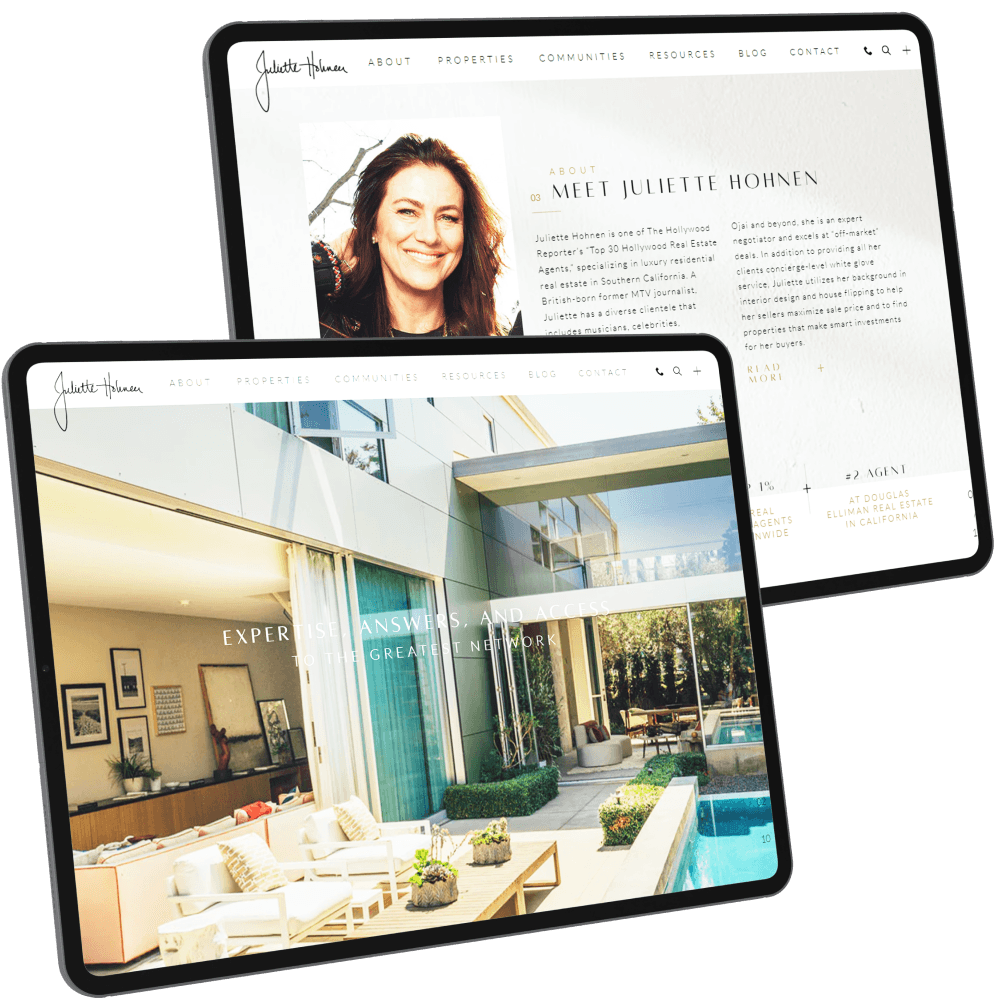
Juliette Hohnen
Why it's differentJuliette Hohnen’s real estate agent website leans into the quiet elegance aesthetic. Each element of her site is carefully curated, highlighting her exquisite taste and the fact that less can indeed be more.
Browse through this website to find- Vertical featured communities akin to TikTok content
- Expertly photographed featured listings
- Contemporary minimalist design
- Insightful buyer and seller resources
High-net-worth individuals are known for their discretion and refined sensibilities. Juliette’s sophisticated yet streamlined website proves she operates on the same wavelength as her prestigious clients.
- 07
Joseph Trujillo
Why it's differentCAHomesPro.com uses a sleek black, gold, and white color palette enhanced with playful red and blue accents to keep things interesting. Every element is arranged strategically, creating an ideal balance between style and accessibility.
Browse through this website to find- Introduction to Joseph Trujillo
- Buyer and seller resources
- Quick Search tool
- Featured Communities and Featured Properties sections
- Testimonials from satisfied clients
The site has a streamlined look that’s nicely complemented by eye-catching images, minimalist design elements, and sections that transition smoothly into one another.
- 08
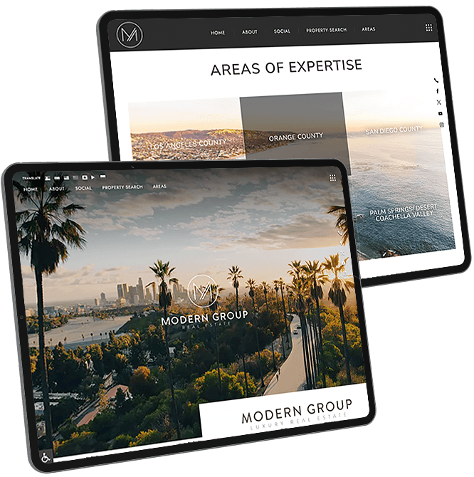
Modern Group Real Estate
Why it's differentFor a team called Modern Group Real Estate, it was only appropriate to have best-in-class contemporary website design. This realtor website is all about clean lines, sans-serif fonts, and stylishly spare colors — a nod to Tony and London Giordano’s seamless, cutting-edge approach to real estate. The site is filled with clever design touches, too. Scroll your cursor on any featured community and the entire grid transforms into your chosen neighborhood, reminiscent of a modern mosaic.
Browse through this website to find- Captivating banner section
- Unique horizontal layout for social media feed
- Seven language options
This project goes to show that a luxury real estate website can be modern and doesn’t have to rely on expected or cliched design conventions.
- 09
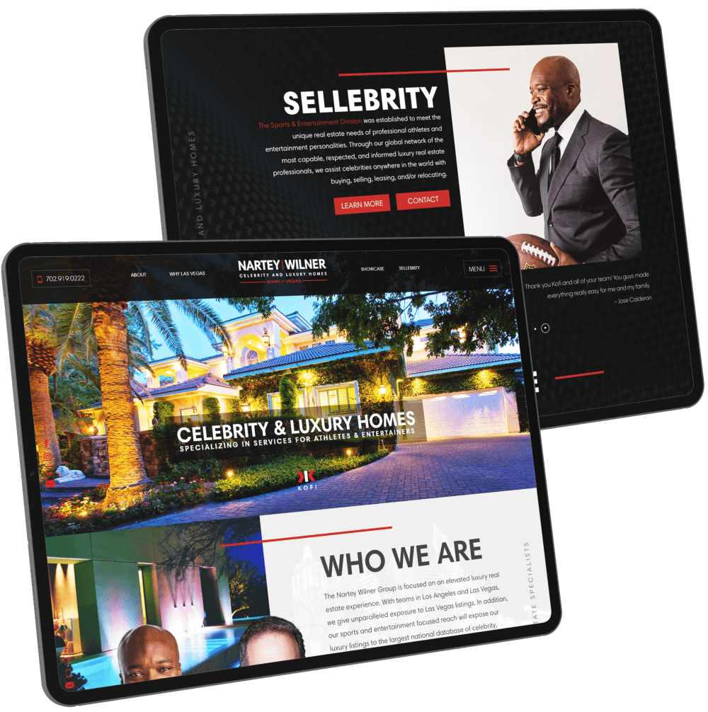
Nartey | Wilner
Why it's differentAt a glance, the Nartey Wilner Group tells visitors exactly what they’re about—the best luxury real estate professionals in Las Vegas for athletes and celebrities. The site combines the vibrancy of Sin City with the extravagance of its luxury properties.
Browse through this website to find- A brief “Who We Are” statement
- “Sellebrity” section with testimonials from A-list clients
- Featured Properties in a great tile layout
- Links to their buying and selling services
- Featured Communities each complete with a succinct description of the area
The design elements play well with the regal color scheme. The rich dark colors contrast with the gray and rust-colored tones, drawing attention to the site’s most important features.
- 10
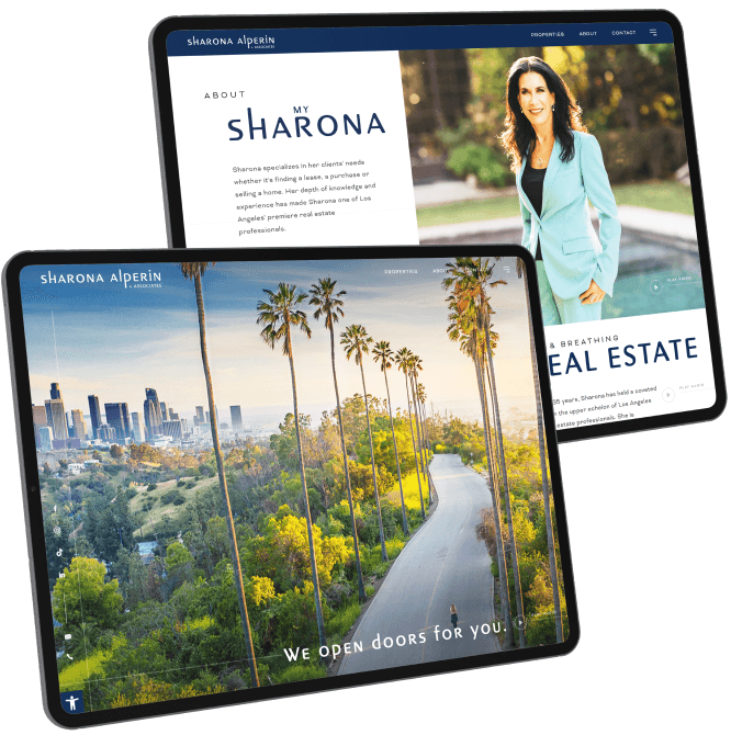
Sharona Alperin
Why it's differentThe goal of this project was simple: to bridge Sharona Alperin’s fascinating past with her high-flying present. After all, this ace agent is not only the inspiration for The Knacks’ #1 hit “My Sharona,” but she is also one of the top-producing agents in Beverly Hills. For this reason, the beloved new-wave song plays over a website that features sleek lines, intuitive layouts, and modern fonts — a marriage of pop culture cachet and exquisite art direction.
Browse through this website to find- Banner video with “My Sharona” as the soundtrack
- Summary of Sharona’s impressive sales record
- Helpful tools/guides for buyers and sellers
- Impressive featured listings and communities
The contrast between pop culture glitz and exclusive luxury creates an engaging browsing experience. It also highlights the fact that many of the music industry’s rock stars call Beverly Hills home.
- 11
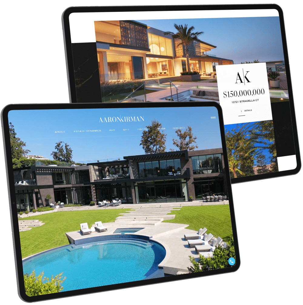
Aaron Kirman
Why it's differentAs an agent with over $7 billion in career sales, Aaron Kirman is not afraid to showcase the prestigious estates he represents. Indeed, his ultra-deluxe listings are prominently featured on AaronKirman.com’s homepage – proof of the exclusive properties this renowned agent has access to. Meanwhile, the striking black-and-white aesthetic only elevates the site’s sense of prestige, as does the marble-like texture used in the background.
Browse through this website to find- Portals for sellers, buyers, and home valuation
- Recent sales that showcase Aaron’s real estate prowess
- Estate Dynamics, Aaron’s AI-powered tech stack that makes selling a home a breeze
- Trailer for “Listing Impossible”, the hit TV show that features Aaron and his team
The simple but stylish layout allows the properties to really shine, demonstrating Aaron’s impeccable taste and attention to detail.
- 12
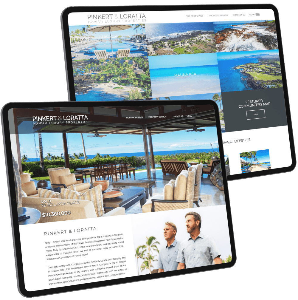
Pinkert & Loratta
Why it's differentUnlike other real estate websites, this one lets the images shine with its clean layout and white background. The overall design is minimal, but it's a welcome invitation to Hawaii luxury properties nonetheless.
Browse through this website to find- A beautiful slideshow of featured luxury properties
- A welcome note that is succinct yet warm
- Featured communities in the form of image links; hover and you get a brief intro about the neighborhood
- Client testimonials
When it comes to Hawaii real estate, we’re used to a rainbow of colors. Pinkert & Loratta’s site sets itself apart with its minimalist tones. It focuses on showcasing the best in real estate offerings and user-friendliness.
- 13
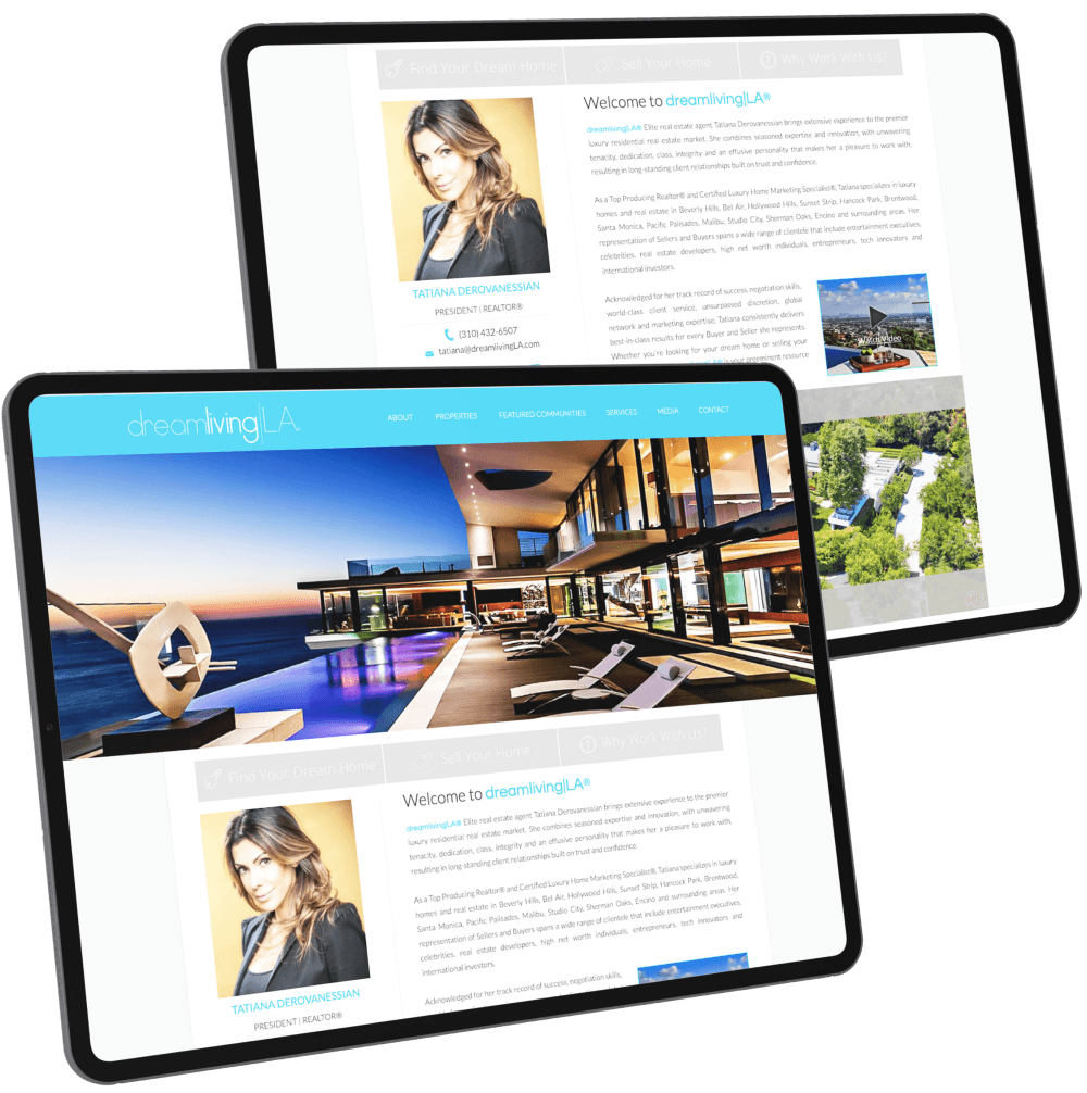
Tatiana Derovanessian
Why it's differentThe site’s cerulean-and-white color scheme brings to mind L.A.’s long stretch of beaches and its polished yet laidback feel. Important links – to the property search tool, the home valuation form, and the company’s about page – are right above the fold.
Browse through this website to find- A brief intro detailing site owner Tatiana Derovanessian’s specializations
- The featured property listing of the week, including a video of the property
- Tatiana’s frequently updated Instagram feed
Streamlined and elegant, it doesn’t bombard the visitor with too much information, allowing it to highlight the essentials.
- 14
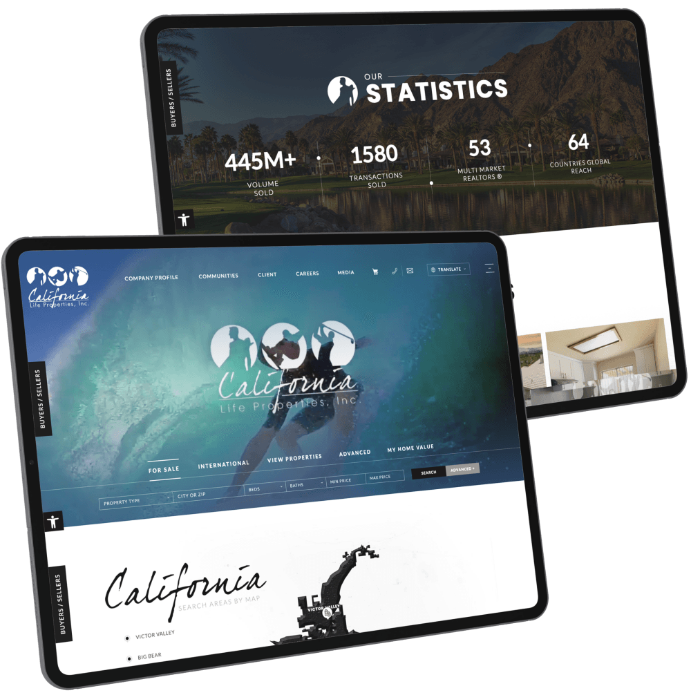
California Life Properties
Why it's differentThis website harnesses the power of video beautifully, taking visitors on a tour of California’s regions to showcase the diversity of lifestyles in the state. And since the video already does most of the talking, a theme of “less is more” permeates the rest of the website.
Browse through this website to find- An interactive map featuring California Life Properties’ areas of specialization
- Buyer and seller resources in the form of circular image links
- A short but sweet welcome note
- Fan testimonies
The embedded video that plays as soon as the site loads is the icing on the cake. It effectively sells the California lifestyle and beckons homebuyers and sellers to learn more about the real estate market. The interactive map is also a useful tool, helping visitors make sense of the areas geographically.
- 15
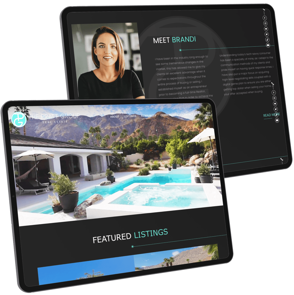
The Pratt Group
Why it's differentBrandi Pratt packages sunny Coachella Valley real estate in a sleek, black-themed website. The contrast is stark and deliberate. More importantly, it works. With the bold color scheme, The Pratt Group presents itself as confidently professional, while highlighting their featured luxurious desert homes through high-definition images that pop out on the viewer’s screen. The teal in the company logo also mirrors the cool blues of the clear sky and sparkling swimming pools in featured property photos.
Browse through this website to find- An impressive showcase of top featured properties
- Quick links to Brandi and her team’s profiles
- Dedicated buttons for buyer- and seller-oriented services
- Direct links to the firm’s featured communities
- Prominent client testimonials and social media updates
Southern California is well-known for its bright and sunny weather. By choosing a dark theme for its website, The Pratt Group deliberately cuts against the grain—a bold, strategic choice that ultimately makes its brand stand out more.
- 16
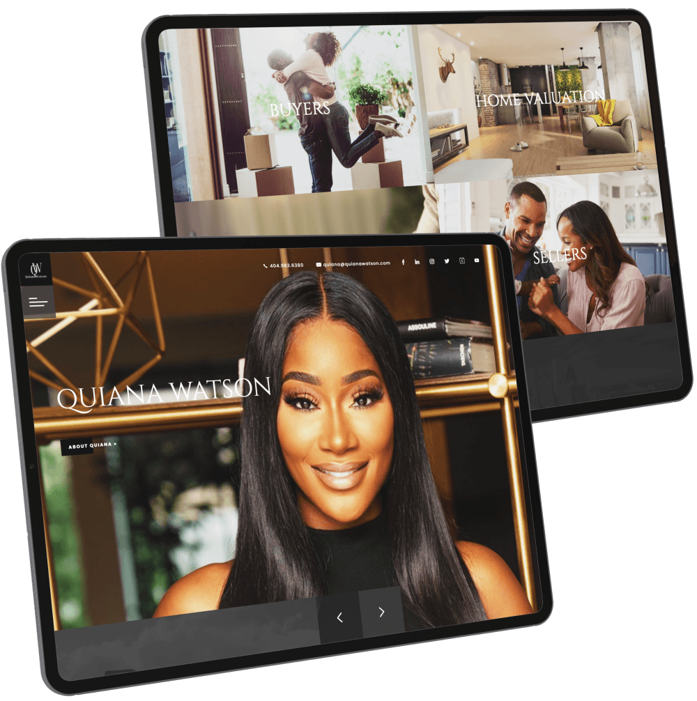
Quiana Watson
Why it's differentBrowsing Quiana Watson’s website is like flipping through a high-end magazine. The crisp images, the scenes of domestic bliss, and the stylishly minimalist design reflect her reputation as one of Metro Atlanta’s leading luxury realtors.
Browse through this website to find- Dedicated portals for buyers and sellers
- Useful tools like home valuation
- Interactive map with active listings
- Informative blog section
The interplay between the dark color scheme and the vibrant photography create a look that’s undeniably refined but also enticing.
- 17
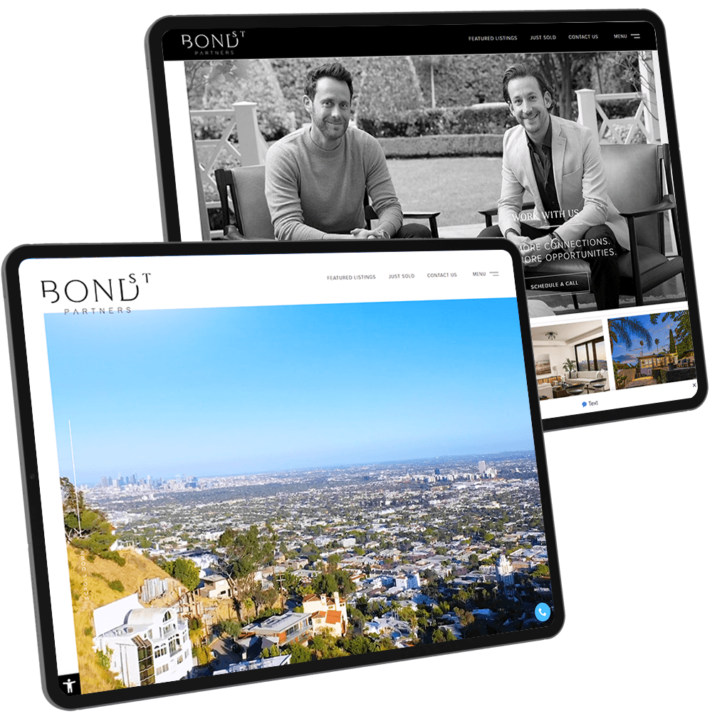
Bond Street Partners
Why it's differentExquisite minimalism best describes BondStreetPartners.com. By stripping away non-essentials, we were able to polish the remaining design elements to sparkling perfection. The result? A website that boasts a bold design and an unmistakably modern feel.
Browse through this website to find- An engaging banner video that showcases deluxe listings
- Masterfully implemented parallax scrolling
- A striking minimalist aesthetic
- “Studio Bond” — the team’s multimedia content studio
We leaned into Bond Street Partners’ expertise as luxury realtors, applying the mantra: “Good taste is knowing what to leave out.”
- 18
Ivan Estrada
Why it's differentIvan Estrada’s website boasts a contemporary design that’s characterized by geometric shapes, clean lines, and modern fonts. The parallax effect and animations make the browsing experience more engaging, while also serving as a nod to the young and dynamic agent’s service.
Browse through this website to find- Video community tour of L.A.’s most iconic neighborhoods
- Ivan’s video series called “Real Estate Minutes”
- Dedicated section for press mentions
- Blog filled with up-to-date industry insights
Every element of this site works together to depict Ivan as the energetic and passionate agent that he is.
- 19
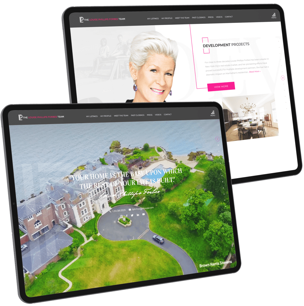
Louise Phillips Forbes
Why it's differentLouise Phillips Forbes may be known for selling multi-million dollar properties, but her goal has always been to help families find the perfect home. For this reason, her website lies at the intersection between ritzy and cozy.
Browse through this website to find- Aspirational introductory video
- Gallery of impressive listings
- Informative market reports
- Portals to past and current real estate developments
The website truly embodies Louise, who effortlessly juggles being an in-demand realtor with being a devoted spouse and mom. This is reflected by the graceful use of both gray and pink tones on the site.
- 20
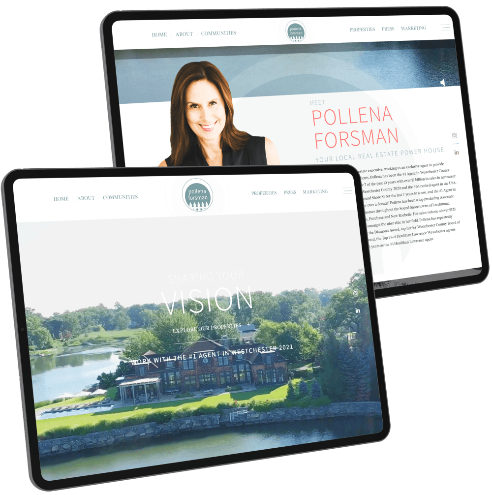
Pollena Forsman
Why it's differentThis website perfectly captures the prestige, exclusivity, and leisurely lifestyle of Westchester County, one of the hottest property markets in New York State.
Browse through this website to find- Banner video that showcases Westchester County
- Section on Pollena’s sales record
- Glowing client reviews
- Press coverage
The website’s simple layout and neutral tones not only capture the locale’s stress-free vibe, but also allow the visual elements to truly stand out.
Your Homepage Is Your First Selling Point
As a real estate professional, you want the first page of your website to showcase your strengths and the type of company that you’re representing. With a polished and professional real estate website theme, homebuyers will feel that they are purchasing property from an established and trustworthy company. Aside from having great design, your website should also be user-friendly and easy to navigate so your web visitors can intuitively find their way around your site content.

Captivate Your Visitors With Beautiful Images
Homebuyers want to see high-quality and detailed photos of homes, and what better way to showcase a featured property than on the homepage and property pages of your agent website? A gallery slider or a separate page for detailed photos should accompany each property listing. For special or featured listings, you can also include links to professionally-made property tour videos.
Property Or MLS Search Feature
Your real estate website should have a property search feature where homebuyers can narrow down their searches by location, property type, price range, features, zip code, etc. Make sure that your IDX website offers different ways of searching such as: map search, basic search, advanced search, and address/listing ID search.

Let’s Make Your Website Stand Out
With 25 years of design expertise, Agent Image can give you a real estate website that as trendsetting as the one’s above.
We’ve got flexible packages that will suit your needs, whether you’re a new or established agent. Just chat with our Web Marketing Strategists to find out which one is right for you.


