10 Best Real Estate Websites for May 2020
Here at Agent Image our work is all about putting your brand ahead of the competition and making sure that your name and your business are top-of-mind among your target audience.
Our secret is that we focus on more than just great visual design. We offer the complete package. This means putting in the effort to ensure functionality and reliability, resulting in a smooth and enjoyable user experience regardless of the device used to view the site.
Take a look at the outstanding websites we launched in May 2020:
Movement Property Group Nashville, Tennessee
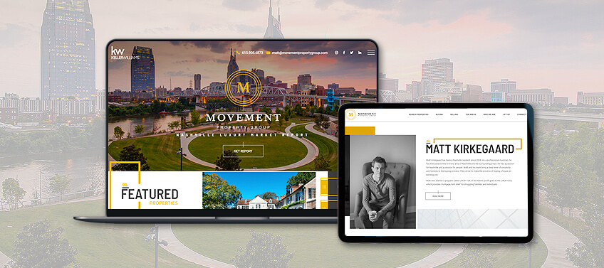
Matt Kirkegaard’s Movement Property Group is the name to remember when it comes to luxury homes in Nashville. You’ll know it just by looking at their website, which speaks a language of its own with its carefully chosen visual elements. Clean lines, eye-catching images, and bold, prominent text make it the ideal platform to showcase the finest luxury real estate opportunities here—as well as the expertise of Matt and his team.
Why it made the list: Subtle yet deliberate design choices communicate the prestige and elegance of the market that the team represents.
Beth Cummins Palm Springs, California
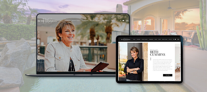
Palm Springs luxury real estate expert Beth Cummins opts for simplicity and minimalism as she presents the finest living opportunities that the West Coast has to offer. You’ll know right off the bat that you’re in for an enjoyable experience as soon as her homepage loads. Vibrant and colorful images invite you to explore her featured communities and Beth herself greets every visitor with her bright and friendly smile—adding just the right personal touch.
Why it made the list: This website perfectly mirrors the agent’s bright and accommodating personality.
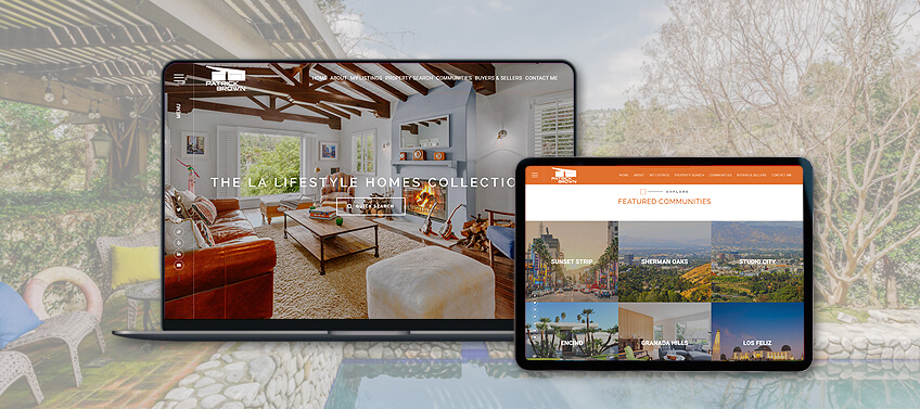
Patrick Brown Los Angeles, California
Patrick Brown’s LALifestyleHomes.com makes the most of Agent Image’s new AgentPro Iconic Lux template to display the finest luxury living options in the City of Angels. Featured listings and communities are displayed in a stunning manner, using large and appealing image tiles that stretch from one edge of the screen to the other. Smooth animation effects add a sense of exciting dynamism that matches the lively LA lifestyle. Meanwhile, clay-hued visual accents lend a distinctive quality to establish brand recognition.
Why it made the list: This dynamic design is just perfect for today’s visually-driven internet audience.
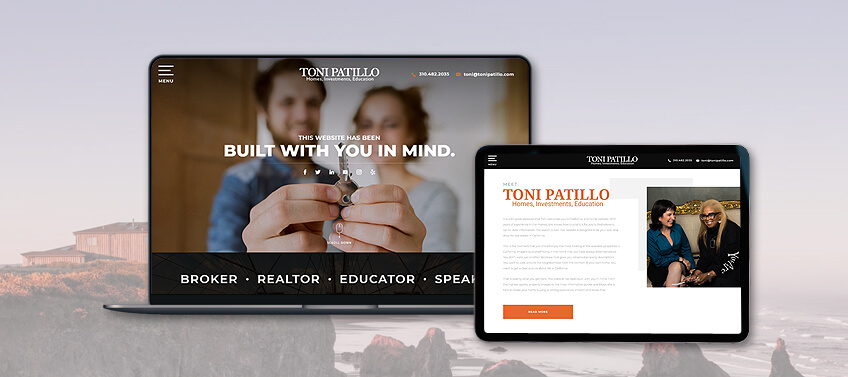
Toni Patillo Beverly Hills, California
Toni is adamant about giving you the best life that you deserve. That’s why this prolific realtor, educator, coach, and radio host worked with Agent Image to create a website that is genuinely “built with you in mind.” The end result is a convenient, one-stop hub for her myriad resources—from her attention-grabbing featured properties to the variety of guide books she’s written as well as her notable media appearances. This website keeps everything you need just one easy click or tap away.
Why it made the list: Tidy layouts and straightforward navigation create the ideal platform for this agent’s multi-faceted brand.
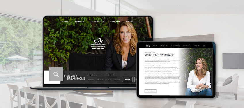
Dianne Reppucci Orange County, California
When one thinks of Southern California’s sunny coastal cities, bright and sunny themes often come to mind. Dianne Reppucci’s YourHomeBrokerage.com challenges this norm. Opting instead for blacks, greys, and muted tones for her website’s color scheme, Dianne offers a more intimate and personal glimpse into the lifestyle on offer in these exceptional locales. Using subdued sophistication, the website serves its purpose masterfully, making header text, property listing details, and calls to action pop out effortlessly from the page.
Why it made the list: Dark and muted tones deliver an intimate and sophisticated profile of the agent’s local area.
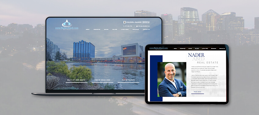
Nader Abed Washington, D.C., Virginia, and Maryland
With a dramatic video wall above the fold, Nader Abed welcomes you to the Washington D.C. Metropolitan Area in style. Better yet, he invites you to stay. Beneath the sweeping views of the city is a variety of tools and resources that will make your real estate journey a breeze—from searching for properties, to reading the latest area news and market updates. The entire website is a joy to view, with its clean blue-against-white aesthetic that is always easy on the eyes.
Why it made the list: An absolute joy to view, from the breathtaking video wall to the soothing color scheme.
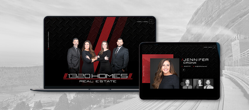
1320 Homes Real Estate Denver, Colorado
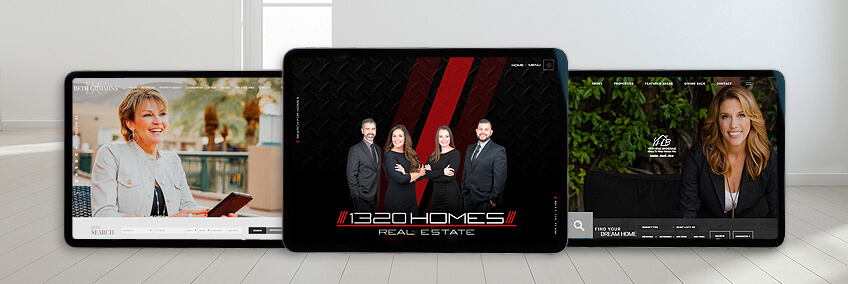
Using a metallic black, diamond plate-patterned background with standout red accents, 1320Homes.com makes an instant impression on you as soon as the homepage loads. You meet the team right away, as well, as the agents appear front and center on the main screen. This is an excellent example of how to use website design to build brand recognition and recall. Most importantly, this is just the tip of the iceberg for this feature-packed real estate resource hub.
Why it made the list: The distinctive diamond plate pattern background, matched with a memorable red-on-black color scheme.
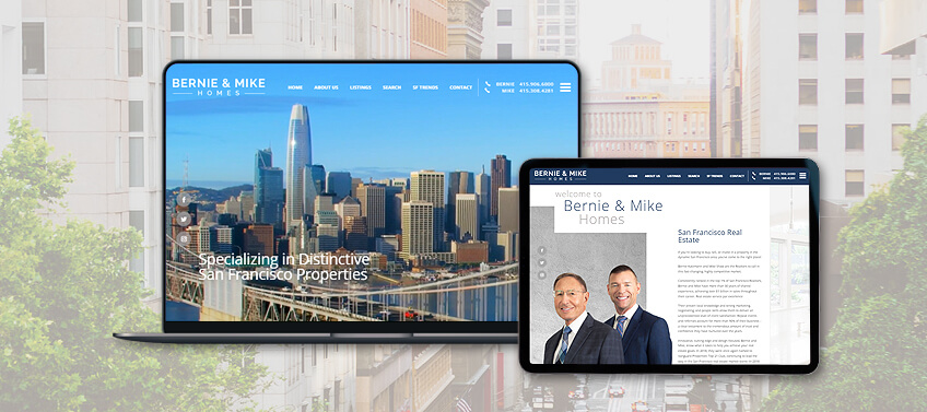
Bernie & Mike Homes San Francisco, California
The many facets of the Bay Area lifestyle are fully showcased on the main screen of BernieAndMikeHomes.com, giving the website’s visitors a quick yet substantial glimpse of what awaits them in this market. Right below the fold, this team offers even more video content, providing easy access to important snippets of information. With this generous serving of rich video resources, Bernie and Mike connect with the modern online audience immediately and in a compelling manner.
Why it made the list: Presenting rich video content right from the top, this website immediately captures and keeps viewers’ attention.
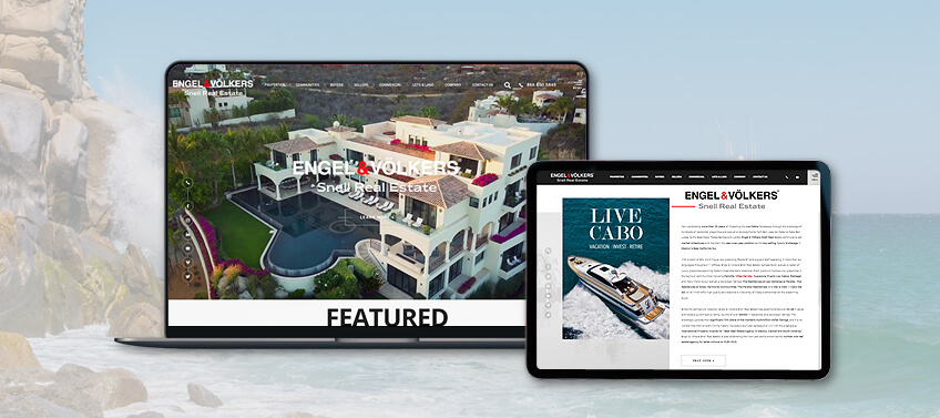
Snell Real Estate Los Cabos, Mexico
Get ready to make the dream luxury lifestyle in Mexico’s Baja California Peninsula a reality when you enter SnellRealEstate.com. Right away, its video wall will transport you to the blue water paradise that is Los Cabos, enticing you to dive deeper into the website’s content. As you scroll further down the homepage, you can launch straight into viewing the top listings and developments available today. If you’ve ever dreamed of living in paradise, this website is the perfect place to begin your journey.
Why it made the list: Spectacular video content depicting the height of luxury living in one of the most prestigious international destinations.
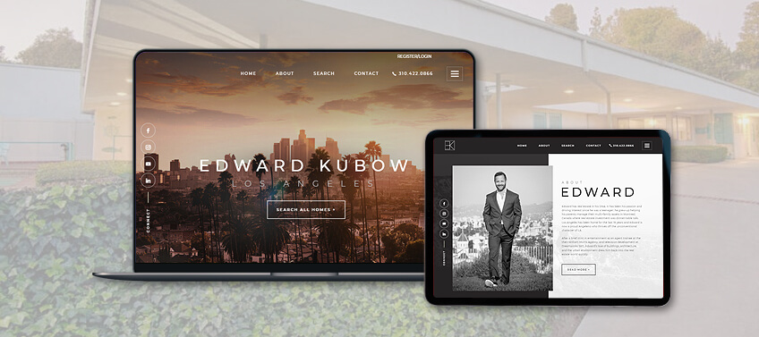
Edward Kubow Los Angeles, California
Few real estate markets in the world can compare with sunny Los Angeles. That’s why top-producing agents in this locale like Edward Kubow go to great lengths to capture its incredible allure on a fantastic website. Leading with a dramatic, sunset-hued image of the LA skyline, Edward’s agent website is sleek and streamlined, presenting essential tools and resources on the homepage. From customizable property search to highlighted listings and access to Edward’s social media channels, everything is prominently displayed.
Why it made the list: Straightforward navigation perfectly complements the dramatic visual appeal of LA views and properties.
Let’s recap!
There’s clearly more than one way to create a stunning and effective real estate agent website, and our list of May’s best is proof. At the end of the day, it boils down to the language you want to speak, the story you want to tell, and the personality you want to project. Let’s run through how our top 10 managed to capture all these:
MovementPropertyGroup.com – Effective use of deliberate design elements to communicate luxury and sophistication
BethCumminsProperties.com – Capturing and communicating the agent’s personality through the most apt visual aesthetic
LALifestyleHomes.com – Simple, clean design brought to life with dynamic visual effects
ToniPatillo.com – A bold and clear statement displayed for target customers, with the smooth and convenient user experience to back it up
YourHomeBrokerage.com – Using a dark and muted color scheme to effectively convey luxury, intimacy, and sophistication
NaderAbed.com – Dynamic embedded video and smooth transition animations combine to make a spectacular visual experience
1320Homes.com – Make your brand stand out immediately with striking visual choices
BernieAndMikeHomes.com – Maximizing video content to attract visitors’ attention and inspire continued engagement
SnellRealEstate.com – Use of high-quality video footage to showcase one of the world’s most desirable luxury destinations to an international market
EdwardKubow.com – Full-featured functionality wrapped in a visually captivating presentation
Boost your online presence with a real estate agent website that genuinely captures your brand and personality. Contact Agent Image and get a free consultation with our website design and internet marketing experts. Call 800.979.5799 today to learn more.
